1. 什么是CSS CSS,Cascading Style Sheets 层叠样式表。
即:如何修饰网页信息的显示样式。
目前推荐遵循的是 W3C 发布的 CSS3.0(1998年5月21日W3C推出了CSS2.0),用来表现XHTML或者XML等样式文件的计算机语言。
2. CSS语法
每个CSS样式由两部分组成,即选择符和声明,声明又分为属性和属性值
属性必须放在花括号{}内,属性与属性值用冒号:连接
每条声明用分号;结束
当一个属性有多个属性值的时候,属性值与属性值不分先后顺序,用空格隔开
在书写样式过程中,空格、换行等操作不影响显示
常规原则:style 标签需要放在 head 标签中,写一个即可。
1 2 3 4 5 6 7 8 9 10 11 12 13 14 15 16 17 18 <head > <meta charset ="UTF-8" > <meta name ="viewport" content ="width=device-width, initial-scale=1.0" > <title > css</title > <style > h1 { color : red; } h2 { color : yellow; } </style > </head > <body > <h1 > 1111</h1 > <h2 > 2222</h2 > </body >
3. CSS样式 3.1 外部样式-常用 link 与 @import
1 2 3 4 5 6 <link rel ="stylesheet" type ="text/css" href ="css/index.css" > <style > @import url(css/index.css); </style >
css/index.css
1
2
3
4
5
6
h1 {color : blue;h2 {color : green;
扩展:link 和 import 之间的区别?
本质差别:link 属于XHTML标签,而 @import 完全是CSS提供的一种方式
加载顺序差别:当一个页面被加载的时候(即浏览器浏览的时候),link引用的CSS会同时被加载,而@import引用的CSS会等到页面全部被下载完再被加载。所以有时候浏览@import加载的CSS页面时会开始没有样式(就是闪烁),网速慢时最明显。
兼容性差别:@import是CSS2.1提出的,所以老的浏览器不支持,@import只有IE5以上才能识别,而link标签无此问题。
3.2 内部样式 1 2 3 4 5 6 7 8 9 10 11 12 13 14 15 16 <!DOCTYPE html > <html lang ="en" > <head > <meta charset ="UTF-8" > <meta name ="viewport" content ="width=device-width, initial-scale=1.0" > <title > CSS内部样式</title > <style > div { color : yellow; } </style > </head > <body > <div > 1111111111111</div > </body > </html >
显示写在head标签内的。
3.3 行内样式 标签内 style 标签直接写样式。
样式优先级:就近原则。即 行内样式 > 内部样式 > 外部样式。
!important 突破优先级顺序,加谁身上,谁优先级高。如果都有!important还是就近原则。且针对的是同一个标签同一个样式属性,其他的会被保留下来。
即 !important > 行内 > 内部 > 外部。
1 2 3 4 div {color : red!important ;background-color : yellow;
4. CSS选择器 要使用CSS对HTML页面中的元素实现一对一、一对多或多对一的控制。
元素选择符/类型选择符(element选择器),如
1 2 3 4 5 div {width : 100px ;height : 100px ;background : red;
语法:元素名称{属性:属性值;}
4.1 class类选择器. 语法:.class名{属性:属性值;}
说明:
当使用class选择符时,应先为每个元素定义一个class名称
class选择符的语法格式是
1 2 如 <div class="top "></div >.top {width :200px ; height :100px ; background :green;}
用法:class选择器更适合定义一类样式。
注意:生效的顺序取决于 style 中的编写顺序,不受 class 定义的影响。
1 2 3 4 5 6 7 8 9 10 11 12 13 14 15 16 17 18 19 20 21 22 23 24 25 26 <!DOCTYPE html > <html lang ="en" > <head > <meta charset ="UTF-8" > <meta name ="viewport" content ="width=device-width, initial-scale=1.0" > <title > 类选择器</title > <style > .ibm { background-color : blue; } .soft { color : red; background-color : yellow; } </style > </head > <body > <div > 111111</div > <div class ="ibm soft" > 222222</div > <div class ="soft ibm" > 333333</div > <div class ="ibm" > 444444</div > <div > 555555</div > </body > </html >
4.2 id选择器# 语法:#id名{属性:属性值;}
说明:
当使用id选择器时,应该给每个元素定义一个id属性
id选择器语法格式需要加上 # 号
1 #box {width :300px ; height :300px ;}
起名要用英文名,且不能使用关键字(所有的标签和属性都是关键字,如head标签)
一个id名称只能对应html文档中一个具体的元素对象(唯一性)
1 2 3 4 5 6 7 8 9 10 11 12 13 14 15 16 17 18 <head > <style > #box1 { background-color : red; } #box2 { background-color : green; } #box3 { background-color : blue; } </style > </head > <body > <div id ="box1" > 11111</div > <div id ="box2" > 22222</div > <div id ="box3" > 33333</div > </body >
4.3 通配符* 语法:*{属性:属性值;}
说明:通配符的写法就是 *,含义就是所有元素
如 *{margin:0; padding:0;} 代表清除所有元素的默认边距值和填充值 。
1 2 3 4 5 6 7 8 9 10 11 12 13 <head > <style > *{ margin : 0 ; padding : 0 ; } </style > </head > <body > <div > 11111</div > <p > 222222</p > <h1 > 3333333</h1 > </body >
4.4 群组&包含&后代选择器 4.4.1 群组选择器 语法:选择符1, 选择符2, 选择符3....{属性:属性值;}
说明:当有多个选择器应用相同的声明时,可以选择用,分隔的方式,合并为一组。
举例:
1 #top1 , #nav1 , h1 {width :960px ;}
4.4.2 后代or包含选择器 语法:选择符1 选择符2{属性:属性值;}
说明:其含义就是选择符1中包含的选择符2
用法:当元素存在父级元素时,需要改变自己本身的样式,可以不另加选择符,直接包含选择器的方式解决
举例:
1 2 3 4 5 6 7 8 9 10 11 12 13 14 <head > <style > div p { color : red; } </style > </head > <body > <div > <p > 111111</p > </div > <p > 2222222</p > </body >
4.5 伪类选择器 语法:
a:link{属性:属性值;} 超链接初始的状态;a:visited{属性:属性值;} 超链接被访问后状态;a:hover{属性:属性值;} 超链接鼠标悬停,即鼠标滑过超链接时的状态; - 最常用a:active{属性:属性值;} 超链接被激活时,即鼠标按下超链接时的状态;
Link >> visited >> hover >> active , 即 L V H A
说明:
当这个4个超链接伪类选择符联合使用时,应注意顺序,正常顺序为:
为了简化代码,可以把相同的声明放在a选择符中
1 2 3 4 5 6 7 8 9 10 11 12 13 14 15 16 17 18 19 20 21 22 23 24 25 26 <head > <meta charset ="UTF-8" > <meta name ="viewport" content ="width=device-width, initial-scale=1.0" > <title > Document</title > <style > a :link { color : red; } a :visited { color : yellow; } a :hover { color : orange; } a :active { color : green; } </style > </head > <body > <a href ="https://www.baidu.com/" > 百度一下</a > </body >
1 2 3 4 5 6 7 8 9 10 11 12 13 14 15 16 17 18 19 20 21 22 23 24 25 26 27 28 29 30 31 32 33 34 35 36 37 38 39 40 41 <head > <style > .home { background-color : red; } a { background-color : black; color : white; } a :hover { background-color : red; } </style > </head > <body > <a href ="" class ="home" > 首页</a > <a href ="" > 国内</a > <a href ="" > 国际</a > <a href ="" > 军事</a > <a href ="" > 关于</a > </body >
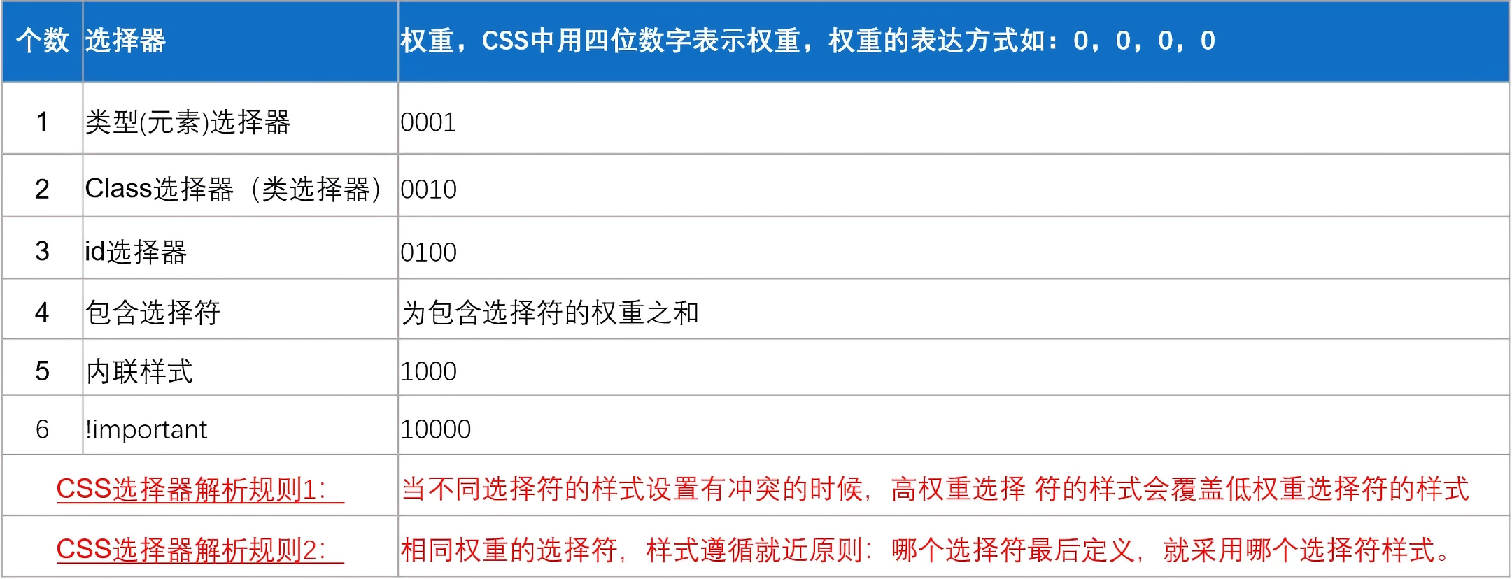
4.6 选择器【权重】
!important > 内联/行内样式 > 包含/后代/群组选择器 > id选择器 > class类选择器 > 元素选择器
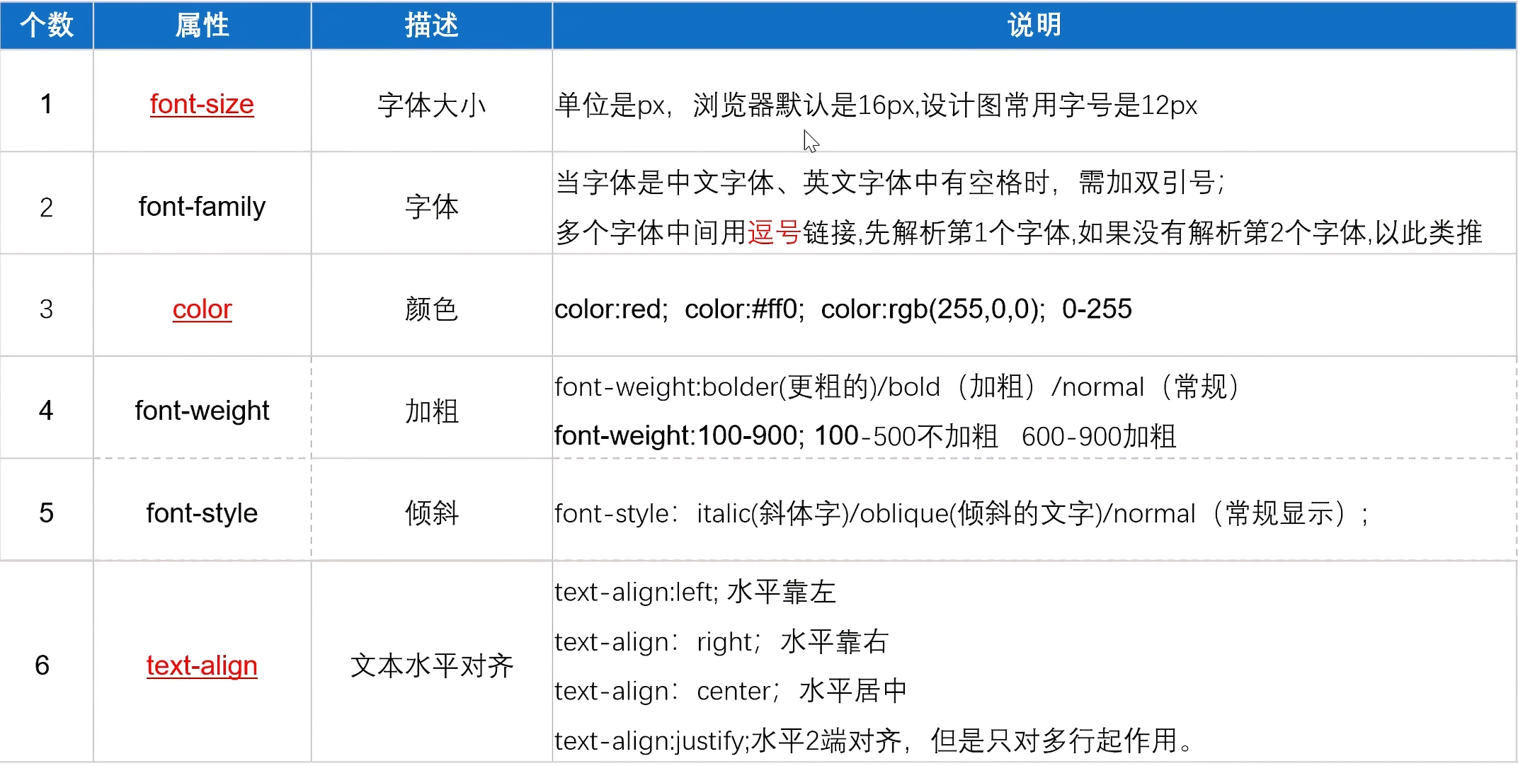
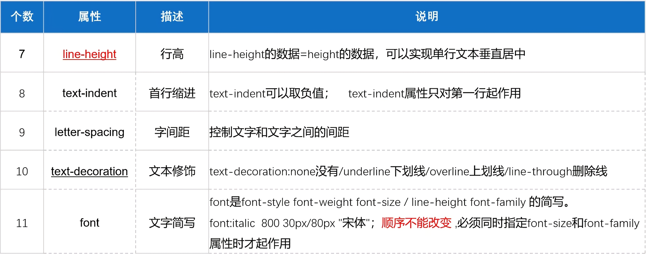
5. CSS属性 5.1 CSS文本属性
font-weight:
100-细体,ligter
400-正常,normal
700-加粗,bold
900-更粗,bolder
1 text-decoration : line-through underline;
1 text-transform : uppercase;
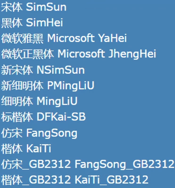
网页浏览器支持的常见字体:
文本水平位置和行高eg:
1 2 3 4 5 6 7 8 9 10 11 12 13 14 15 16 17 18 19 20 21 22 23 24 25 26 27 28 29 30 31 32 33 34 35 36 37 38 39 40 <!DOCTYPE html > <html lang ="en" > <head > <meta charset ="UTF-8" > <meta name ="viewport" content ="width=device-width, initial-scale=1.0" > <title > Document</title > <style > .box1 { text-align : center; width : 500px ; background-color : yellow; } .box2 { text-align : justify; width : 500px ; background-color : green; } .box3 { width : 500px ; height : 100px ; background-color : yellow; line-height : 100px ; text-align : center; } .box4 { width : 500px ; height : 100px ; background-color : orange; line-height : 15px ; text-align : center; } </style > </head > <body > <div class ="box1" > 大家好</div > <p class ="box2" > Lorem ipsum, dolor sit amet consectetur adipisicing elit. Perferendis voluptatem adipisci officia atque animi earum ullam illum deleniti delectus cupiditate esse corrupti harum alias illo, minus sed ratione et. Enim.</p > <div class ="box3" > 大家都很好,好好好啊!</div > <p class ="box4" > Lorem ipsum dolor sit amet consectetur adipisicing elit. Hic possimus consequatur sequi illum ab quasi voluptatum ea voluptas magni culpa, provident deleniti quaerat pariatur qui similique beatae ipsam delectus error!</p > </body > </html >
5.2 CSS列表属性
list-style 复合属性,没有顺序要求,都会生效。
常用:(方便自定义控制列表)
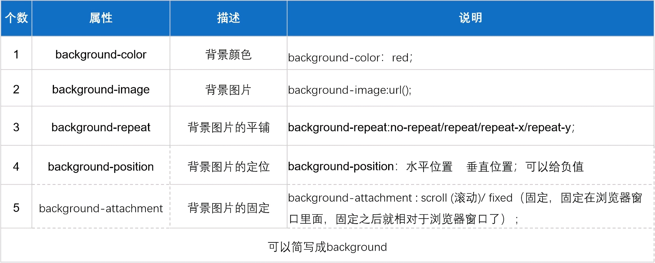
5.3 CSS背景属性
1 2 3 4 5 6 7 8 9 10 11 12 13 14 15 16 17 18 19 20 21 22 23 24 25 26 27 28 29 30 31 background-color : red; background-color : rgb (255 , 0 , 0 ); background-color : rgba (0 , 0 , 0 , 0.5 ); background-color : #ff0000 ; background-image : url (../html/img/1.png ); background-repeat : repeat; background-repeat : repeat-x; background-repeat : repeat-y; background-repeat : no-repeat; background-position : 20px 20px ; background-position : 10% 10% ; background-position : center center; background-size : 800px 800px ; background-size : 100% 100% ; background-size : cover;background-attachment : scroll; background-attachment : fixed; background : url (../html/img/1.png ) no-repeat center fixed yellow;
视差效果示例:
1 2 3 4 5 6 7 8 9 10 11 12 13 14 15 16 17 18 19 20 21 22 23 24 25 26 27 28 29 30 31 32 33 34 <!DOCTYPE html > <html lang ="en" > <head > <meta charset ="UTF-8" > <meta name ="viewport" content ="width=device-width, initial-scale=1.0" > <title > 视差效果</title > <style > *{ margin : 0 ; padding : 0 ; } div { height : 750px ; background-position : center; background-size : cover; background-attachment : fixed; } .box1 { background-image : url (img/bg1.png ); } .box2 { background-image : url (img/bg2.png ); } .box3 { background-image : url (img/bg3.png ); } </style > </head > <body > <div class ="box1" > </div > <div class ="box2" > </div > <div class ="box3" > </div > </body > </html >
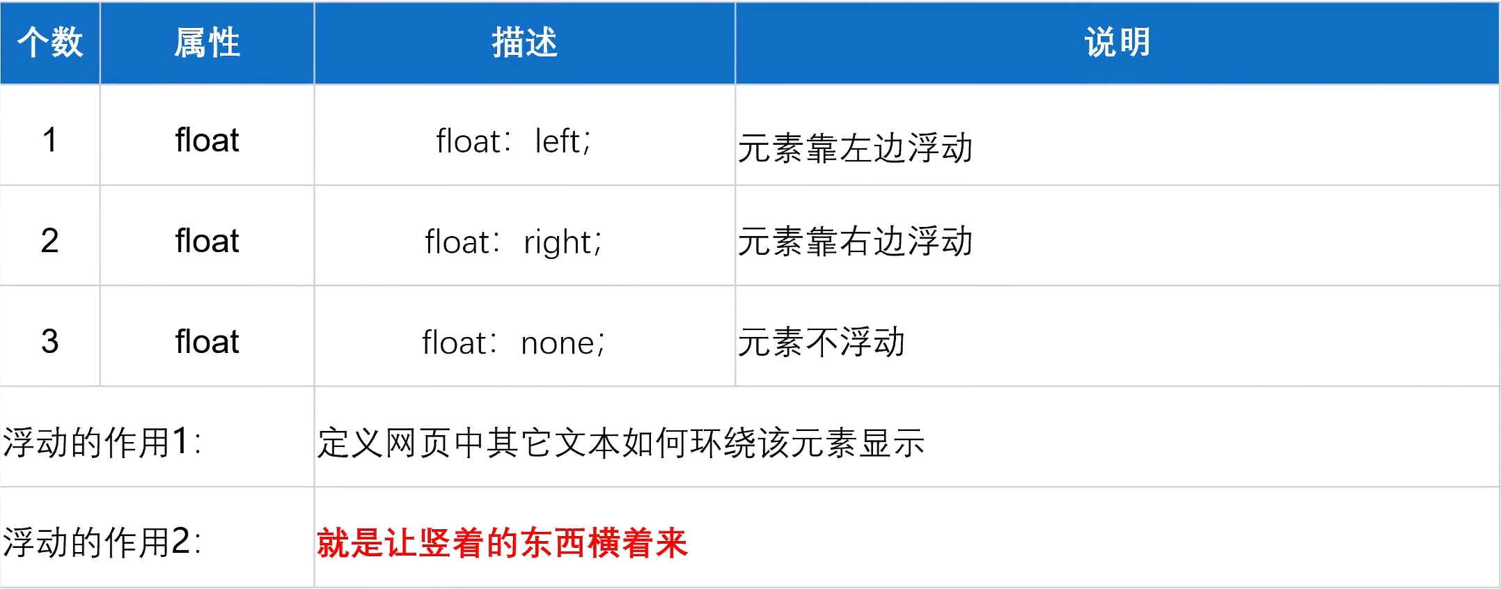
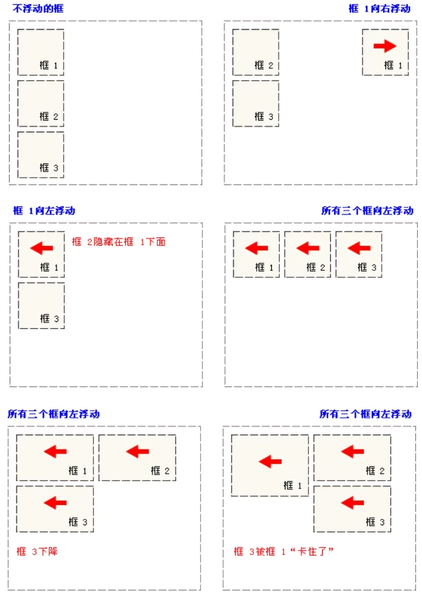
5.4 CSS浮动属性-float(★)
1 2 3 4 5 6 7 8 9 10 11 12 13 14 15 16 17 18 19 20 21 22 23 24 25 26 27 28 29 30 31 32 33 34 35 36 37 38 39 40 41 42 43 44 45 46 47 <!DOCTYPE html > <html lang ="en" > <head > <meta charset ="UTF-8" > <meta name ="viewport" content ="width=device-width, initial-scale=1.0" > <title > Document</title > <style > .box1 , .box2 { width : 200px ; height : 200px ; float : left; } .box1 { background-color : yellow; } .box2 { background-color : blue; } .box3 { width : 300px ; height : 300px ; background-color : red; } .container { overflow : hidden; } </style > </head > <body > <div class ="container" > <div class ="box1" > </div > <div class ="box2" > </div > </div > <div class ="box3" > </div > </body > </html >
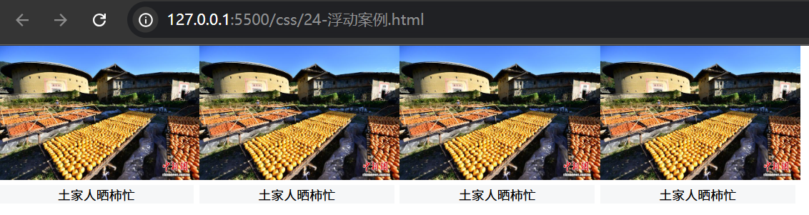
案例:
1 2 3 4 5 6 7 8 9 10 11 12 13 14 15 16 17 18 19 20 21 22 23 24 25 26 27 28 29 30 31 32 33 34 35 36 37 38 39 40 41 42 43 44 45 <!DOCTYPE html > <html lang ="en" > <head > <meta charset ="UTF-8" > <meta name ="viewport" content ="width=device-width, initial-scale=1.0" > <title > Document</title > <style > *{ margin : 0 ; padding : 0 ; } div { float : left; } div img { width : 187px ; height : 125px ; } div p { font-size : 12px ; text-align : center; background : #f6f7f8 ; width : 182px ; } </style > </head > <body > <div > <img src ="https://contentcms-bj.cdn.bcebos.com/cmspic/913444a2e714cbedd2071dd175e87f53.jpeg" alt ="" > <p > 土家人晒柿忙</p > </div > <div > <img src ="https://contentcms-bj.cdn.bcebos.com/cmspic/913444a2e714cbedd2071dd175e87f53.jpeg" alt ="" > <p > 土家人晒柿忙</p > </div > <div > <img src ="https://contentcms-bj.cdn.bcebos.com/cmspic/913444a2e714cbedd2071dd175e87f53.jpeg" alt ="" > <p > 土家人晒柿忙</p > </div > <div > <img src ="https://contentcms-bj.cdn.bcebos.com/cmspic/913444a2e714cbedd2071dd175e87f53.jpeg" alt ="" > <p > 土家人晒柿忙</p > </div > </body > </html >
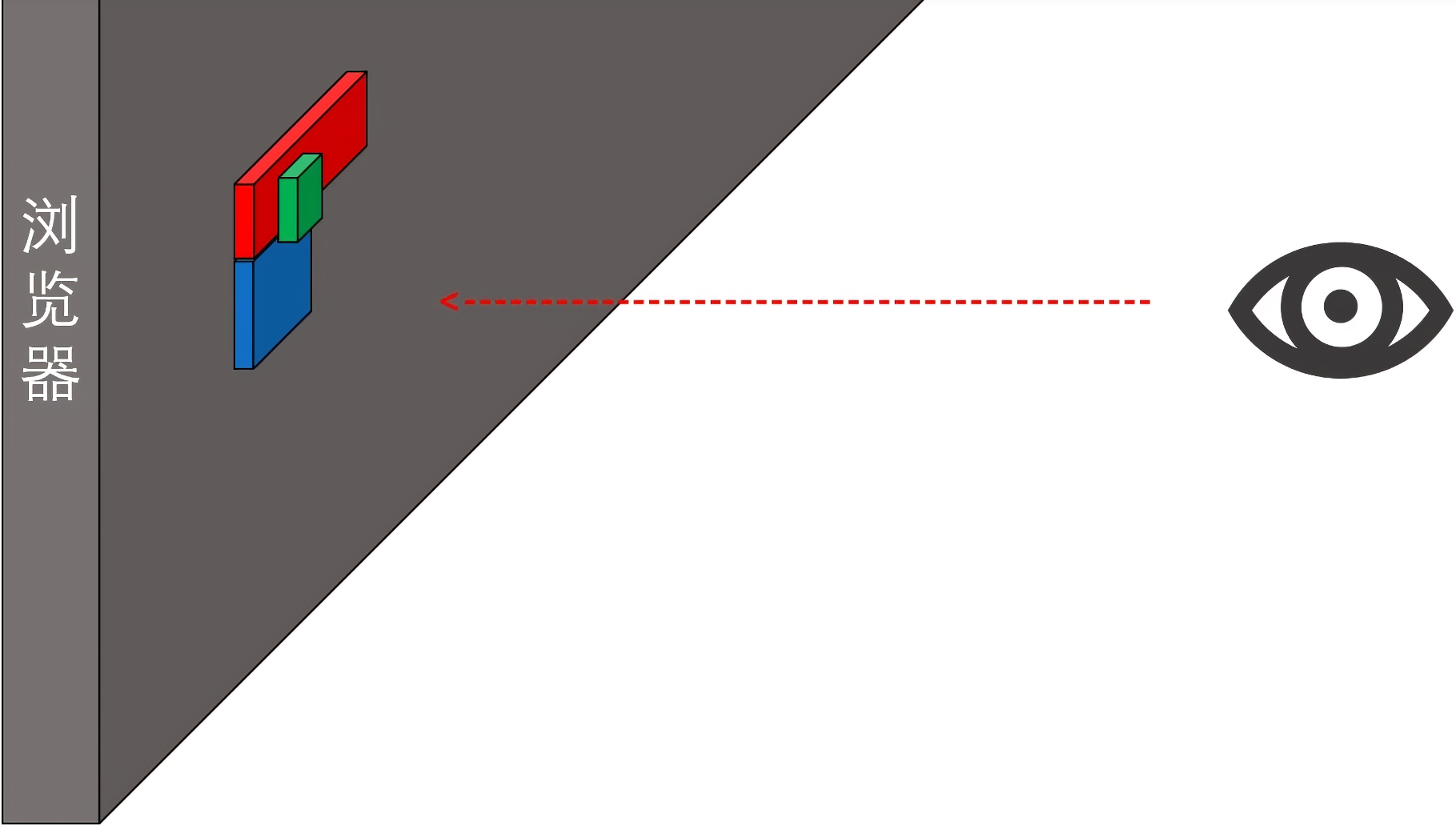
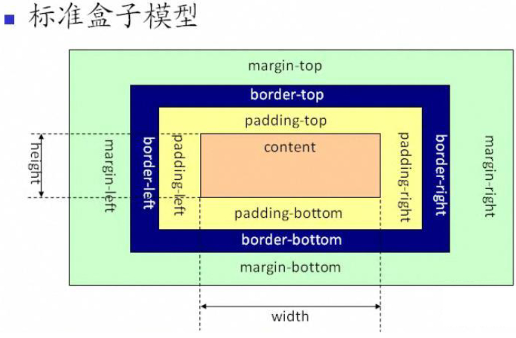
6. 盒子模型
6.1 padding 内边距 padding
背景色会蔓延到内边距
可以单独设置1到4个值均可,对应位置不同
可以单独设置某个方向,或将其清0,如上右下左 padding-top/padding-right/padding-bottom/padding-left
*{padding:0} 清除默认带的内边距样式设置为负值没有意义,即不支持
1 2 3 4 5 6 7 8 9 10 11 12 13 14 15 16 17 18 19 20 21 22 23 24 25 26 27 <!DOCTYPE html > <html lang ="en" > <head > <meta charset ="UTF-8" > <meta name ="viewport" content ="width=device-width, initial-scale=1.0" > <title > Document</title > <style > div { width : 300px ; height : 300px ; background-color : yellow; text-align : justify; padding : 10px 20px 30px 40px ; } </style > </head > <body > <div > Lorem ipsum dolor sit amet, consectetur adipisicing elit. Illum cum nesciunt beatae dolores sint quisquam nostrum voluptatibus explicabo! Eos illum rem soluta corrupti voluptates quibusdam voluptas incidunt fugit. Voluptates, ipsa.</div > </body > </html >
6.2 border 边框 border 边框
样式: solid-实线,double-双实线,dashed-虚线,dotted-点状线
1 2 3 4 5 6 7 8 9 10 11 12 13 14 15 16 17 18 19 20 21 22 23 24 25 26 27 28 29 30 31 32 33 34 35 36 37 38 39 40 41 42 43 44 45 46 47 <!DOCTYPE html > <html lang ="en" > <head > <meta charset ="UTF-8" > <meta name ="viewport" content ="width=device-width, initial-scale=1.0" > <title > Document</title > <style > .box1 { width : 100px ; height : 100px ; background : yellow; border : 10px solid red; } .box2 { width : 100px ; height : 100px ; background : blue; border-top : 5px solid red; border-right : 10px double orange; border-bottom : 15px dashed gray; border-left : 20px dotted green; } .box3 { width : 100px ; height : 100px ; background : green; border-width : 10px 20px 30px 40px ; border-color : yellow blue black red; border-style : solid double dashed dotted; } </style > </head > <body > <div class ="box1" > </div > <hr > <div class ="box2" > </div > <hr > <div class ="box3" > </div > </body > </html >
6.3 margin 外边距 margin 外边距
背景色不会蔓延到外边距
可以单独设置1到4个值均可,对应位置不同,与padding位置一致
可以单独设置某个方向,或将其清0,如上右下左 margin-top/margin-right/margin-bottom/margin-left
*{margin:0} 清除默认带的外边距样式设置为负值有意义,即支持
快速屏幕居中 margin: 0 auto;,即 横向居中。
特性:
1 2 3 4 5 6 7 8 9 10 11 12 13 14 15 16 17 18 19 20 21 22 23 24 25 26 27 28 29 30 31 32 33 34 35 36 37 38 39 <!DOCTYPE html > <html lang ="en" > <head > <meta charset ="UTF-8" > <meta name ="viewport" content ="width=device-width, initial-scale=1.0" > <title > Document</title > <style > div { width : 200px ; height : 200px ; } .box1 { background : red; border : 1px solid yellow; margin : 50px 100px ; } .box2 { background : blue; border : 1px solid yellow; margin : 0 auto; } .box3 { background : green; border : 1px solid yellow; margin-left : -100px ; } </style > </head > <body > <div class ="box1" > </div > <div class ="box2" > </div > <div class ="box3" > </div > </body > </html >
案例:图文混排
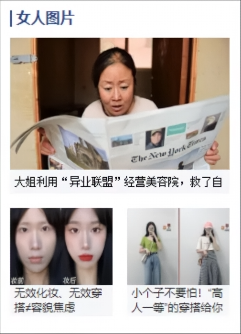
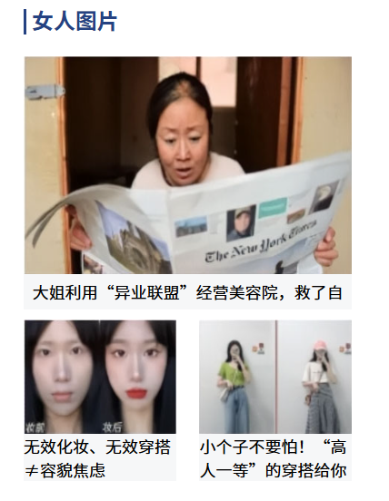
1 2 3 4 5 6 7 8 9 10 11 12 13 14 15 16 17 18 19 20 21 22 23 24 25 26 27 28 29 30 31 32 33 34 35 36 37 38 39 40 41 42 43 44 45 46 47 48 49 50 51 52 53 54 55 56 57 58 59 60 61 62 63 64 65 66 67 68 69 70 71 72 73 74 75 76 77 78 79 80 81 82 83 84 85 86 87 88 89 90 91 <!DOCTYPE html > <html lang ="en" > <head > <meta charset ="UTF-8" > <meta name ="viewport" content ="width=device-width, initial-scale=1.0" > <title > 盒子案例</title > <style > * { margin : 0 ; padding : 0 ; } img { display : block; } #box { width : 241px ; height : 335px ; margin : 0 auto; padding : 11px 11px 18px ; } .title { width : 235px ; height : 19px ; padding-left : 4px ; border-left : 2px solid #254282 ; color : #254282 ; line-height : 16px ; font-weight : bold; margin-bottom : 16px ; } .bigpic { width : 241px ; height : 170px ; margin-bottom : 23px ; } .bigpic p { width : 241px ; height : 26px ; background-color : #f6f7f8 ; font-size : 12px ; text-align : center; line-height : 26px ; } .smallpic { width : 241px ; height : 120px ; } .smallpic p { font-size : 12px ; width : 112px ; background-color : #f6f7f8 ; } .left { float : left; } .right { float : right; } </style > </head > <body > <div id ="box" > <div class ="title" > 女人图片</div > <div class ="bigpic" > <img src ="img/images/cover_03.jpg" style ="width: 241px; height: 160px;" > <p > 大姐利用“异业联盟”经营美容院,救了自</p > </div > <div class ="smallpic" > <div class ="left" > <img src ="img/images/cover_06.jpg" style ="width: 112px; height: 84px;" > <p > 无效化妆、无效穿搭≠容貌焦虑</p > </div > <div class ="right" > <img src ="img/images/cover_08.jpg" style ="width: 112px; height: 84px;" > <p > 小个子不要怕!“高人一等”的穿搭给你</p > </div > </div > </div > </body > </html >
运行效果:
6.4 overflow 溢出 overflow 溢出属性
visible ,默认值,溢出内容会显示在元素之外hidden ,溢出内容隐藏,文本会裁切scroll ,滚动,溢出内容以滚动方式显示auto ,如果有溢出会添加滚动条,没有溢出正常显示 常用inherit ,规定应该遵从父元素继承 overflow 属性的值
1 2 3 4 5 6 7 8 9 10 11 12 13 14 15 16 17 18 19 <head > <style > div { width : 200px ; height : 200px ; background-color : yellow; overflow : auto; } </style > </head > <body > <div > </div > </body >
overflow-x,X轴溢出,设置X轴展示滚动条时使用
overflow-y,Y轴溢出,设置Y轴展示滚动条时使用
1 2 overflow-x : scroll; overflow-y : hidden;
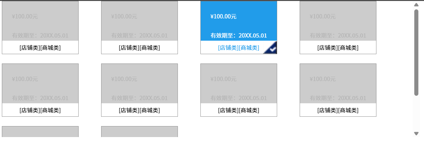
案例:
1 2 3 4 5 6 7 8 9 10 11 12 13 14 15 16 17 18 19 20 21 22 23 24 25 26 27 28 29 30 31 32 33 34 35 36 37 38 39 40 41 42 43 44 45 46 47 48 49 50 51 52 53 54 55 56 57 58 59 60 61 62 63 64 65 66 67 68 69 70 71 72 73 74 75 76 77 78 79 80 81 82 83 84 85 86 87 88 89 90 <!DOCTYPE html > <html lang ="en" > <head > <meta charset ="UTF-8" > <meta name ="viewport" content ="width=device-width, initial-scale=1.0" > <title > Document</title > <style > * { margin : 0 ; padding : 0 ; } #box { width : 890px ; height : 290px ; margin : 0 auto; overflow : auto; } .info { width : 162px ; height : 112px ; border : 1px solid #808080 ; float : left; margin-right : 48px ; margin-bottom : 20px ; } .info div { width : 162px ; height : 84px ; background-color : #cccccc ; font-size : 12px ; } .info .price { height : 63px ; line-height : 63px ; padding-left : 21px ; color : #b5b5b5 ; } .info .date { padding-left : 21px ; color : #b5b5b5 ; } .info .category { background : white; height : 28px ; line-height : 28px ; color : #000000 ; text-align : center; font-size : 12px ; } .info :hover div { background-color : #219cea ; } .info :hover .price , .info :hover .date { color : white; } .info :hover p { color :#219cea ; } .info :hover .category { background-image : url (img/images/icon.png ); background-repeat : no-repeat; background-position : right bottom; } </style > </head > <body > <div id ="box" > <div class ="info" > <div > <p class ="price" > ¥100.00元</p > <p class ="date" > 有效期至:20XX.05.01</p > </div > <p class ="category" > [店铺类][商城类]</p > </div > </div > </body > </html >
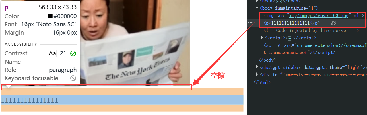
6.5 white-space 空余空间 white-space 空余空间属性,该属性用来设置如何处理元素内的空白。
normal ,默认值,空白会被浏览器忽略nowrap ,文本不换行,文本会在同一行上继续,直到遇到<br/>标签为止 - 最常用pre ,预格式化文本,会显示空格、tab、回车,不换行,常用于代码块等特殊展示pre-wrap ,显示空格、tab、回车,会换行pre-line ,显示回车,不显示空格,会换行inherit ,继承父元素空余空间属性
text-overflow 文本溢出属性
clip ,默认值,不显示省略号(…)ellipsis ,显示省略号标记(…)
因此 ↓
案例:溢出显示省略号(★) 单行文本溢出显示省略号样式 (缺一不可):
容器宽度,width 必须设置;
强制文本在一行内显示,white-space: nowrap;
溢出内容为隐藏,overflow: hidden;
溢出文本显示为省略号,text-overflow: ellipsis;
1 2 3 4 5 6 7 8 9 10 11 12 13 14 15 16 17 18 19 20 21 22 23 <!DOCTYPE html > <html lang ="en" > <head > <meta charset ="UTF-8" > <meta name ="viewport" content ="width=device-width, initial-scale=1.0" > <title > Document</title > <style > div { width : 200px ; height : 200px ; background-color : yellow; white-space : nowrap; overflow : hidden; text-overflow : ellipsis; } </style > </head > <body > <div > </div > </body > </html >
pre标签(代码中带了空格、tab、回车,会被正常渲染显示)
1 2 <pre > </pre >
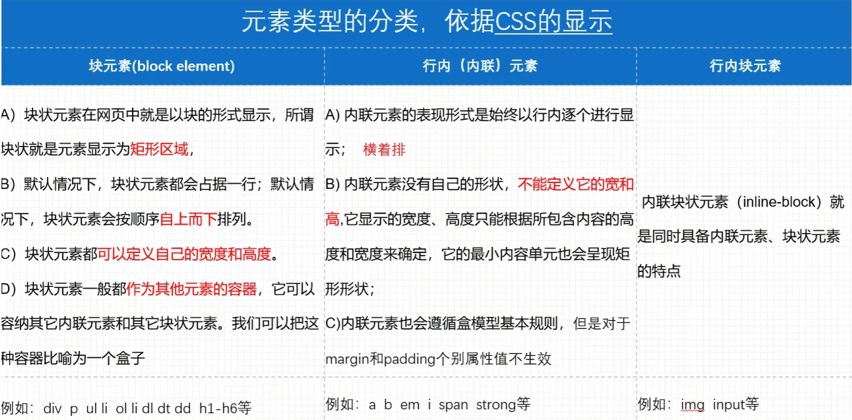
7. 元素显示类型 7.1 元素显示类型
注意:
块元素:拥有 display:block;或 display:list-item;属性。
使用 p 标签放文本可以,坚决不要嵌套任何东西,即不能放块元素 ,这是不成文的规定。
行内(内联)元素:拥有 display:inline; 属性,不能设置宽高。
行内块元素:拥有 display:inline-block; 属性,既可以设置宽高,又能在一行内展示。
7.2 盒子模型影响
反过来如 div 这样的块元素也可以转换为行内元素,即 display:inline; 比如在 a 链接的导航下方继续写div时,会出现高度问题,此时需要将a链接设置为行内块 inline-block 即可解决,让其占据这块位置。
1 2 3 a {display : inline-block;
7.3 display:none 控制展示与否,多用于鼠标滑过或者点击后展示内容。
示例:
1 2 3 4 5 6 7 8 9 10 11 12 13 14 15 16 17 18 19 20 <head > <style > .hide { display : none; } .box :hover .hide { display : block; } </style > </head > <body > <div class ="box" > <ul class ="hide" > <li > 1111</li > <li > 2222</li > <li > 3333</li > </ul > </div > </body >
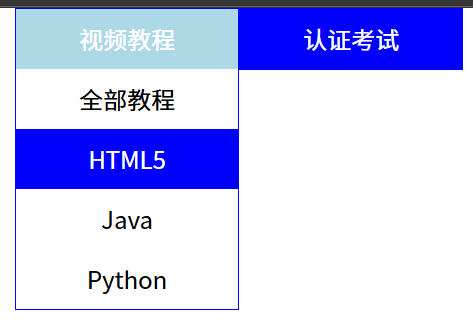
案例:二级菜单 二级菜单效果
注意:
> 符号在选择器上是子代选择器,只会选择下一级子代,即亲儿子空格符号在选择器上是后代选择器,会选择所有的子代生效,即后代都生效
1 2 3 4 5 6 7 8 9 10 11 12 13 14 15 16 17 18 19 20 21 22 23 24 25 26 27 28 29 30 31 32 33 34 35 36 37 38 39 40 41 42 43 44 45 46 47 48 49 50 51 52 53 54 55 56 57 58 59 60 61 62 63 64 <!DOCTYPE html > <html lang ="en" > <head > <meta charset ="UTF-8" > <meta name ="viewport" content ="width=device-width, initial-scale=1.0" > <title > Document</title > <style > *{ margin : 0 ; padding : 0 ; } .box { width : 300px ; margin : 0 auto; } ul { list-style : none; } .box .item { width : 148px ; float : left; text-align : center; border : 1px solid blue; background-color : blue; color : white; line-height : 40px ; } .box >li :hover { background-color : lightblue; } .box >li >ul { display : none; background-color : white; color : black; } .box >li :hover ul { display : block; } .box >li li :hover { color : white; background-color : blue; } </style > </head > <body > <ul class ="box" > <li class ="item" > 视频教程<ul > <li > 全部教程</li > <li > HTML5</li > <li > Java</li > <li > Python</li > </ul > </li > <li class ="item" > 认证考试<ul > <li > PMP</li > <li > 红帽</li > </ul > </li > </ul > </body > </html >
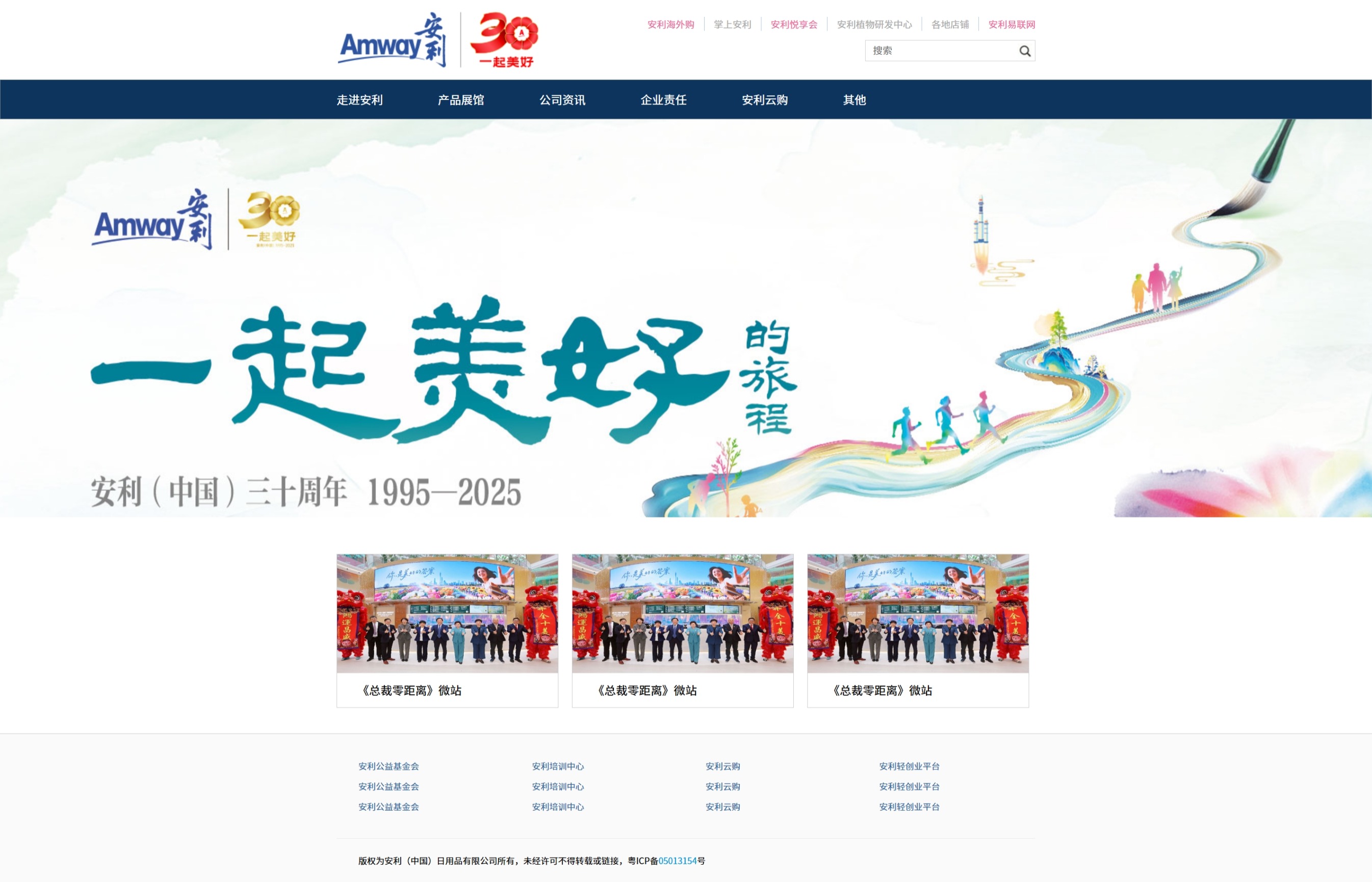
综合案例:仿安利 安利首页:https://www.amway.com.cn/
html:
1 2 3 4 5 6 7 8 9 10 11 12 13 14 15 16 17 18 19 20 21 22 23 24 25 26 27 28 29 30 31 32 33 34 35 36 37 38 39 40 41 42 43 44 45 46 47 48 49 50 51 52 53 54 55 56 57 58 59 60 61 62 63 64 65 66 67 68 69 70 71 72 73 74 75 76 77 78 79 80 81 <!DOCTYPE html > <html lang ="en" > <head > <meta charset ="UTF-8" > <meta name ="viewport" content ="width=device-width, initial-scale=1.0" > <title > 安利首页</title > <link rel ="stylesheet" href ="css/index.css" > </head > <body > <div class ="header con" > <div class ="logo" > </div > <div class ="headrrignt" > <ul > <li > <a class ="active" > 安利海外购</a > </li > <li > <a > 掌上安利</a > </li > <li > <a class ="active" > 安利悦享会</a > </li > <li > <a > 安利植物研发中心</a > </li > <li > <a > 各地店铺</a > </li > <li > <a class ="last active" > 安利易联网</a > </li > </ul > <div class ="search" > <input type ="text" placeholder ="搜索" class ="left" > <input type ="submit" value ="" class ="right" > </div > </div > </div > <div class ="nav" > <ul class ="con" > <li > 走进安利</li > <li > 产品展馆</li > <li > 公司资讯</li > <li > 企业责任</li > <li > 安利云购</li > <li > 其他</li > </ul > </div > <div class ="banner" > </div > <div class ="list con" > <div class ="item" > <img src ="img/item1.jpg" alt ="" > <p > 《总裁零距离》微站</p > </div > <div class ="item" > <img src ="img/item1.jpg" alt ="" > <p > 《总裁零距离》微站</p > </div > <div class ="item itemlast" > <img src ="img/item1.jpg" alt ="" > <p > 《总裁零距离》微站</p > </div > </div > <div class ="footer" > <div class ="con" > <ul > <li > 安利公益基金会</li > <li > 安利培训中心</li > <li > 安利云购</li > <li > 安利轻创业平台</li > <li > 安利公益基金会</li > <li > 安利培训中心</li > <li > 安利云购</li > <li > 安利轻创业平台</li > <li > 安利公益基金会</li > <li > 安利培训中心</li > <li > 安利云购</li > <li > 安利轻创业平台</li > </ul > <p > 版权为安利(中国)日用品有限公司所有,未经许可不得转载或链接,粤ICP备<span > 05013154</span > 号</p > </div > </div > </body > </html >
css:
1 2 3 4 5 6 7 8 9 10 11 12 13 14 15 16 17 18 19 20 21 22 23 24 25 26 27 28 29 30 31 32 33 34 35 36 37 38 39 40 41 42 43 44 45 46 47 48 49 50 51 52 53 54 55 56 57 58 59 60 61 62 63 64 65 66 67 68 69 70 71 72 73 74 75 76 77 78 79 80 81 82 83 84 85 86 87 88 89 90 91 92 93 94 95 96 97 98 99 100 101 102 103 104 105 106 107 108 109 110 111 112 113 114 115 116 117 118 119 120 121 122 123 124 125 126 127 128 129 130 131 132 133 134 135 136 137 138 139 140 141 142 143 144 145 146 147 148 149 150 151 152 153 154 155 156 157 158 159 160 161 162 163 164 165 166 *{margin : 0 ;padding : 0 ;.con {width : 966px ;margin : 0 auto;ul {list-style : none;.header {height : 110px ;.logo {width : 280px ;height : 110px ;background : url (../img/logo.png ) no-repeat center center;float : left;.headrrignt {float : right;.headrrignt ul {height : 44px ;line-height : 44px ;margin-top : 10px ;.headrrignt li {float : left;.headrrignt li a {border-right : 1px solid #b2c7ea ;padding : 0 13px ;font-size : 13px ;color : #ababab ;.headrrignt .last {padding-right : 0 ;border : 0 ;.headrrignt li .active {color : #eb6ca1 ;.search {float : right;width : 234px ;height : 28px ;border : 1px solid #d1d1d1 ;.search input {border : 0 ; outline : none; .search .left {width : 200px ;height : 28px ;float : left;padding-left : 10px ;.search .right {float : right;height : 28px ;width : 24px ;background : url (../img/search.jpg ) no-repeat left center;.nav {height : 53px ;line-height : 53px ;border : 1px solid #657588 ;background : #0c345c ;color : white;.nav li {float : left;font-size : 16px ;margin-right : 76px ;.banner {height : 550px ;background : url (../img/banner1.jpg ) no-repeat center top;.list {height : 213px ;margin-top : 51px ;margin-bottom : 35px ;.item {height : 211px ;width : 305px ;border : 1px solid #cccccc ;float : left;margin-right : 19px ;.item img {width : 305px ;height : 164px ;display : block; .item p {height : 47px ;line-height : 47px ;padding-left : 28px ;font-size : 16px ;.itemlast {margin-right : 0 ;.footer {height : 206px ;border-top : 1px solid #cccccc ;background-color : #fafafa ;.footer ul {height : 84px ;padding-top : 30px ;padding-bottom : 30px ;border-bottom : 1px solid #ecebeb ;line-height : 28px ;.footer ul li {width : 210px ;padding-left : 30px ;font-size : 12px ;color : #336699 ;float : left;.footer p {height : 61px ;line-height : 61px ;padding-left : 30px ;font-size : 12px ;.footer p span {color : #0096da ;
最终效果: