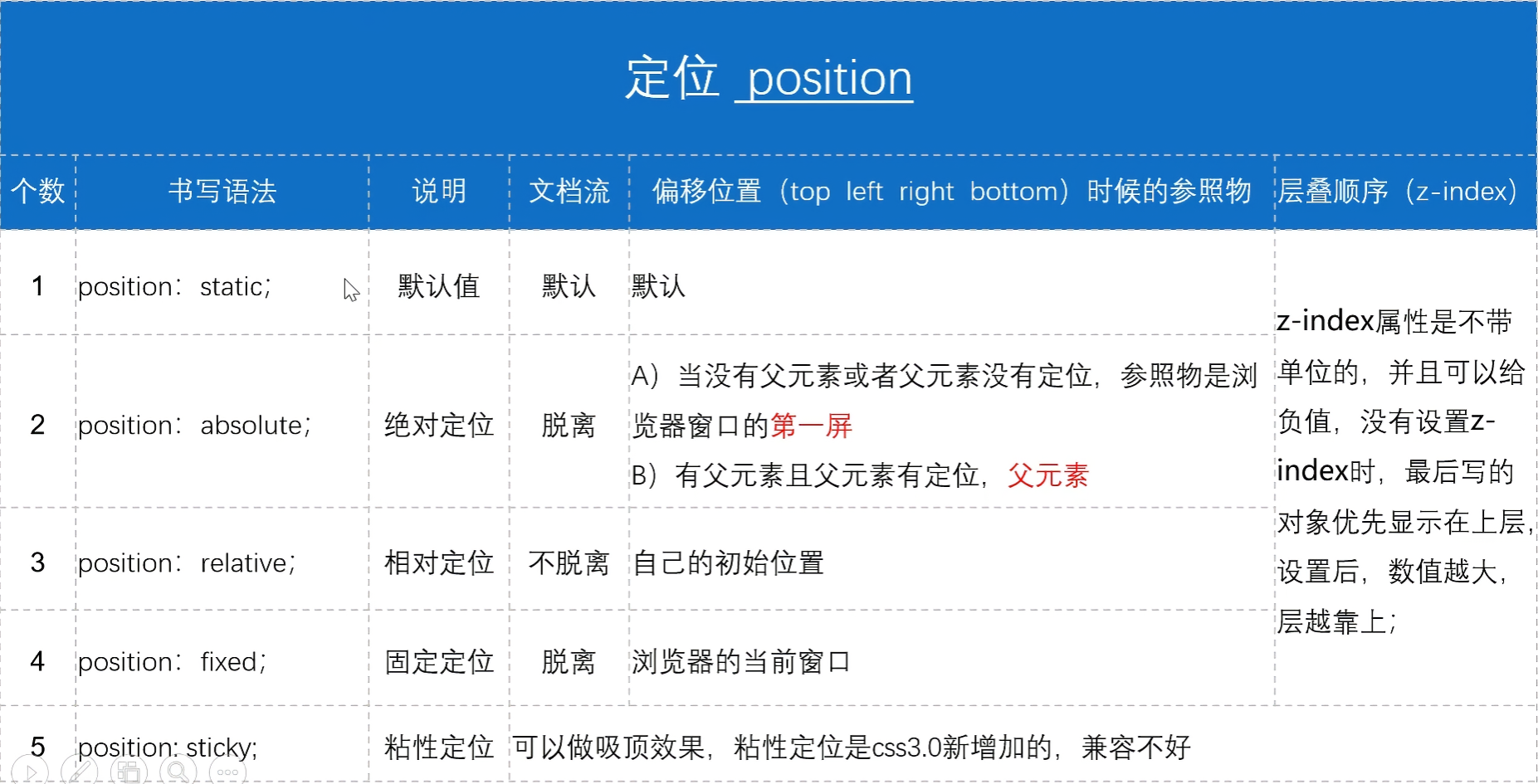
1. position 定位 position 定位,需要结合偏移位置(top/left/right/bottom)使用。有 6 个取值。
6 postion: inherit; 从其父元素继承此属性。
1
2
3
4
5
position 偏移位置属性:top :100px ;left :100px ;right :100px ;bottom :100px ;
1.1 绝对与相对定位 口诀:子绝父相,子盒子绝对定位,父盒子使用相对定位,即可实现子盒相对于父盒的位置定位。
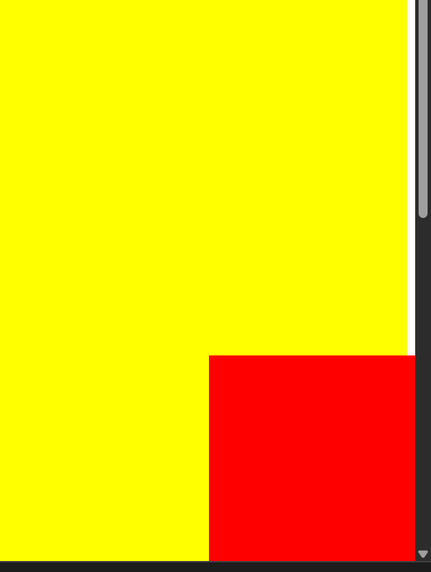
1.2 固定定位
fixed 固定定位演示(右下角,不受窗口滚动影响):
1
2
3
4
5
6
7
8
9
10
11
12
13
14
15
16
17
18
19
20
21
22
23
24
25
26
27
28
<!DOCTYPE html > <html lang ="en" > <head > <meta charset ="UTF-8" > <meta name ="viewport" content ="width=device-width, initial-scale=1.0" > <title > Document</title > <style > .box1 { width : 100% ; height : 2000px ; background-color : yellow; } .box2 { width : 200px ; height : 200px ; background-color : red; position : fixed; right : 0 ; bottom : 0 ; } </style > </head > <body > <div class ="box1" > </div > <div class ="box2" > </div > </body > </html >
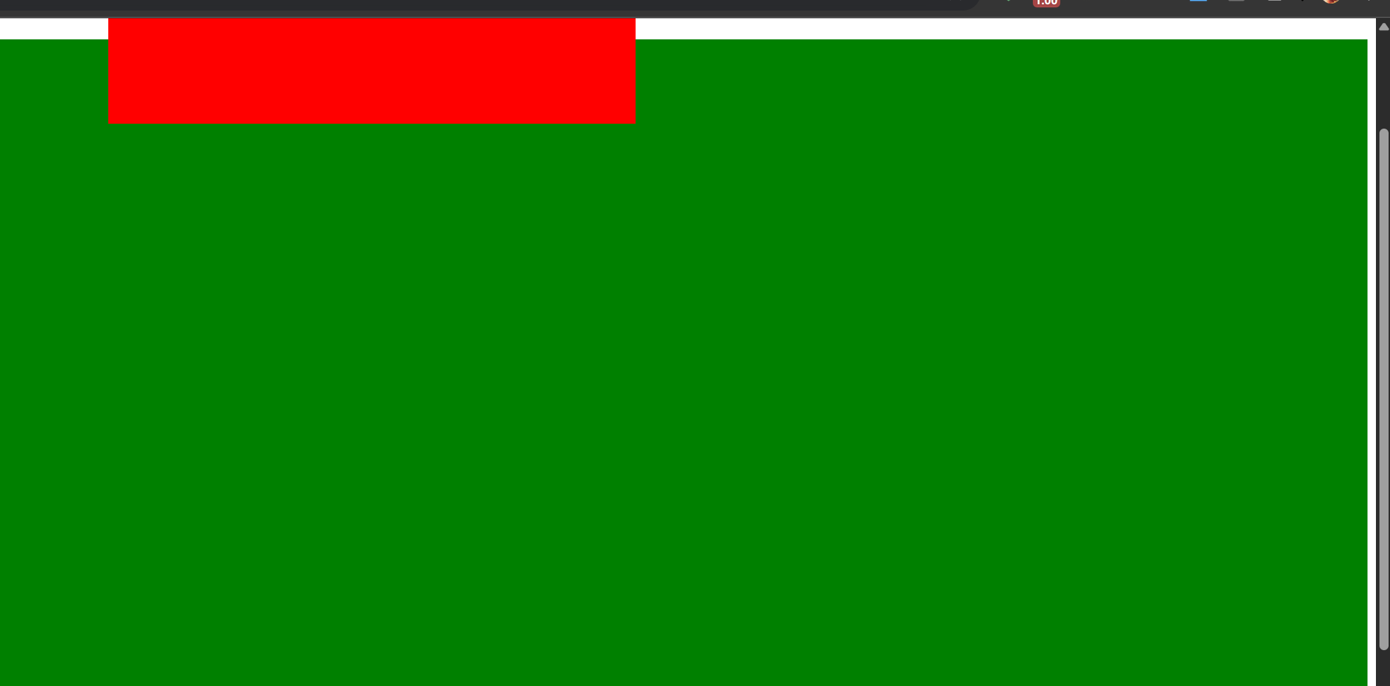
1.3 粘性定位
1
2
3
4
5
6
7
8
9
10
11
12
13
14
15
16
17
18
19
20
21
22
23
24
25
26
27
28
29
30
31
32
<!DOCTYPE html > <html lang ="en" > <head > <meta charset ="UTF-8" > <meta name ="viewport" content ="width=device-width, initial-scale=1.0" > <title > Document</title > <style > .header { background : yellow; width : 100% ; height : 100px ; } .nav { background : red; width : 500px ; height : 100px ; margin : 0 auto; position : sticky; top : 0 ; } .body { height : 2000px ; background : green; } </style > </head > <body > <div class ="header" > </div > <div class ="nav" > </div > <div class ="body" > </div > </body > </html >
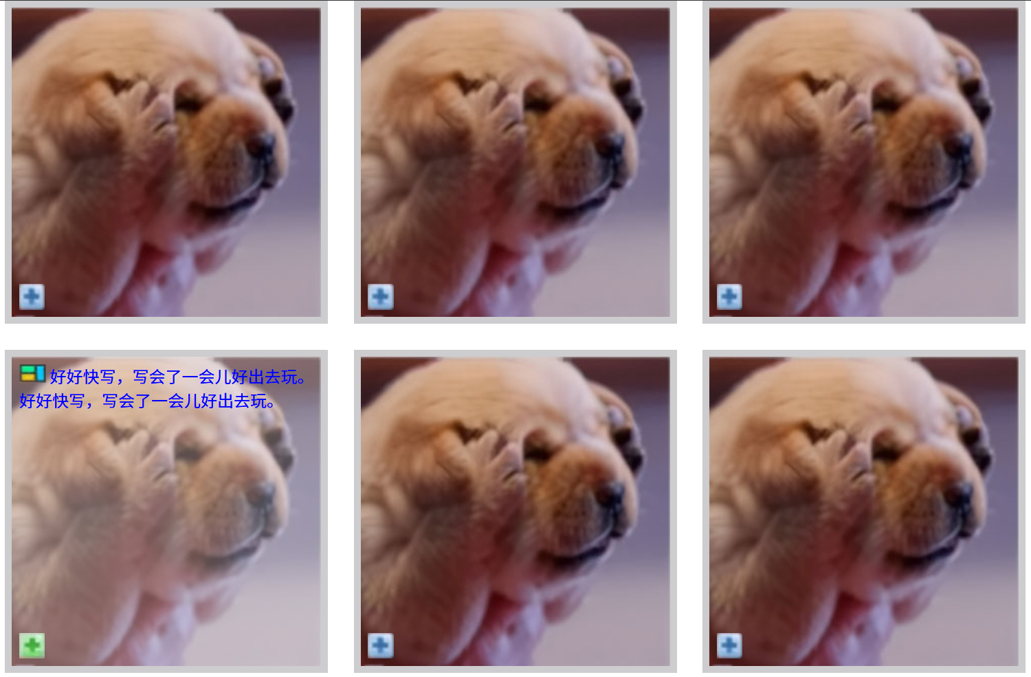
案例:6图展示
1
2
3
4
5
6
7
8
9
10
11
12
13
14
15
16
17
18
19
20
21
22
23
24
25
26
27
28
29
30
31
32
33
34
35
36
37
38
39
40
41
42
43
44
45
46
47
48
49
50
51
52
53
54
55
56
57
58
59
60
61
62
63
64
65
66
67
68
69
70
71
72
73
74
75
76
77
78
79
80
81
82
83
84
85
86
87
88
89
90
91
92
93
94
95
96
97
98
99
100
101
102
103
104
105
106
107
108
109
110
111
112
113
114
115
116
117
118
119
120
<!DOCTYPE html > <html lang ="en" > <head > <meta charset ="UTF-8" > <meta name ="viewport" content ="width=device-width, initial-scale=1.0" > <title > Document</title > <style > *{ margin : 0 ; padding : 0 ; } .container { width : 1033px ; height : 681px ; margin : 0 auto; } .box { width : 300px ; height : 300px ; border : 7px solid #cdccce ; position : relative; float : left; margin-right : 25px ; margin-bottom : 25px ; } .box .pic { width : 100% ; height : 100% ; } .box .icon , .box .icongreen { width : 25px ; height : 25px ; position : absolute; left : 7px ; bottom : 7px ; } .box .icongreen { display : none; } .box :hover .icongreen , .box :hover .box1 { display : block; } .box :hover .pic { opacity : 0.7 ; } .box .box1 { position : absolute; left : 7px ; top : 7px ; display : none; } .box .box1 span { color : blue; } .picright { margin-right : 0 ; } </style > </head > <body > <div class ="container" > <div class ="box" > <img src ="img/images/dog_03.jpg" alt ="" class ="pic" > <img src ="img/images/icon_03.jpg" alt ="" class ="icon" > <img src ="img/images/icongreen_03.jpg" alt ="" class ="icon icongreen" > <div class ="box1" > <img src ="img/images/icon2_03.jpg" alt ="" class ="icon2" > <span > 好好快写,写会了一会儿好出去玩。好好快写,写会了一会儿好出去玩。</span > </div > </div > <div class ="box" > <img src ="img/images/dog_03.jpg" alt ="" class ="pic" > <img src ="img/images/icon_03.jpg" alt ="" class ="icon" > <img src ="img/images/icongreen_03.jpg" alt ="" class ="icon icongreen" > <div class ="box1" > <img src ="img/images/icon2_03.jpg" alt ="" class ="icon2" > <span > 好好快写,写会了一会儿好出去玩。好好快写,写会了一会儿好出去玩。</span > </div > </div > <div class ="box picright" > <img src ="img/images/dog_03.jpg" alt ="" class ="pic" > <img src ="img/images/icon_03.jpg" alt ="" class ="icon" > <img src ="img/images/icongreen_03.jpg" alt ="" class ="icon icongreen" > <div class ="box1" > <img src ="img/images/icon2_03.jpg" alt ="" class ="icon2" > <span > 好好快写,写会了一会儿好出去玩。好好快写,写会了一会儿好出去玩。</span > </div > </div > <div class ="box" > <img src ="img/images/dog_03.jpg" alt ="" class ="pic" > <img src ="img/images/icon_03.jpg" alt ="" class ="icon" > <img src ="img/images/icongreen_03.jpg" alt ="" class ="icon icongreen" > <div class ="box1" > <img src ="img/images/icon2_03.jpg" alt ="" class ="icon2" > <span > 好好快写,写会了一会儿好出去玩。好好快写,写会了一会儿好出去玩。</span > </div > </div > <div class ="box" > <img src ="img/images/dog_03.jpg" alt ="" class ="pic" > <img src ="img/images/icon_03.jpg" alt ="" class ="icon" > <img src ="img/images/icongreen_03.jpg" alt ="" class ="icon icongreen" > <div class ="box1" > <img src ="img/images/icon2_03.jpg" alt ="" class ="icon2" > <span > 好好快写,写会了一会儿好出去玩。好好快写,写会了一会儿好出去玩。</span > </div > </div > <div class ="box picright" > <img src ="img/images/dog_03.jpg" alt ="" class ="pic" > <img src ="img/images/icon_03.jpg" alt ="" class ="icon" > <img src ="img/images/icongreen_03.jpg" alt ="" class ="icon icongreen" > <div class ="box1" > <img src ="img/images/icon2_03.jpg" alt ="" class ="icon2" > <span > 好好快写,写会了一会儿好出去玩。好好快写,写会了一会儿好出去玩。</span > </div > </div > </div > </body > </html >
案例:三角形案例
1
2
3
4
5
6
7
8
9
10
11
12
13
14
15
16
17
18
19
20
21
22
23
24
25
26
27
28
<!DOCTYPE html > <html lang ="en" > <head > <meta charset ="UTF-8" > <meta name ="viewport" content ="width=device-width, initial-scale=1.0" > <title > Document</title > <style > .box1 { width : 0 ; height : 0 ; border : 20px solid transparent; border-top : 20px solid red; } .box2 { width : 0 ; height : 0 ; border : 20px solid transparent; border-bottom : 20px solid red; } </style > </head > <body > <div class ="box1" > </div > <div class ="box2" > </div > </body > </html >
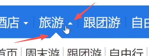
导航中三角形展示案例:
1
2
3
4
5
6
7
8
9
10
11
12
13
14
15
16
17
18
19
20
21
22
23
24
25
26
27
28
29
30
31
32
33
34
35
36
37
38
39
40
41
42
43
44
45
46
47
<!DOCTYPE html > <html lang ="en" > <head > <meta charset ="UTF-8" > <meta name ="viewport" content ="width=device-width, initial-scale=1.0" > <title > Document</title > <style > .box { width : 100px ; height : 50px ; line-height : 50px ; text-align : center; background-color : blue; color : white; } span { width : 0 ; height : 0 ; display : inline-block; border : 5px solid transparent; border-top : 5px solid white; position : relative; top : 2.5px ; } .box :hover span { border : 5px solid transparent; border-bottom : 5px solid white; position : relative; top : -2.5px ; } </style > </head > <body > <div class ="box" > <span > </span > </div > </body > </html >
效果:
鼠标移动上去:
1.4 定位的层级 z-index
取值为数字,正负均可,用在两个元素都有定位时的层级控制,值越大层级越靠上显示;反之靠下显示
1 2 3 4 5 6 7 8 9 10 11 12 13 14 15 16 17 18 19 20 21 22 23 24 <style > div { height : 200px ; width : 200px ; } .box1 { background-color : yellow; position : relative; top : 100px ; left : 100px ; z-index : 100 ; } .box2 { background-color : red; position : relative; z-index : 200 ; } </style > <body > <div class ="box1" > </div > <div class ="box2" > </div > </body >
a)绝对定位的影响
子盒子绝对定位时,子盒子层级 z-index 设置为负值,即可被父盒子盖住 - 不常用
兄弟盒子都是绝对定位时,也论 z-index 的大小,谁大谁层级高就在上面
行内元素如span,即行内元素设置绝对定位后就可以转为块级元素
1 2 3 4 5 6 7 8 9 10 11 12 13 14 15 16 17 18 19 20 <style>.box1 {height : 200px ;width : 200px ;background-color : yellow;position : relative;.child {height : 100px ;width : 100px ;background-color : red;position : absolute;top : 10px ;left : 10px ;z-index : -1 ;
1 2 3 4 5 6 7 8 9 10 11 12 13 14 15 16 17 18 19 20 21 22 23 <style>.box1 {height : 200px ;width : 200px ;background-color : yellow;position : absolute; top : 100px ;left : 100px ;z-index : 1 ;.box2 {height : 200px ;width : 200px ;background-color : red;position : absolute; top : 0px ;left : 0px ;z-index : -1 ;
1 2 3 4 5 6 7 8 9 <style>span {width : 200px ;height : 200px ;background-color : yellow;position : absolute;
b)行内–转–块级 方法有三:(都可以让宽高能够生效)
1
2
3
1 . display : block; 2 . position : absolute; 3 . float : left;
1.5 水平垂直居中 水平居中:
垂直居中:绝对定位 + 浏览器窗口距离上和左各50% + 外边距的上和左各回来一半
1
2
3
4
5
position : absolute;top : 50% ;left : 50% ;margin-top : 负一半px;margin-left : 负一半px;
示例水平+垂直居中:
1 2 3 4 5 6 7 8 9 10 11 12 13 14 15 16 17 18 <style>margin : 0 ;padding : 0 ;div {width : 200px ;height : 200px ;background : yellow;margin : 0 auto; position : absolute;top : 50% ;left : 50% ;margin-top : -100px ;margin-left : -100px ;
父子中的子盒子的水平和垂直居中:子盒子百分比不生效,只能设置为大小一半的像素值
1 2 3 4 5 6 7 8 9 10 11 12 13 14 15 16 17 18 19 20 21 22 23 24 25 26 27 <style>margin : 0 ;padding : 0 ;.box {width : 500px ;height : 500px ;background : yellow;margin : 0 auto; position : relative; .child {width : 200px ;height : 200px ;background : red;position : absolute; top : 50% ;left : 50% ;margin-left : -100px ; margin-top : -100px ;div class="box">div class="child"></div >div >
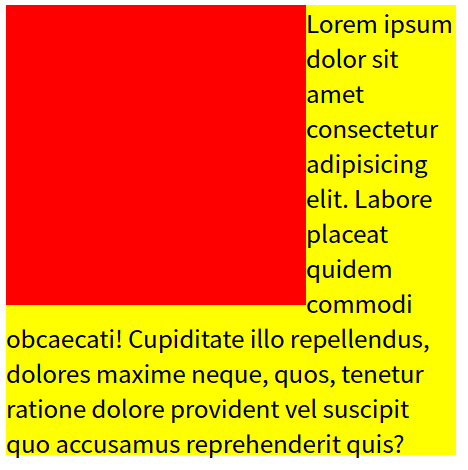
1.6 文字环绕
float:方向; - 半脱离,有文字环绕效果position: absolute; - 全脱离,不会出现文字环绕效果
1
2
3
4
5
6
7
8
9
10
11
12
13
14
15
16
17
18
19
20
21
22
23
24
25
26
27
28
29
30
31
32
33
34
35
36
<!DOCTYPE html > <html lang ="en" > <head > <meta charset ="UTF-8" > <meta name ="viewport" content ="width=device-width, initial-scale=1.0" > <title > Document</title > <style > .box1 { height : 200px ; width : 200px ; background-color : red; float : left; } .box2 { height : 300px ; width : 300px ; background-color : yellow; } </style > </head > <body > <div class ="box1" > </div > <div class ="box2" > </div > </body > </html >
效果:
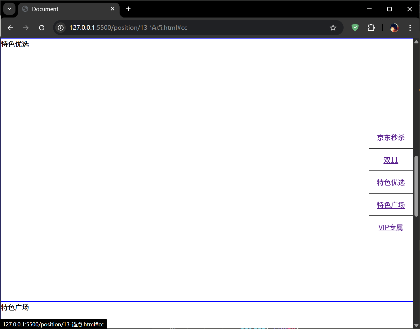
2. 锚点 作用:页面不同区域的跳转,使用的是 a 标签,即超链接标签。
用法:
1 2 3 <a href ="#锚点名字" > </a > <div id ="锚点名字" > </div >
示例:
1
2
3
4
5
6
7
8
9
10
11
12
13
14
15
16
17
18
19
20
21
22
23
24
25
26
27
28
29
30
31
32
33
34
35
36
37
38
39
40
41
42
43
44
45
46
47
48
<!DOCTYPE html > <html lang ="en" > <head > <meta charset ="UTF-8" > <meta name ="viewport" content ="width=device-width, initial-scale=1.0" > <title > Document</title > <style > *{ margin : 0 ; padding : 0 ; } ul { list-style : none; position : fixed; right : 0px ; top : 200px ; } li { width : 100px ; height : 50px ; line-height : 50px ; text-align : center; border : 1px solid black; } div { height : 600px ; border : 1px solid blue; } </style > </head > <body > <ul > <li > <a href ="#aa" > 京东秒杀</a > </li > <li > <a href ="#bb" > 双11</a > </li > <li > <a href ="#cc" > 特色优选</a > </li > <li > <a href ="#dd" > 特色广场</a > </li > <li > <a href ="#ee" > VIP专属</a > </li > </ul > <div id ="aa" > 京东秒杀</div > <div id ="bb" > 双11</div > <div id ="cc" > 特色优选</div > <div id ="dd" > 特色广场</div > <div id ="ee" > VIP专属</div > </body > </html >
点击不同的导航,就可以将视窗定位到不同的位置:
3. 精灵图/雪碧图 CSS Sprites的原理(图片整合技术)(CSS精灵)/雪碧图
将导航背景图片、按钮背景图片有规则的合并成一张背景图,即将多张图片合为一张整图,然后用background-position来实现背景图片的定位技术。
图片整合的优势:
减少对服务器的请求次数,从而提高页面加载速度减少图片体积,也可以加快请求效率和加载速度
京东页脚案例:
1
2
3
4
5
6
7
8
9
10
11
12
13
14
15
16
17
18
19
20
21
22
23
24
25
26
27
28
29
30
31
<!DOCTYPE html > <html lang ="en" > <head > <meta charset ="UTF-8" > <meta name ="viewport" content ="width=device-width, initial-scale=1.0" > <title > Document</title > <style > div { width : 103px ; height : 32px ; float : left; margin : 10px ; background : yellow url (img/jdfooter.png ); } .box1 { background-position : -205px -111px ; } .box2 { background-position : -205px -74px ; } .box3 { background-position : -205px -37px ; } </style > </head > <body > <div class ="box1" > </div > <div class ="box2" > </div > <div class ="box3" > </div > </body > </html >
4. 宽高自适应 自适应:网页布局中需要定义元素的宽和高,很多时候希望元素大小根据窗口或者子元素自动调整。
4.1 基本自适应
宽度自适应:元素宽度默认值为 auto
min-width 最小宽度,窗口变小到该尺寸时会出现横向滚动条,窗口拉大则会自适应宽度
max-width 最大宽度,窗口变小在该尺寸范围时会自适应,窗口拉大超过时则固定为最大值
高度自适应:元素高度默认值为 {height: auto;}
min-height 最小高度【常用 】,如果内容超过了则自动撑开即自适应高度max-height 最大高度,内容少时自适应,内容多时会溢出
1
2
3
4
5
6
div {height : 100px ;background-color : yellow;
1
2
3
4
5
6
7
8
9
10
11
12
13
14
15
16
17
18
19
20
21
22
23
24
25
26
27
28
29
30
31
32
33
34
35
36
37
38
39
40
<!DOCTYPE html > <html lang ="en" > <head > <meta charset ="UTF-8" > <meta name ="viewport" content ="width=device-width, initial-scale=1.0" > <title > Document</title > <style > *{ margin : 0 ; padding : 0 ; } .header , .footer { width : 100% ; height : 50px ; background : yellow; } .body { min-height : 300px ; background : red; } li { height : 150px ; } </style > </head > <body > <div class ="header" > </div > <div class ="body" > <ul > <li > 11111</li > <li > 22222</li > <li > 33333</li > <li > 44444</li > <li > 55555</li > </ul > </div > <div class ="footer" > </div > </body > </html >
4.2 清除浮动自适应 问题:父元素不写高度时,子元素写了浮动后,父元素发生高度塌陷。
解决方法有三:
给父元素添加声明 overflow:hidden;缺点 :会隐藏溢出的元素
在浮动元素下方添加空块元素,并给该元素添加声明:clear:both; height:0; overflow:hidden;缺点 :在结构里增加了空的标签,不利于代码可读性,且降低了浏览器的性能
万能清除浮动法
1 2 3 4 5 6 7 8 选择符::after {content : "" ; clear : both; display : block; height : 0 ; visibility : hidden; overflow : hidden;
::伪元素
::after与content属性一起使用,定义在对象后的内容
1
2
div ::after { content : url (logo.jpg ); }div ::after { content : "文本内容" ; }
::before与content属性一起使用,定义在对象前的内容
1 div ::before { content : "在其前放内容" ; }
::first-letter定义对象内第一个字符的样式
::first-line定义对象内第一行文本的样式
案例:二级菜单改造(让下方加内容时,二级菜单的弹出不影响下方内容)
1
2
3
4
5
6
7
8
9
10
11
12
13
14
15
16
17
18
19
20
21
22
23
24
25
26
27
28
29
30
31
32
33
34
35
36
37
38
39
40
41
42
43
44
45
46
47
48
49
50
51
52
53
54
55
56
57
58
59
60
61
62
63
64
65
66
67
68
69
70
71
72
73
74
75
76
77
78
79
80
81
82
83
<!DOCTYPE html > <html lang ="en" > <head > <meta charset ="UTF-8" > <meta name ="viewport" content ="width=device-width, initial-scale=1.0" > <title > Document</title > <style > *{ margin : 0 ; padding : 0 ; } .box { width : 300px ; margin : 0 auto; } ul { list-style : none; } .box >li { width : 148px ; float : left; text-align : center; border : 1px solid blue; background-color : blue; color : white; line-height : 40px ; position : relative; } .box >li :hover { background-color : lightblue; } .box >li >ul { display : none; background-color : white; color : black; position : absolute; left : 0 ; top : 40px ; width : 148px ; } .box >li :hover ul { display : block; } .box >li li :hover { color : blue; } .content { height : 200px ; background : yellow; } .box ::after { content : "" ; clear : both; display : block; width : 0 ; height : 0 ; visibility : hidden; } </style > </head > <body > <ul class ="box" > <li class ="item" > 视频教程<ul > <li > 全部教程</li > <li > HTML5</li > <li > Java</li > <li > Python</li > </ul > </li > <li class ="item" > 认证考试<ul > <li > PMP</li > <li > 红帽</li > </ul > </li > </ul > <div class ="content" > 111111111</div > </body > </html >
4.3 窗口自适应 盒子根据窗口的大小进行改变。
设置方法:
1
2
3
html , body {height : 100% ;
示例:
1
2
3
4
5
6
7
8
9
10
11
12
13
14
15
16
17
18
19
20
21
22
23
24
25
26
27
28
29
30
31
32
33
34
35
36
<!DOCTYPE html > <html lang ="en" > <head > <meta charset ="UTF-8" > <meta name ="viewport" content ="width=device-width, initial-scale=1.0" > <title > Document</title > <style > *{ margin : 0 ; padding : 0 ; } .box { width : 100% ; height : 100% ; background : yellow; } html ,body { height : 100% ; } .child1 { background : blue; height : 50% ; } .child2 { background : red; height : 50% ; } </style > </head > <body > <div class ="box" > <div class ="child1" > </div > <div class ="child2" > </div > </div > </body > </html >
5. 布局 5.1 两栏布局 calc()函数:用于动态计算长度。
需要注意的是,运算符前后都需要保留一个空格,例如:
1 width : calc (100% - 10px );
任何长度值都可以使用calc()函数进行计算
calc函数支持 + - * / 运算
calc函数使用标准的数据运算优先级规则
两栏布局示例:
1
2
3
4
5
6
7
8
9
10
11
12
13
14
15
16
17
18
19
20
21
22
23
24
25
26
27
28
29
30
31
32
33
<!DOCTYPE html > <html lang ="en" > <head > <meta charset ="UTF-8" > <meta name ="viewport" content ="width=device-width, initial-scale=1.0" > <title > Document</title > <style > *{ margin : 0 ; padding : 0 ; } html , body { height : 100% ; } .box1 { width : 200px ; height : 100% ; background : red; float : left; } .box2 { width : calc (100% - 200px ); height : 100% ; background : yellow; float : left; } </style > </head > <body > <div class ="box1" > </div > <div class ="box2" > </div > </body > </html >
5.2 三栏布局
方案一:
1 2 3 4 5 6 7 8 9 10 11 12 13 14 15 16 17 18 19 20 21 22 23 24 25 26 27 28 29 30 31 32 <style > *{ margin : 0 ; padding : 0 ; } html , body { height : 100% ; } .left , .right { width : 200px ; height : 100% ; } .left { background : yellow; float : left; } .right { background : red; float : right; } .center { height : 100% ; background : blue; margin-left : 200px ; margin-right : 200px ; } </style > <div class ="left" > </div > <div class ="right" > </div > <div class ="center" > </div >
方案二:
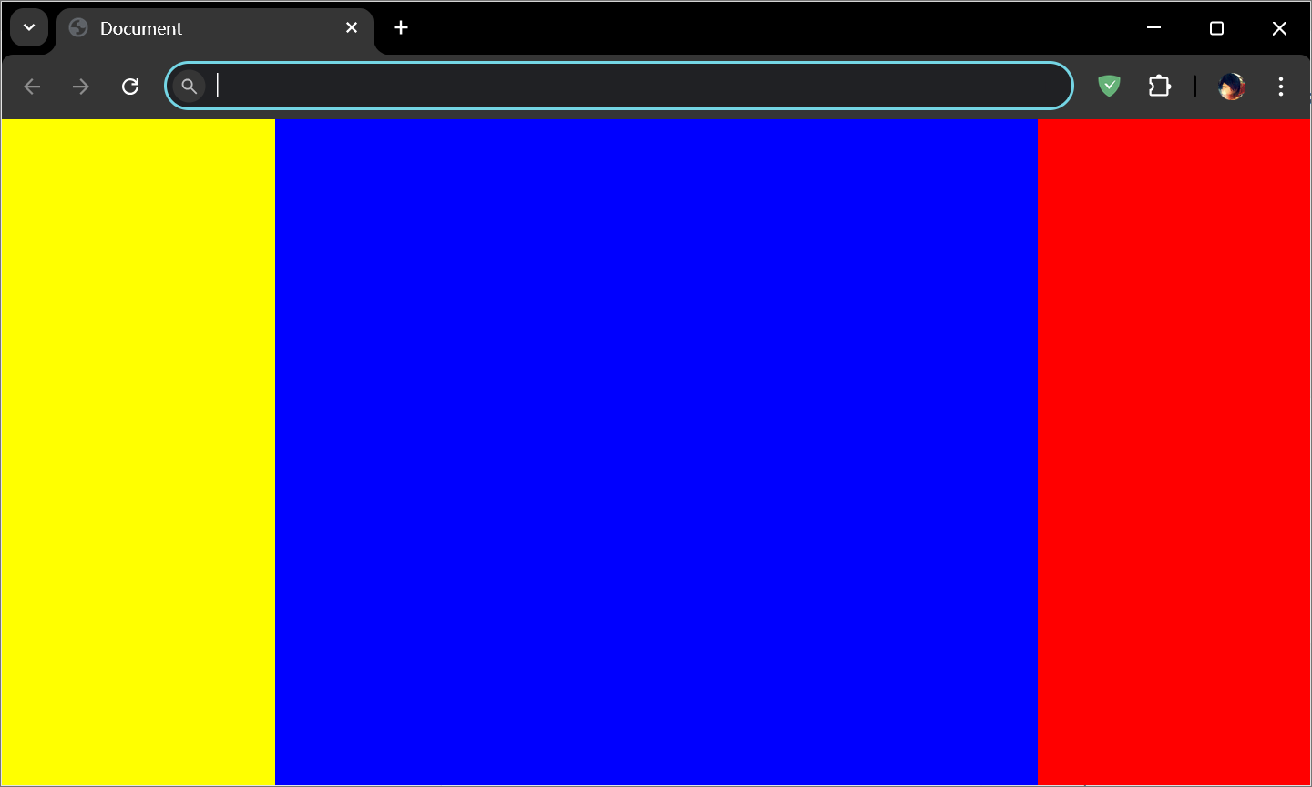
1 2 3 4 5 6 7 8 9 10 11 12 13 14 15 16 17 18 19 20 21 22 23 24 25 26 27 28 29 30 31 32 <style > *{ margin : 0 ; padding : 0 ; } html , body { height : 100% ; } .left , .right { width : 200px ; height : 100% ; } .left { background : yellow; float : left; } .right { background : red; float : right; } .center { width : calc (100% - 400px ); height : 100% ; background : blue; float : left; } </style > <div class ="left" > </div > <div class ="center" > </div > <div class ="right" > </div >
5.3 多栏布局
1
2
3
4
5
6
7
8
9
10
11
12
13
14
15
16
17
18
19
20
21
22
23
24
25
26
27
28
29
30
31
32
33
34
35
36
37
38
39
40
41
42
43
44
45
46
47
<!DOCTYPE html > <html lang ="en" > <head > <meta charset ="UTF-8" > <meta name ="viewport" content ="width=device-width, initial-scale=1.0" > <title > Document</title > <style > *{ margin : 0 ; padding : 0 ; } html ,body { height : 100% ; } .top , .bottom { width : 100% ; height : 50px ; background : #ccc ; } .middle { height : calc (100% - 100px ); background : yellow; } .left , .right { width : 100px ; height : 200px ; background : red; float : left; } .center { width : calc (100% - 200px ); height : 100% ; background : green; float : left; } </style > </head > <body > <div class ="top" > </div > <div class ="middle" > <div class ="left" > </div > <div class ="center" > </div > <div class ="right" > </div > </div > <div class ="bottom" > </div > </body > </html >