1. 文本阴影
text-shadow 设置文本的阴影。
- 第一个参数,水平方向阴影位移
- 第二个参数,垂直方向阴影位移
- 第三个参数,阴影模糊程度
- 第四个参数,阴影颜色
1
2
3
4
5
6
7
8
9
10
11
12
13
14
15
16
17
18
19
| <!DOCTYPE html>
<html lang="en">
<head>
<meta charset="UTF-8">
<meta name="viewport" content="width=device-width, initial-scale=1.0">
<title>Document</title>
<style>
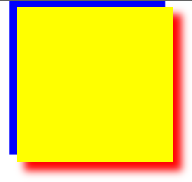
div{
text-shadow: 10px 11px 2px red, -10px -11px 2px blue;
}
</style>
</head>
<body>
<div>大家好</div>
</body>
</html>
|
注意:支持多阴影参数设置,英文逗号分隔。
效果:

2. 盒子阴影
box-shadow 设置盒子的阴影。
- h-shadow,必需的,水平阴影位置,允许负值
- v-shadow,必须的,垂直阴影位置,允许负值
- blur,可选,模糊距离
- spread,可选,阴影大小
- color,可选,阴影颜色
- inset,可选,内阴影
写法eg:
1
| box-shadow: 10px 10px 5px #888888;
|
1
2
3
4
5
6
7
8
9
10
11
12
13
14
15
16
17
18
19
20
21
22
| <!DOCTYPE html>
<html lang="en">
<head>
<meta charset="UTF-8">
<meta name="viewport" content="width=device-width, initial-scale=1.0">
<title>Document</title>
<style>
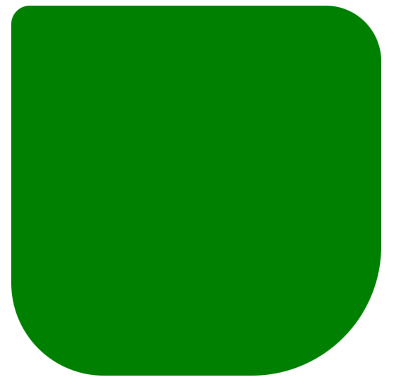
div{
width: 200px;
height: 200px;
background: yellow;
margin: 0 auto;
box-shadow: 10px 10px 10px 1px red, -10px -10px 1px blue;
}
</style>
</head>
<body>
<div></div>
</body>
</html>
|
注意:也支持多阴影参数设置,英文逗号分隔。
3. 圆角
border-radius 设置盒子圆角效果,支持 px 或 百分比。
- v1 四个角
- v1 v2 左上右下,左下右上 一致
- v1 v2 v3 左上,左上右下,右下 一致
- v1 v2 v3 v4 顺时针方向圆角均一致
- v1 0 0 0 设置一个方向为圆角,其他不变,即扩展参数
扩展参数:
1
2
3
4
| border-top-left-radius 左上
border-top-right-radius 右上
border-bottom-left-radius 左下
border-bottom-right-radius 右下
|
示例:
1
2
3
4
5
6
7
8
9
10
11
12
13
14
15
16
17
18
19
20
21
22
23
24
25
26
27
28
29
30
31
32
33
34
| <!DOCTYPE html>
<html lang="en">
<head>
<meta charset="UTF-8">
<meta name="viewport" content="width=device-width, initial-scale=1.0">
<title>Document</title>
<style>
div{
height: 200px;
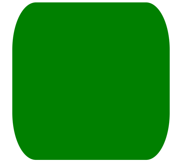
width: 200px;
background: green;
margin: 0 auto;
border-top-left-radius: 10px;
border-top-right-radius: 30px;
border-bottom-left-radius: 50px;
border-bottom-right-radius: 70px;
border-radius: 30px/60px;
}
</style>
</head>
<body>
<div></div>
</body>
</html>
|
- v1/v2 水平方向便宜v1,垂直方向便宜v2,形成的弧度圆角,仅支持 border-radius
- 正圆,盒子宽高一致,圆角的值为
盒子宽高的一半(如果有内边距或外边距或边框,都需要加上)。
1
2
3
4
5
6
7
8
9
10
11
| div{
height: 200px;
width: 200px;
background: green;
margin: 0 auto;
border-radius: 50%;
border: 20px solid red;
border-radius: calc(50% + 20px);
}
|
- 圆角矩形,盒子宽高不一致时,即长方形,设置
px像素值 单值才能更加常用,如百度首页的搜索框圆角
1
2
3
4
5
6
7
8
| div{
width: 200px;
height: 100px;
background: green;
margin: 0 auto;
border-radius: 100px 100px 0 0;
}
|
1
2
3
4
5
6
7
8
| div{
width: 100px;
height: 100px;
background: green;
margin: 0 auto;
border-radius: 100px 0 0 0;
}
|
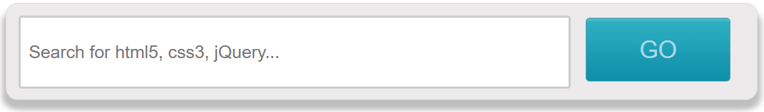
案例:搜索框
1
2
3
4
5
6
7
8
9
10
11
12
13
14
15
16
17
18
19
20
21
22
23
24
25
26
27
28
29
30
31
32
33
34
35
36
37
38
39
40
41
42
43
44
45
46
47
48
49
50
51
52
| <!DOCTYPE html>
<html lang="en">
<head>
<meta charset="UTF-8">
<meta name="viewport" content="width=device-width, initial-scale=1.0">
<title>Document</title>
<style>
*{
margin: 0;
padding: 0;
}
input{
outline: none;
}
div{
width: 935px;
height: 120px;
border: 1px solid #dedede;
margin: 10px auto;
background: #eceaeb;
border-radius: 15px;
box-shadow: 4px 11px 7px #bfbfbf, -4px 11px 7px #bfbfbf;
}
[type=text]{
width: 683px;
height: 86px;
margin: 15px;
border: 3px solid #ccc;
border-radius: 4px;
font-size: 22px;
text-indent: 10px;
color: #555;
}
[type=submit]{
width: 180px;
height: 83px;
background: url(img/1.png);
border-radius: 5px;
border: 1px solid #5ca3b4;
}
</style>
</head>
<body>
<form action="">
<div>
<input type="text" placeholder="Search for html5, css3, jQuery...">
<input type="submit" value="GO">
</div>
</form>
</body>
</html>
|
4. 自定义字体引入
@font-face 是CSS3中的一个模块,主要是把自定义的web字体嵌入到网页中,早在IE4就支持。
语法规则:
1
2
3
4
5
6
| @font-face{
font-family: <YourWebFontName>;
src: <source>[<format>][,<source>[<format>]]*;
[font-weight: <weight>];
[font-style: <style>];
}
|
说明:
- YourWebFontName,自定义的字体名称,最好是下载的默认字体,它将被引入到web元素中的font-family中
- source,自定义字体的存放路径,可以是相对路径可以是绝对路径
1
2
3
4
5
6
7
8
9
10
11
12
13
14
15
16
17
18
19
20
21
22
23
24
25
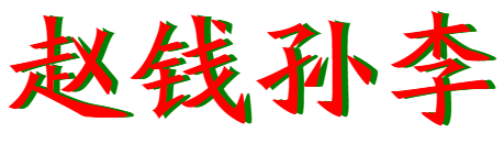
| <!DOCTYPE html>
<html lang="en">
<head>
<meta charset="UTF-8">
<meta name="viewport" content="width=device-width, initial-scale=1.0">
<title>Document</title>
<style>
@font-face {
font-family: fzbwksjt;
src: url(font/方正北魏楷书简体.ttf);
}
div{
font-family: fzbwksjt;
font-size: 100px;
color: red;
text-shadow: 5px 0 0 green;
}
</style>
</head>
<body>
<div>赵钱孙李</div>
</body>
</html>
|
效果:
5. 字体图标
参考资料:阿里巴巴适量图标库 https://www.iconfont.cn/
(个人:微信注册、扫码登陆即可)
下载 → 引入 → 使用。
5.1 下载
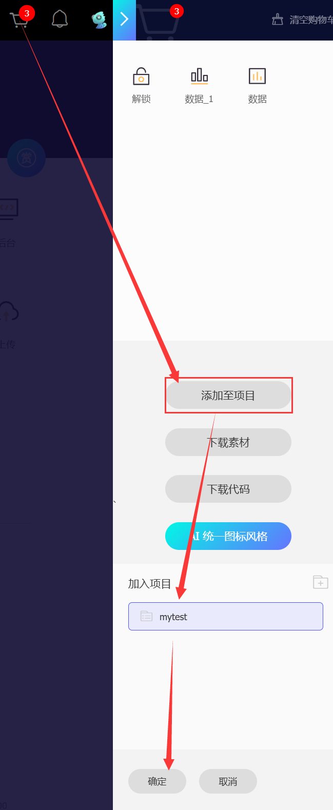
- 找到自己想用的图标后,
加入购物车。
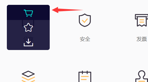
- 从购物车中
添加至项目,如果没有项目就随便建一个即可
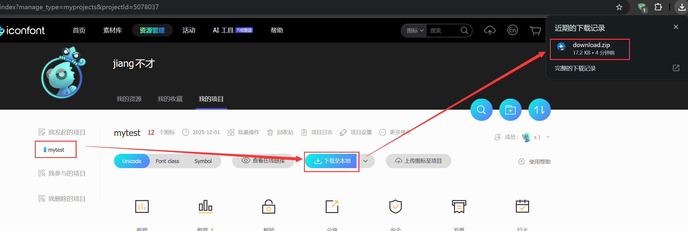
- 在【我发起的项目】中,将需要下载的项目里的图标,点击
下载至本地,即 download.zip
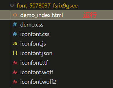
- 将download.zip压缩包,
解压出来,内容拷贝至自己的项目下
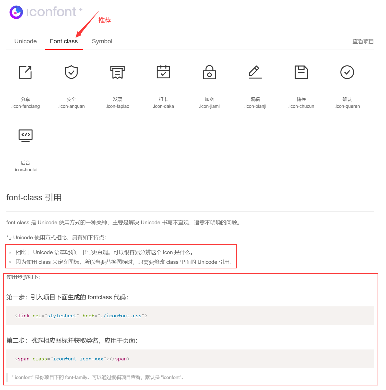
5.2 引入使用
1
2
3
4
5
6
7
8
9
10
11
12
13
14
15
16
17
18
| <!DOCTYPE html>
<html lang="en">
<head>
<meta charset="UTF-8">
<meta name="viewport" content="width=device-width, initial-scale=1.0">
<title>Document</title>
<link rel="stylesheet" href="font_5078037_fsrix9gsee/iconfont.css">
<style>
span.icon-anquan{
font-size: 100px;
color: red;
}
</style>
</head>
<body>
<span class="iconfont icon-anquan"></span>
</body>
</html>
|
效果: