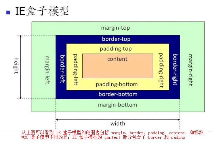
1. 怪异盒模型 box-sizing 属性,可以设置标准盒模型或怪异盒模型。子元素样式
content-box ,属性值,标准盒模型border-box , 属性值,怪异盒模型,为元素设定的宽度和高度决定了元素的边框盒。
就是说,为元素指定的任何内边距和边框都将在已设定的宽度和高度内进行绘制,通过从已设定的宽度和高度分别减去边框和内边距才能得到内容的宽度和高度。
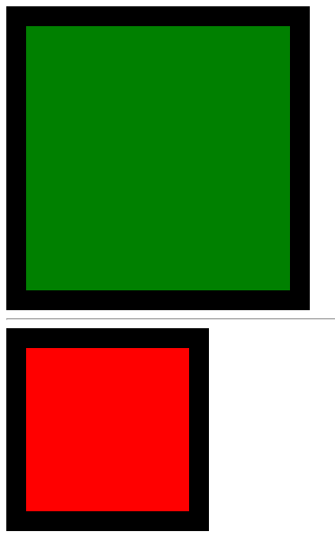
示例:
1
2
3
4
5
6
7
8
9
10
11
12
13
14
15
16
17
18
19
20
21
22
23
24
25
26
27
28
29
30
31
32
33
34
35
36
<!DOCTYPE html > <html lang ="en" > <head > <meta charset ="UTF-8" > <meta name ="viewport" content ="width=device-width, initial-scale=1.0" > <title > Document</title > <style > .box1 { width : 200px ; height : 200px ; background : green; padding : 30px ; border : 20px solid black; box-sizing : content-box; } .box2 { width : 200px ; height : 200px ; background : red; padding : 30px ; border : 20px solid black; box-sizing : border-box; } </style > </head > <body > <div class ="box1" > </div > <hr > <div class ="box2" > </div > </body > </html >
效果:
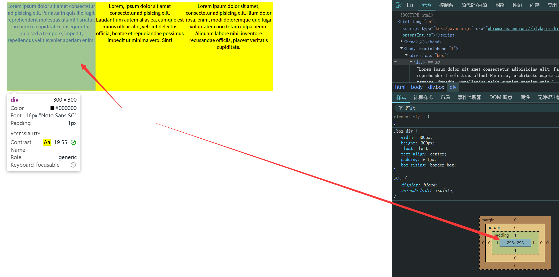
应用场景 1 2 3 4 5 6 7 8 9 10 11 12 13 14 15 16 17 18 19 20 21 22 23 24 25 26 27 28 29 30 31 32 33 34 <!DOCTYPE html > <html lang ="en" > <head > <meta charset ="UTF-8" > <meta name ="viewport" content ="width=device-width, initial-scale=1.0" > <title > Document</title > <style > .box { width : 900px ; height : 300px ; background : yellow; margin : 0 auto; } .box div { width : 300px ; height : 300px ; float : left; text-align : center; padding : 1px ; box-sizing : border-box; } </style > </head > <body > <div class ="box" > <div > Lorem ipsum dolor sit amet consectetur adipisicing elit. Pariatur in quis illo fugit reprehenderit molestias ullam! Pariatur, architecto cupiditate consequuntur quia sed a tempore, impedit, repellendus velit eveniet aperiam enim.</div > <div > Lorem, ipsum dolor sit amet consectetur adipisicing elit. Laudantium autem alias ea, cumque est minus officiis illo, vel sint delectus officia, beatae et repudiandae possimus impedit ut minima vero! Sint!</div > <div > Lorem ipsum dolor sit amet, consectetur adipisicing elit. Illum dolor ipsa, enim, modi doloremque quo fuga voluptatem non totam culpa nemo. Aliquam labore nihil inventore recusandae officiis, placeat veritatis cupiditate.</div > </div > </body > </html >
2. 弹性盒布局 2.0 display:flex 弹性盒布局 display: flex; 弹性盒布局。
影响 :
让子元素默认横向排列(注意:不是浮动!)
子元素是行内元素的话,子元素会变成块元素
只有一个元素的时候,margin:auto; 自动水平垂直居中
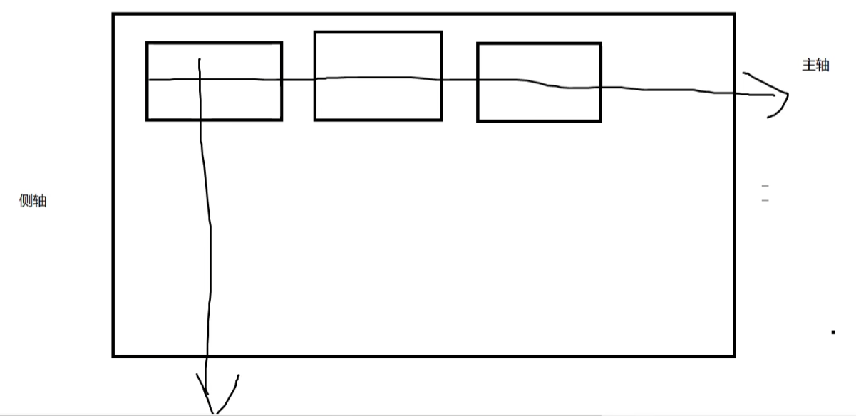
主轴与侧轴 ,并不对应X轴或Y轴,主、侧只是参照物,比如 竖向也可以设置为主轴,那么横向为侧轴。
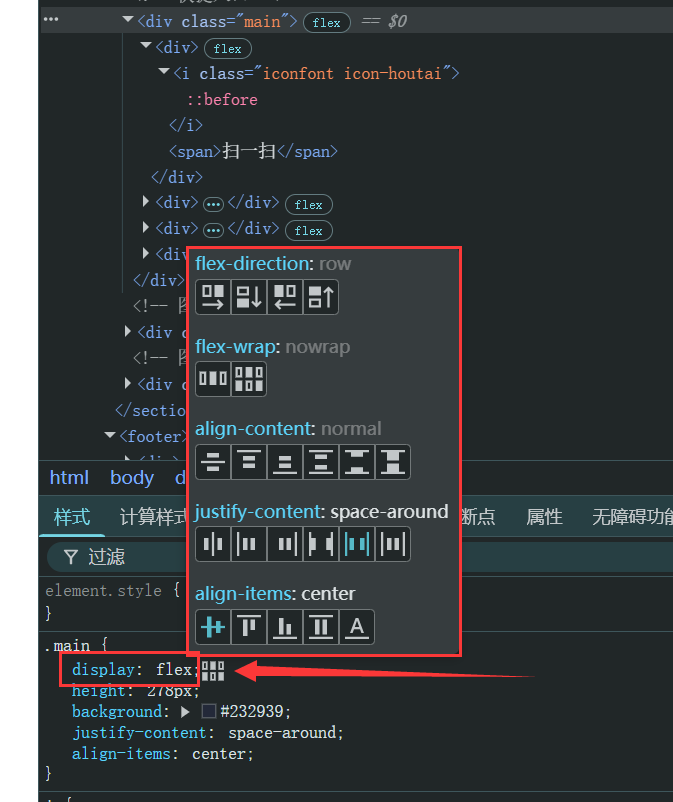
调试小技巧:
开发者工具中,样式内可以针对 flex 弹性盒子布局快捷点击效果图,进行子元素排列方式的对比和比较。
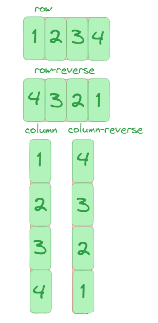
2.1 flex-direction 主轴排列方向★ flex-direction 弹性盒主轴元素排列方向 。
1 2 3 .box {flex-direction : row | row-reverse | column | column-reverse;
row (默认值):主轴为水平方向,起点在左端。row-reverse :主轴为水平方向,起点在右端。column :主轴为垂直方向,起点在上沿。column-reverse :主轴为垂直方向,起点在下沿。
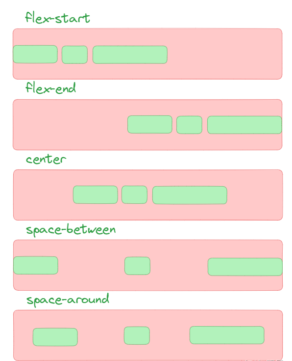
2.2 justify-content 主轴对齐方向★ justify-content 调整主轴 子元素的对齐方向。[测试 ]
1 2 3 .box {justify-content : flex-start | flex-end | center | space-between | space-around;
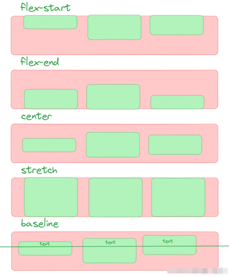
2.3 align-items 侧轴对齐方向★ align-items 调整侧轴 对齐方向。
1 2 3 .box {align-items : flex-start | flex-end | center | baseline | stretch;
stretch (默认值):如果项目未设置高度或设为auto,将占满整个容器的高度。flex-start :侧轴的起点对齐。flex-end :侧轴的终点对齐。center :居中,侧轴的中点对齐(与 justify-content: center 一起,也可以 水平垂直居中)baseline : 项目的第一行文字的基线对齐。
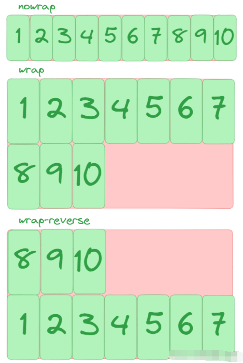
2.4 flex-wrap 折行以及方向★ flex-wrap 换行不换行以及换行的方向。
1 2 3 .box {flex-wrap : nowrap | wrap | wrap-reverse;
nowrap (默认):不换行wrap :换行,第一行在上方。wrap-reverse :换行,第一行在下方。
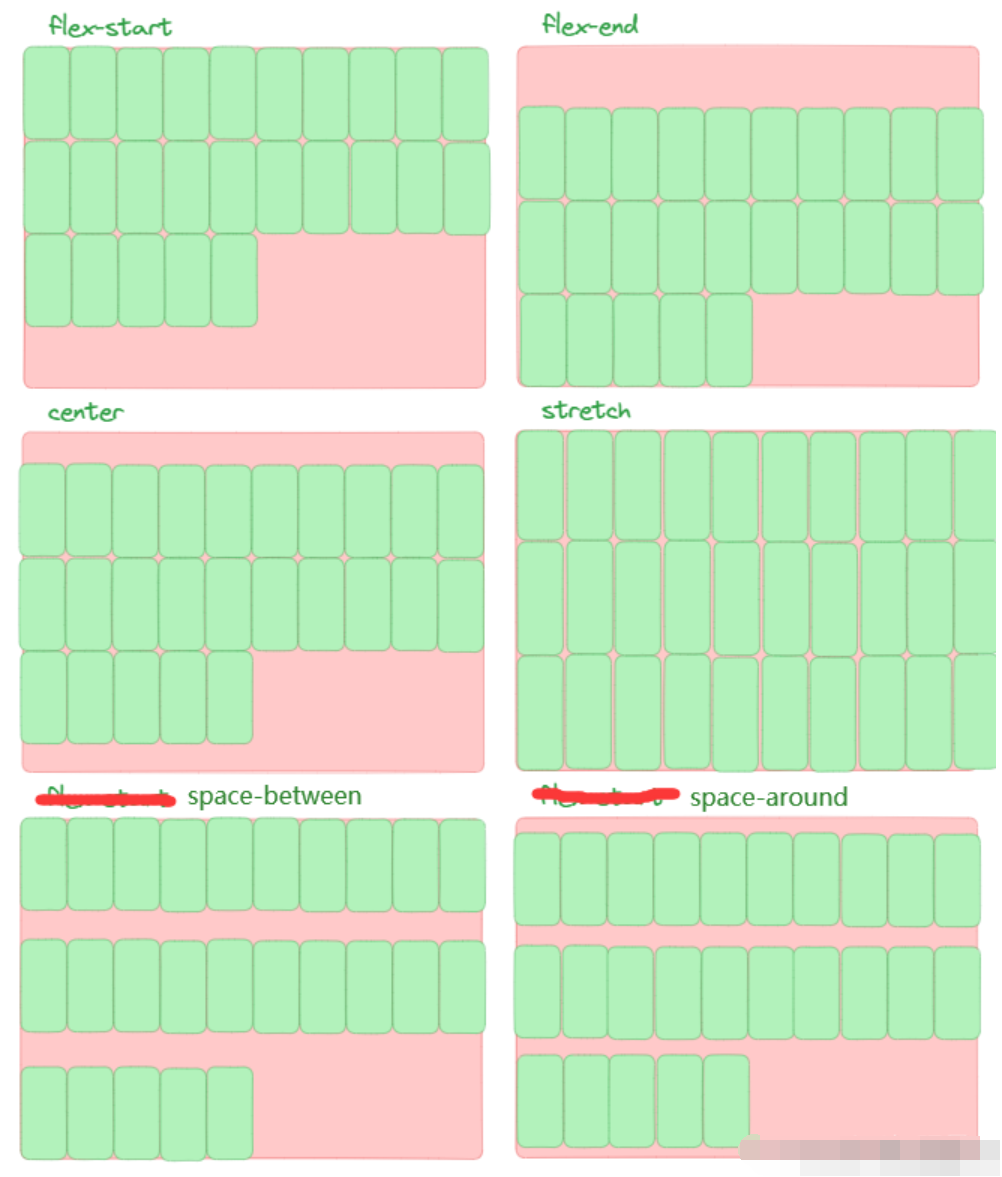
2.5 align-content 折行行间距★ align-content 控制折行后的行间距,定义了多根轴线的对齐方式。如果项目只有一根轴线,该属性不起作用。
1 2 3 .box {align-content : stretch | flex-start | flex-end | center | space-between | space-around;
stretch (默认值):轴线占满整个交叉轴。flex-start :与交叉轴的起点对齐。flex-end :与交叉轴的终点对齐。center :与交叉轴的中点对齐。space-between :与交叉轴两端对齐,轴线之间的间隔平均分布。space-around :每根轴线两侧的间隔都相等。所以,轴线之间的间隔比轴线与边框的间隔大一倍。
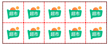
案例:京东手机端金刚区
1 2 3 4 5 6 7 8 9 10 11 12 13 14 15 16 17 18 19 20 21 22 23 24 25 26 27 28 29 30 31 32 33 34 35 36 37 38 39 40 41 42 43 44 45 46 47 48 49 50 51 52 53 54 55 56 57 58 59 60 61 62 63 64 65 66 67 68 69 70 71 72 73 74 75 76 77 78 79 80 81 82 83 84 85 86 87 <!DOCTYPE html > <html lang ="en" > <head > <meta charset ="UTF-8" > <meta name ="viewport" content ="width=device-width, initial-scale=1.0" > <title > 京东手机版顶部金刚区(2行5列共计10个图标)</title > <style > .box { width : 300px ; height : 120px ; border : 1px solid black; margin : 10px auto; display : flex; flex-wrap : wrap; } .box div { width : 60px ; height : 60px ; border : 1px dashed red; box-sizing : border-box; display : flex; flex-direction : column; justify-content : space-around; align-items : center; } .box div img { width : 35px ; height : 35px ; } .box div span { font-size : 10px ; } </style > </head > <body > <div class ="box" > <div > <img src ="https://img12.360buyimg.com/babel/jfs/t20270715/38278/23/22574/7960/6694edb4F07db03e3/d663cd498321eadc.png" alt ="" > <span > 京东超市</span > </div > <div > <img src ="https://img12.360buyimg.com/babel/jfs/t20270715/38278/23/22574/7960/6694edb4F07db03e3/d663cd498321eadc.png" alt ="" > <span > 京东超市</span > </div > <div > <img src ="https://img12.360buyimg.com/babel/jfs/t20270715/38278/23/22574/7960/6694edb4F07db03e3/d663cd498321eadc.png" alt ="" > <span > 京东超市</span > </div > <div > <img src ="https://img12.360buyimg.com/babel/jfs/t20270715/38278/23/22574/7960/6694edb4F07db03e3/d663cd498321eadc.png" alt ="" > <span > 京东超市</span > </div > <div > <img src ="https://img12.360buyimg.com/babel/jfs/t20270715/38278/23/22574/7960/6694edb4F07db03e3/d663cd498321eadc.png" alt ="" > <span > 京东超市</span > </div > <div > <img src ="https://img12.360buyimg.com/babel/jfs/t20270715/38278/23/22574/7960/6694edb4F07db03e3/d663cd498321eadc.png" alt ="" > <span > 京东超市</span > </div > <div > <img src ="https://img12.360buyimg.com/babel/jfs/t20270715/38278/23/22574/7960/6694edb4F07db03e3/d663cd498321eadc.png" alt ="" > <span > 京东超市</span > </div > <div > <img src ="https://img12.360buyimg.com/babel/jfs/t20270715/38278/23/22574/7960/6694edb4F07db03e3/d663cd498321eadc.png" alt ="" > <span > 京东超市</span > </div > <div > <img src ="https://img12.360buyimg.com/babel/jfs/t20270715/38278/23/22574/7960/6694edb4F07db03e3/d663cd498321eadc.png" alt ="" > <span > 京东超市</span > </div > <div > <img src ="https://img12.360buyimg.com/babel/jfs/t20270715/38278/23/22574/7960/6694edb4F07db03e3/d663cd498321eadc.png" alt ="" > <span > 京东超市</span > </div > </div > </body > </html >
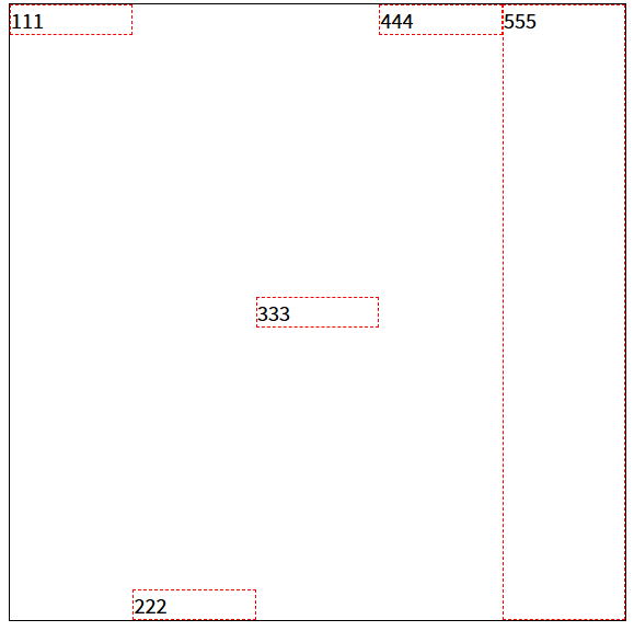
2.6 align-self 项目对齐方式 align-self属性允许单个项目有与其他项目不一样的对齐方式,可覆盖align-items属性。
auto ,默认值,表示继承父元素的align-items属性,如果没有父元素,则等同于stretch(拉伸)。
1 2 3 .item {align-self : auto | flex-start | flex-end | center | baseline | stretch;
该属性可能取6个值,除了auto,其他都与 align-items 属性完全一致。
stretch 属性的特性说明:
横向排列时:如果没有设置高度,则高度会拉伸会占满父盒子高度
纵向排列时:如果没有设置宽度,则宽度会拉伸会占满父盒子宽度
示例:横向
1 2 3 4 5 6 7 8 9 10 11 12 13 14 15 16 17 18 19 20 21 22 23 24 25 26 27 28 29 30 31 32 33 34 35 36 37 38 39 40 41 42 43 44 45 46 47 48 49 50 <!DOCTYPE html > <html lang ="en" > <head > <meta charset ="UTF-8" > <meta name ="viewport" content ="width=device-width, initial-scale=1.0" > <title > Document</title > <style > .box { width : 500px ; height : 500px ; border : 1px solid black; margin : 100px auto; display : flex; } .box div { width : 100px ; border : 1px dashed red; box-sizing : border-box; } .div1 { align-self : flex-start; } .div2 { align-self : flex-end; } .div3 { align-self : center; } .div4 { align-self : baseline; } .div5 { align-self : stretch; } </style > </head > <body > <div class ="box" > <div class ="div1" > 111</div > <div class ="div2" > 222</div > <div class ="div3" > 333</div > <div class ="div4" > 444</div > <div class ="div5" > 555</div > </div > </body > </html >
示例:纵向
1 2 3 4 5 6 7 8 9 10 11 12 13 14 15 16 17 18 19 20 21 22 23 24 25 26 27 28 29 30 31 32 33 34 35 36 37 38 39 40 41 42 43 44 45 46 47 48 49 50 51 <!DOCTYPE html > <html lang ="en" > <head > <meta charset ="UTF-8" > <meta name ="viewport" content ="width=device-width, initial-scale=1.0" > <title > Document</title > <style > .box { width : 500px ; height : 500px ; border : 1px solid black; margin : 100px auto; display : flex; flex-direction : column; } .box div { height : 100px ; border : 1px dashed red; box-sizing : border-box; } .div1 { align-self : flex-start; } .div2 { align-self : flex-end; } .div3 { align-self : center; } .div4 { align-self : baseline; } .div5 { align-self : stretch; } </style > </head > <body > <div class ="box" > <div class ="div1" > 111</div > <div class ="div2" > 222</div > <div class ="div3" > 333</div > <div class ="div4" > 444</div > <div class ="div5" > 555</div > </div > </body > </html >
2.7 order 项目排序设置 order 属性定义项目的排列顺序。数值越小,排列越靠前(如果方向是reverse则反之),默认为0。
1 2 3 .item {order : <integer>;
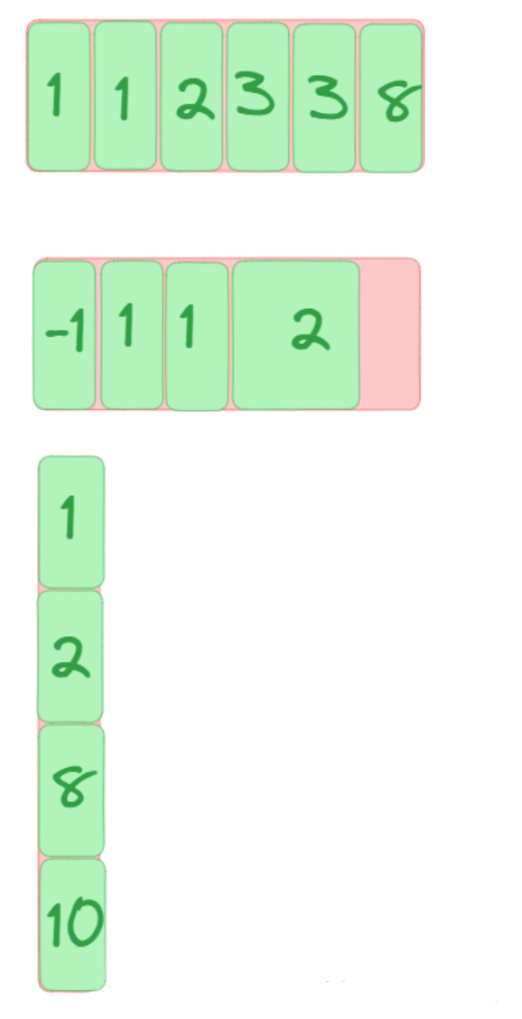
2.8 flex 项目剩余宽高★ flex属性是flex-grow, flex-shrink 和 flex-basis 的简写,默认值为0, 1 和 auto属性可选。
1 2 3 .item {flex : none | [ <'flex-grow' > <'flex-shrink' >? || <'flex-basis' > ]
该属性有两个快捷值:auto (1 1 auto) 和 none (0 0 auto)。
建议优先使用这个属性,而不是单独写三个分离的属性,因为浏览器会推算相关值。
示例:(根据同级元素比例份数划分所占空间比例,详见代码注释 )
1 2 3 4 5 6 7 8 9 10 11 12 13 14 15 16 17 18 19 20 21 22 23 24 25 26 27 28 29 30 31 32 33 34 35 36 37 38 39 40 41 42 43 44 45 46 47 48 <!DOCTYPE html > <html lang ="en" > <head > <meta charset ="UTF-8" > <meta name ="viewport" content ="width=device-width, initial-scale=1.0" > <title > Document</title > <style > .box { width : 500px ; height : 500px ; border : 1px solid black; margin : 100px auto; display : flex; } .box div { width : 100px ; height : 100px ; border : 1px dashed red; } .div2 { flex : 1 ; } .div1 , .div2 , .div3 { flex : 1 ; } .div1 , .div3 { flex : 1 ; } .div2 { flex : 2 ; } </style > </head > <body > <div class ="box" > <div class ="div1" > 111</div > <div class ="div2" > 222</div > <div class ="div3" > 333</div > </div > </body > </html >
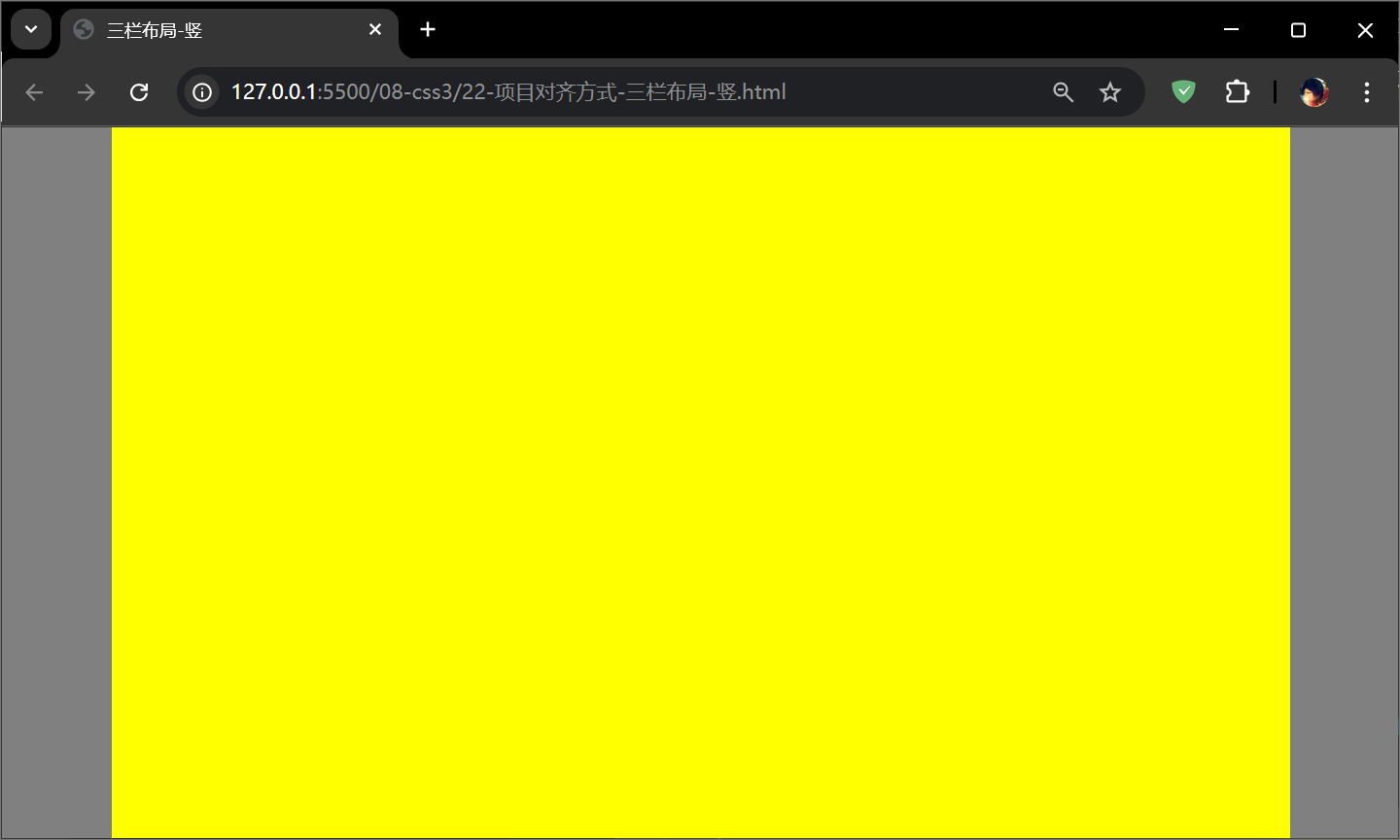
案例:三栏布局-竖 1 2 3 4 5 6 7 8 9 10 11 12 13 14 15 16 17 18 19 20 21 22 23 24 25 26 27 28 29 30 31 32 33 34 35 <!DOCTYPE html > <html lang ="en" > <head > <meta charset ="UTF-8" > <meta name ="viewport" content ="width=device-width, initial-scale=1.0" > <title > 三栏布局-竖</title > <style > *{ margin : 0 ; padding : 0 ; } html ,body { height : 100% ; } body { display : flex; } .box1 , .box3 { width : 100px ; background : gray; } .box2 { flex : 1 ; background : yellow; } </style > </head > <body > <div class ="box1" > </div > <div class ="box2" > </div > <div class ="box3" > </div > </body > </html >
效果:
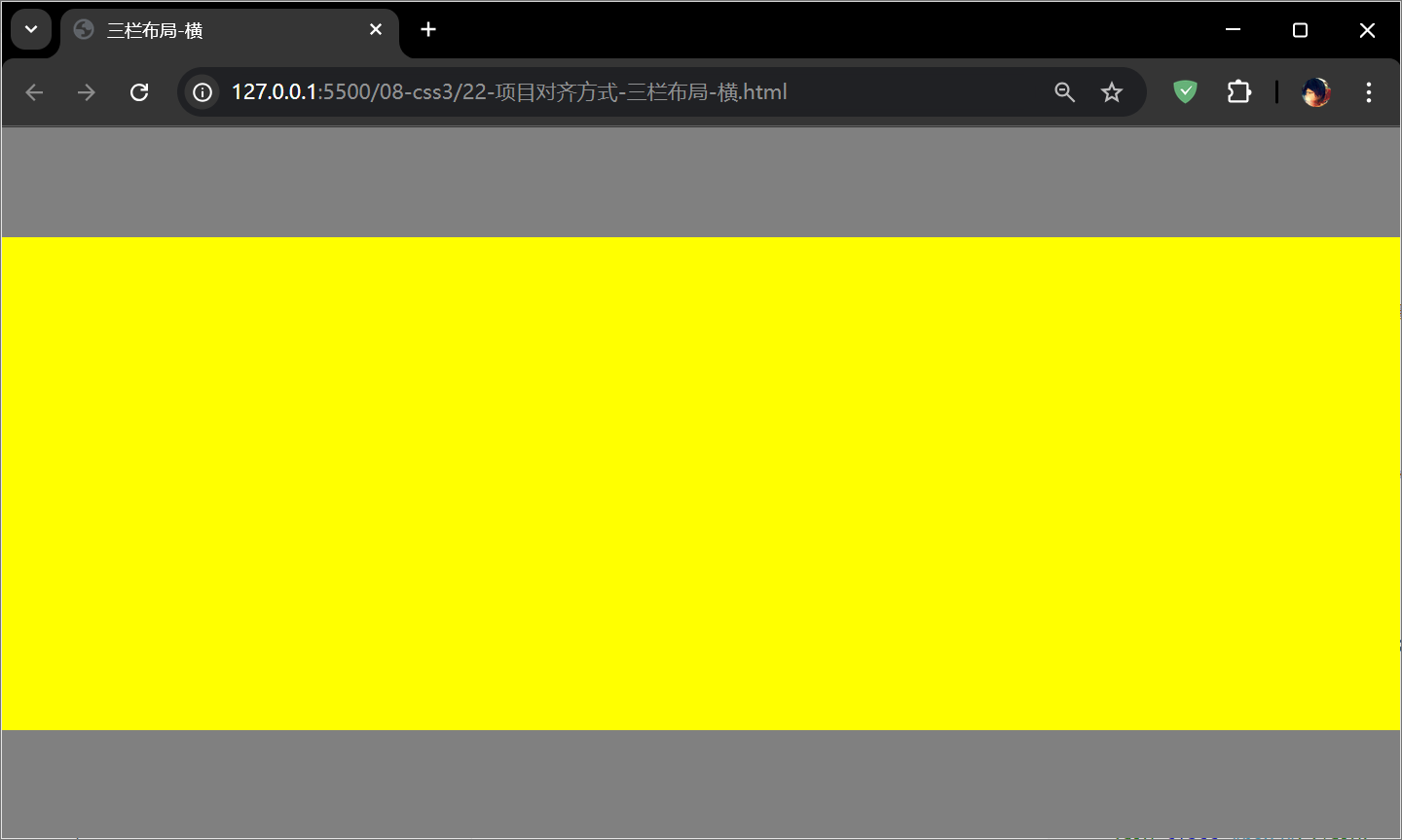
案例:三栏布局-横 1 2 3 4 5 6 7 8 9 10 11 12 13 14 15 16 17 18 19 20 21 22 23 24 25 26 27 28 29 30 31 32 33 34 35 36 <!DOCTYPE html > <html lang ="en" > <head > <meta charset ="UTF-8" > <meta name ="viewport" content ="width=device-width, initial-scale=1.0" > <title > 三栏布局-横</title > <style > *{ margin : 0 ; padding : 0 ; } html ,body { height : 100% ; } body { display : flex; flex-direction : column; } .box1 , .box3 { height : 100px ; background : gray; } .box2 { flex : 1 ; background : yellow; } </style > </head > <body > <div class ="box1" > </div > <div class ="box2" > </div > <div class ="box3" > </div > </body > </html >
效果:
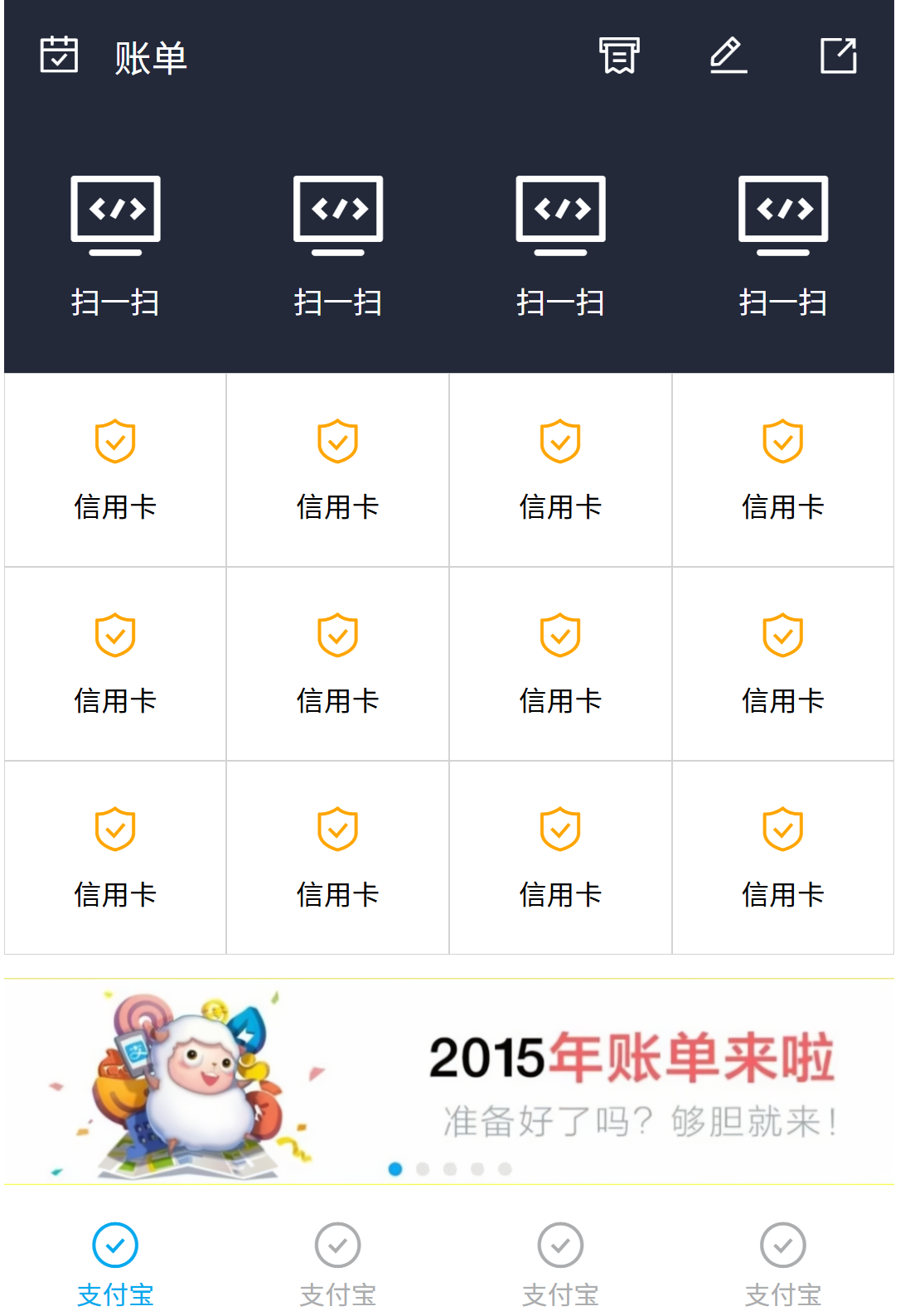
案例:支付宝首页(弹性盒布局) 1 2 3 4 5 6 7 8 9 10 11 12 13 14 15 16 17 18 19 20 21 22 23 24 25 26 27 28 29 30 31 32 33 34 35 36 37 38 39 40 41 42 43 44 45 46 47 48 49 50 51 52 53 54 55 56 57 58 59 60 61 62 63 64 65 66 67 68 69 70 71 72 73 74 75 76 77 78 79 80 81 82 83 84 85 86 87 88 89 90 91 92 93 94 95 96 97 98 99 100 101 102 103 104 105 106 107 108 109 110 111 112 113 114 115 116 117 118 119 120 121 122 123 124 125 126 127 128 129 130 131 132 133 134 135 136 137 138 139 140 141 142 143 144 145 146 147 148 149 150 151 152 153 154 155 156 157 158 159 160 161 162 163 164 165 166 167 168 169 170 171 172 173 174 175 176 177 178 179 180 181 182 183 184 185 186 187 188 189 190 191 192 193 194 195 196 197 198 199 200 201 202 203 204 205 206 207 208 209 210 211 212 213 214 215 216 217 218 219 220 221 222 223 224 225 226 227 228 229 230 231 232 233 234 235 236 237 238 239 240 241 242 243 244 245 246 247 248 249 250 251 252 253 254 255 256 257 258 259 260 261 262 263 264 <!DOCTYPE html > <html lang ="en" > <head > <meta charset ="UTF-8" > <meta name ="viewport" content ="width=device-width, initial-scale=1.0" > <title > Document</title > <link rel ="stylesheet" href ="font_5078037_fsrix9gsee/iconfont.css" > <style > *{ margin : 0 ; padding : 0 ; } .box { width : 955px ; height : 1420px ; margin : 0 auto; display : flex; flex-direction : column; } header { height : 124px ; background : #232939 ; display : flex; } header i { width : 118px ; height : 124px ; line-height : 124px ; text-align : center; font-size : 48px !important ; color : white; } header span { flex : 1 ; height : 124px ; line-height : 124px ; text-align : left; font-size : 40px ; color : white; } section { flex : 1 ; } .main { display : flex; height : 278px ; background : #232939 ; justify-content : space-around; align-items : center; } .main div { width : 120px ; height : 168px ; display : flex; flex-direction : column; justify-content : space-between; } .main div i { font-size : 110px ; text-align : center; color : white; } .main div span { font-size : 32px ; text-align : center; color : white; } .list { display : flex; flex-wrap : wrap; background : white; } .list div { width : 25% ; height : 208px ; border : 1px solid lightgray; box-sizing : border-box; display : flex; flex-direction : column; justify-content : center; } .list div i { height : 77px ; line-height : 77px ; text-align : center; font-size : 55px ; color : orange; } .list div span { height : 61px ; line-height : 61px ; text-align : center; font-size : 30px ; } .pic { margin-top : 25px ; } .pic img { height : 100% ; width : 100% ; } footer { height : 128px ; display : flex; } footer div { flex : 1 ; display : flex; flex-direction : column; justify-content : center; color : #acadaf ; background : white; } footer div i { height : 66px ; line-height : 66px ; text-align : center; font-size : 58px !important ; } footer div span { height : 36px ; line-height : 36px ; text-align : center; font-size : 28px ; } footer div :first -child{ color : #06a9ee ; } footer div :hover { color : #06a9ee ; } </style > </head > <body > <div class ="box" > <header > <i class ="iconfont icon-daka" > </i > <span > 账单</span > <i class ="iconfont icon-fapiao" > </i > <i class ="iconfont icon-bianji" > </i > <i class ="iconfont icon-fenxiang" > </i > </header > <section > <div class ="main" > <div > <i class ="iconfont icon-houtai" > </i > <span > 扫一扫</span > </div > <div > <i class ="iconfont icon-houtai" > </i > <span > 扫一扫</span > </div > <div > <i class ="iconfont icon-houtai" > </i > <span > 扫一扫</span > </div > <div > <i class ="iconfont icon-houtai" > </i > <span > 扫一扫</span > </div > </div > <div class ="list" > <div > <i class ="iconfont icon-anquan" > </i > <span > 信用卡</span > </div > <div > <i class ="iconfont icon-anquan" > </i > <span > 信用卡</span > </div > <div > <i class ="iconfont icon-anquan" > </i > <span > 信用卡</span > </div > <div > <i class ="iconfont icon-anquan" > </i > <span > 信用卡</span > </div > <div > <i class ="iconfont icon-anquan" > </i > <span > 信用卡</span > </div > <div > <i class ="iconfont icon-anquan" > </i > <span > 信用卡</span > </div > <div > <i class ="iconfont icon-anquan" > </i > <span > 信用卡</span > </div > <div > <i class ="iconfont icon-anquan" > </i > <span > 信用卡</span > </div > <div > <i class ="iconfont icon-anquan" > </i > <span > 信用卡</span > </div > <div > <i class ="iconfont icon-anquan" > </i > <span > 信用卡</span > </div > <div > <i class ="iconfont icon-anquan" > </i > <span > 信用卡</span > </div > <div > <i class ="iconfont icon-anquan" > </i > <span > 信用卡</span > </div > </div > <div class ="pic" > <img src ="img/zhufubao.png" alt ="" > </div > </section > <footer > <div > <i class ="iconfont icon-queren" > </i > <span > 支付宝</span > </div > <div > <i class ="iconfont icon-queren" > </i > <span > 支付宝</span > </div > <div > <i class ="iconfont icon-queren" > </i > <span > 支付宝</span > </div > <div > <i class ="iconfont icon-queren" > </i > <span > 支付宝</span > </div > </footer > </div > </body > </html >
效果:
案例总结弹性盒写法 通过案例总结出来的弹性盒写法,以 footer 为例:
1 2 3 4 5 6 7 8 9 10 11 12 13 14 15 16 17 18 19 20 21 22 23 24 25 26 27 28 29 footer {height : 158px ; display : flex; footer div {flex : 1 ; color : gray; display : flex; flex-direction : column; justify-content : center; align-items : center; footer div i {height : 74px ; line-height : 74px ; font-size : 58px !important ;footer div span {height : 46px ; line-height : 46px ; font-size : 30px ;footer div :hover {color : #06a9ee ;