1. rem等比例缩放
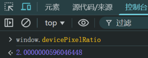
背景:设备缩放比 window.devicePixelRatio ,比如拿到设计稿是750px,设备缩放比是2.0,那么设备像素设置就应该为 375px。
示例:
1
2
3
4
5
6
7
8
9
10
11
12
13
14
15
16
17
18
19
20
21
22
23
24
25
26
27
28
29
30
31
32
33
34
35
| <!DOCTYPE html>
<html lang="en">
<head>
<meta charset="UTF-8">
<meta name="viewport" content="width=device-width, initial-scale=1.0">
<title>Document</title>
<style>
html{
font-size: 20px;
}
.div1, .div2{
border: 1px solid red;
font-size: 16px;
}
.div1 p{
font-size: 32px;
}
.div2 p{
font-size: 2rem;
}
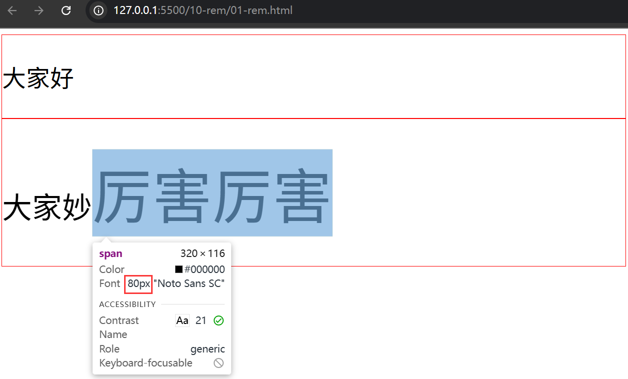
.div2 p span{
font-size: 2em;
}
</style>
</head>
<body>
<div class="div1">
<p>大家好</p>
</div>
<div class="div2">
<p>大家妙<span>厉害厉害</span></p>
</div>
</body>
</html>
|
效果:
2. rem布局准备
2.1 font-size基准
使用如下一行JS代码将根元素 html 的字体大小进行自动参与像素计算,适应屏幕大小。
动态计算的font-size值 = 当前设备的CSS布局宽度 / 物理分辨率(即设计稿量取宽度) * 基准font-size
1
2
3
4
| html{
font-size: 100px;
}
|
如 以 iphone6 为基准,设备像素宽度是 750px,缩放比是2(因浏览器中仿真模拟为 375px 或 用 window.devicePixelRatio 查看结果)
- 因为
缩放比是2,所以计算 font-size 使用 750/2 = 375px
- 因为前提使用
750px设计稿,所以可以量取多少就写多少px -> 转 rem 即可适配移动端不同设备
1
2
3
4
| <script>
document.documentElement.style.fontSize = document.documentElement.clientWidth/375 * 100 + 'px';
</script>
|
示例:
1
2
3
4
5
6
7
8
9
10
11
12
13
14
15
16
17
18
19
20
21
22
23
24
25
26
27
28
29
30
31
32
33
34
35
36
| <!DOCTYPE html>
<html lang="en">
<head>
<meta charset="UTF-8">
<meta name="viewport" content="width=device-width, initial-scale=1.0">
<title>Document</title>
<style>
*{
margin: 0;
padding: 0;
}
html{
font-size: 100px;
}
body{
font-size: 16px;
}
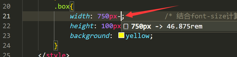
.box{
width: 7.5rem;
height: 100px;
background: yellow;
}
</style>
<script>
document.documentElement.style.fontSize = document.documentElement.clientWidth/750 * 100 + 'px';
</script>
</head>
<body>
<div class="box"></div>
<p>哈哈哈</p>
</body>
</html>
|
PS:JS需要加载,需要手动刷新页面。
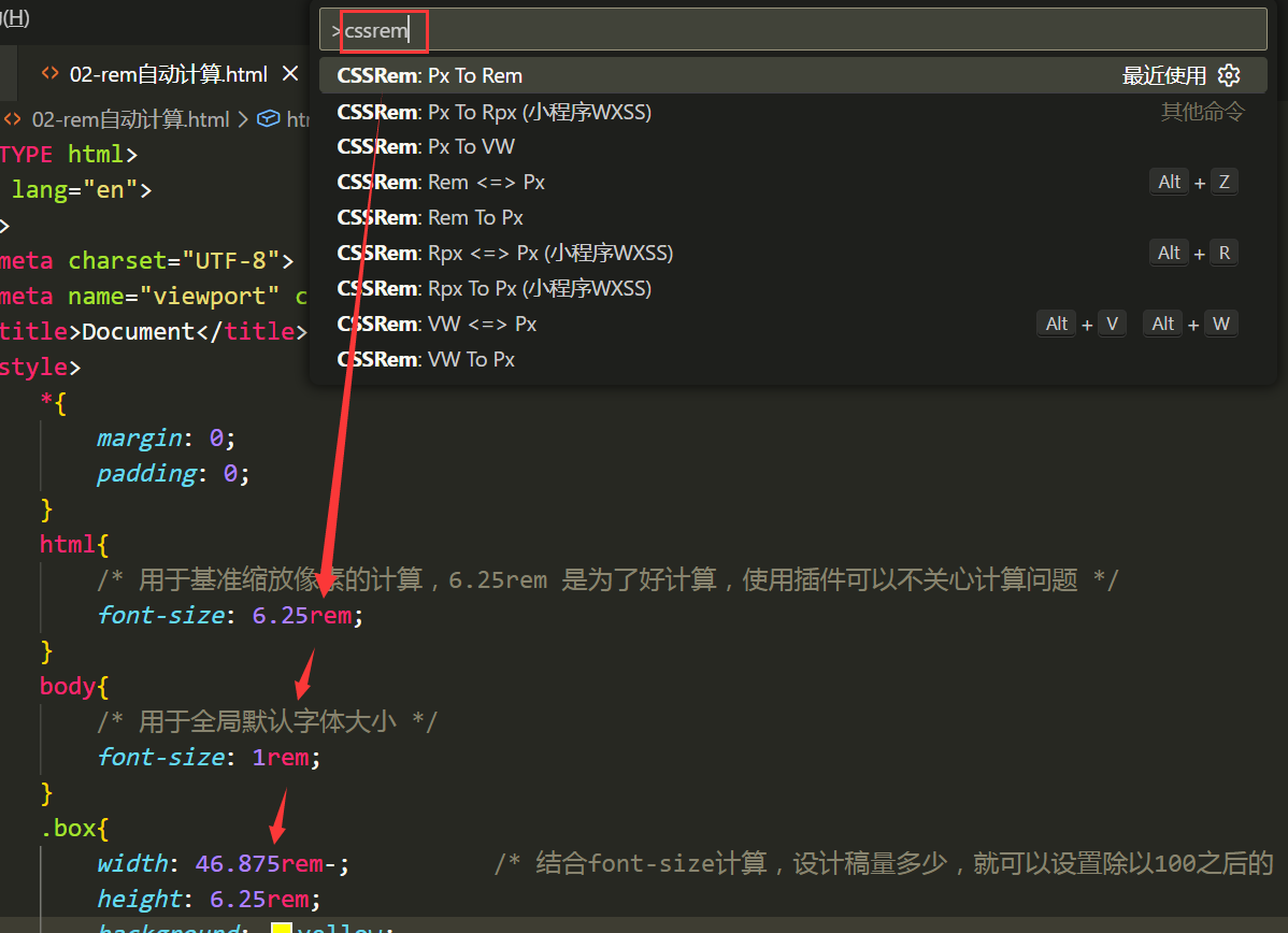
2.2 rem计算插件
插件名称:px to rem & rpx & vw (cssrem)
使用方式:
方式①
- 快捷键【Alt+Z】可以快速转换单个属性 或者 整个文档的 px->rem
方式②
方式③
- 按 F1 搜索 cssrem,回车,则会把页面中的所有尺寸进行计算转换为 rem 单位。
案例:足球圈首页rem改造
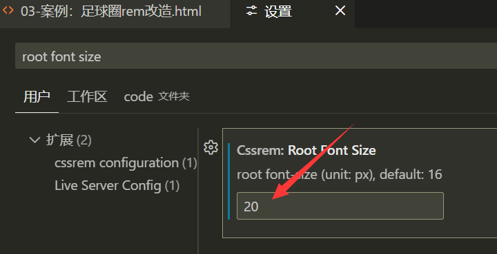
此处基准值修改为 20px了,留意!默认值是 16px
特殊说明:
1
2
3
4
5
6
| <script>
//font-size 计算:当前设备的CSS布局宽度 / 物理分辨率(即设计稿量取宽度) * 基准font-size
//改造说明:rem转换后会有问题,因为之前足球圈的尺寸已经是除以2后的值,所以使用量取值缩小2倍,即 640->320
//如果量取的像素值是1:1使用的,则此处就按照量取尺寸取值,即 640而不是320
document.documentElement.style.fontSize = document.documentElement.clientWidth/320 * 20 + 'px';
</script>
|
改造后:
1
2
3
4
5
6
7
8
9
10
11
12
13
14
15
16
17
18
19
20
21
22
23
24
25
26
27
28
29
30
31
32
33
34
35
36
37
38
39
40
41
42
43
44
45
46
47
48
49
50
51
52
53
54
55
56
57
58
59
60
61
62
63
64
65
66
67
68
69
70
71
72
73
74
75
76
77
78
79
80
81
82
83
84
85
86
87
88
89
90
91
92
93
94
95
96
97
98
99
100
101
102
103
104
105
106
107
108
109
110
111
112
113
114
115
116
117
118
119
120
121
122
123
124
125
126
127
128
129
130
131
132
133
134
135
136
137
138
139
140
141
142
143
144
145
146
147
148
149
150
151
152
153
154
155
156
157
158
159
160
161
162
163
164
165
166
167
168
169
170
171
172
173
174
175
176
177
178
179
180
181
182
183
184
185
186
187
188
189
190
191
192
193
194
195
196
197
198
199
200
201
202
203
204
205
206
207
208
209
210
211
212
213
214
215
216
217
218
219
220
221
222
223
224
225
| <!DOCTYPE html>
<html lang="en">
<head>
<meta charset="UTF-8">
<meta name="viewport" content="width=device-width, initial-scale=1.0">
<title>Document</title>
<link rel="stylesheet" href="../08-css3/font_5078037_fsrix9gsee/iconfont.css">
<style>
*{
margin: 0;
padding: 0;
}
ul{
list-style: none;
}
html,body{
height: 100%;
}
html{
font-size: 20px;
}
body{
display: flex;
flex-direction: column;
font-size: 1rem;
}
header{
height: 2.75rem;
background: green;
display: flex;
justify-content: center;
align-items: center;
}
header div{
width: 3.75rem;
height: 1.5625rem;
line-height: 1.5625rem;
text-align: center;
color: white;
}
header div:nth-child(1){
border-radius: .75rem 0 0 .75rem;
background: lightgreen;
}
header div:nth-child(2){
border-radius: 0 .75rem .75rem 0;
background: #a9e4b4;
}
section{
flex: 1;
overflow: auto;
}
section ul{
display: flex;
position: sticky;
top: 0;
background: white;
}
section ul li{
flex: 1;
text-align: center;
height: 2.1875rem;
line-height: 2.1875rem;
border-bottom: .0625rem solid #d9d9d9;
color: gray;
font-size: .875rem;
}
section ul li:nth-child(1) {
color: #08c63e;
}
section ul li:hover{
border-bottom: .125rem solid #08c63e;
color: #08c63e;
}
section .list{
display: flex;
flex-wrap: wrap;
justify-content: space-between;
}
section .list>div{
width: 49%;
margin-top: .25rem;
border: .0625rem solid gray;
}
section .list>div img{
width: 100%;
}
section .list>div p{
height: 1.875rem;
line-height: 1.875rem;
text-indent: .625rem;
}
footer{
height: 2.75rem;
background: white;
}
footer ul{
display: flex;
height: 100%;
}
footer ul li{
flex: 1;
display: flex;
flex-direction: column;
justify-content: center;
color: gray;
}
footer ul li:nth-child(1) {
color: #08c63e;
}
footer ul li i{
height: 1.3125rem;
line-height: 1.3125rem;
text-align: center;
font-size: 1rem;
}
footer ul li span{
height: 1.0625rem;
line-height: 1.0625rem;
text-align: center;
font-size: .75rem;
}
footer ul li:hover{
color: #08c63e;
}
footer ul li:nth-child(3) {
position: relative;
}
footer ul li:nth-child(3) i{
width: 3.125rem;
height: 3.125rem;
border: .0625rem solid gray;
border-radius: 50%;
position: absolute;
left: 50%;
margin-left: -1.625rem;
top: -0.5rem;
font-size: 1.875rem;
text-align: center;
line-height: 3.125rem;
background: white;
}
.iconfont{
font-size: .8rem;
}
</style>
<script>
document.documentElement.style.fontSize = document.documentElement.clientWidth/320 * 20 + 'px';
</script>
</head>
<body>
<header>
<div>热点</div>
<div>关注</div>
</header>
<section>
<ul>
<li>足球现场</li>
<li>足球生活</li>
<li>足球美女</li>
</ul>
<div class="list">
<div>
<img src="../08-css3/img/2.png" alt="">
<p>大家好</p>
</div>
<div><img src="../08-css3/img/2.png" alt="">
<p>大家好</p></div>
<div><img src="../08-css3/img/2.png" alt="">
<p>大家好</p></div>
<div><img src="../08-css3/img/2.png" alt="">
<p>大家好</p></div>
<div><img src="../08-css3/img/2.png" alt="">
<p>大家好</p></div>
<div><img src="../08-css3/img/2.png" alt="">
<p>大家好</p></div>
<div><img src="../08-css3/img/2.png" alt="">
<p>大家好</p></div>
</div>
</section>
<footer>
<ul>
<li>
<i class="iconfont icon-anquan"></i>
<span>首页</span>
</li>
<li><i class="iconfont icon-daka"></i>
<span>发现</span></li>
<li><i class="iconfont icon-fenxiang"></i></li>
<li><i class="iconfont icon-fapiao"></i>
<span>我的</span></li>
<li><i class="iconfont icon-houtai"></i>
<span>退出</span></li>
</ul>
</footer>
</body>
</html>
|
3. vh与vw单位
与 rem 一样,不使用 js 实现等比例缩放布局。
1
2
3
4
5
6
7
8
9
10
11
12
13
14
15
| <style>
*{
margin: 0;
padding: 0;
}
div{
width: 100vw;
height: 100vh;
background: yellow;
}
</style>
|
26.67vw 等同于 100px 的基准font-size值,转换后的 rem 则就能够等比缩放。
1
2
3
4
5
6
7
8
9
10
11
12
13
14
15
16
17
18
19
| <style>
*{
margin: 0;
padding: 0;
}
html{
font-size: 26.67vw;
}
div{
width: 3.75rem;
height: 100px;
background: yellow;
}
</style>
|
足球圈案例继续改造:
1
2
3
4
5
6
7
8
9
10
11
| html{
font-size: 5vw;
}
.iconfont{
font-size: 1rem;
}
|
面试题:
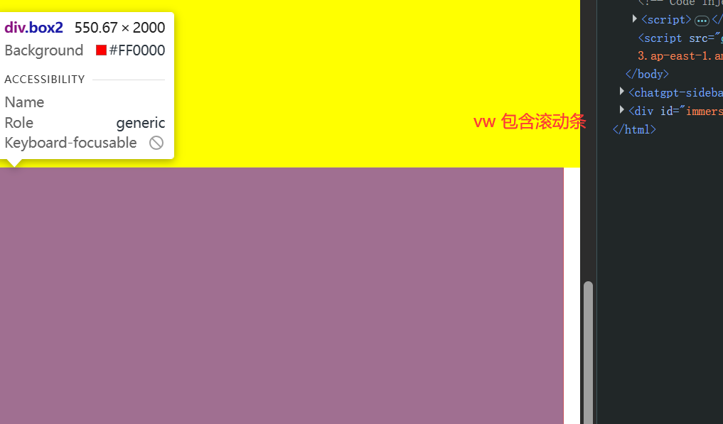
- 没有滚动条的时候:100vw = 100%
- 有滚动条的时候:100vw包含滚动条,即窗口大小;100%刨除滚动条后剩余空间占满。
1
2
3
4
5
6
7
8
9
10
11
12
13
14
15
16
17
18
19
20
21
22
23
24
25
26
27
28
29
30
31
32
33
34
| <!DOCTYPE html>
<html lang="en">
<head>
<meta charset="UTF-8">
<meta name="viewport" content="width=device-width, initial-scale=1.0">
<title>Document</title>
<style>
*{
margin: 0;
padding: 0;
}
.box1{
width: 100vw;
height: 2000px;
background: yellow;
}
.box2{
width: 100%;
height: 2000px;
background: red;
}
</style>
</head>
<body>
<div class="box1"></div>
<div class="box2"></div>
</body>
</html>
|
效果: