参考资料:
1. 渐变 gradient
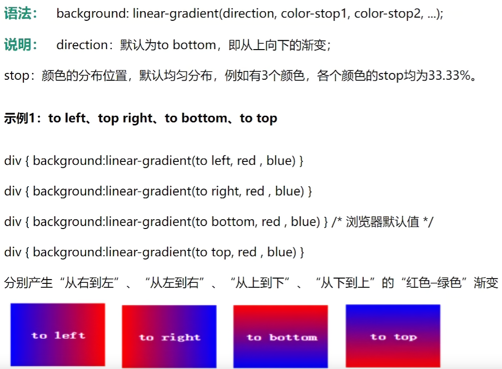
CSS3渐变(gradient)可以让你在两个或多个指定的颜色之间显示平稳的过渡。
渐变效果的元素在放大时看起来效果更好,因为渐变是浏览器生成的。
1.1 线性渐变
background: linear-gradient(...)
1
| background: linear-gradient(direction, color-stop1, color-stop2, ...);
|
1
2
3
4
5
6
7
8
9
10
11
12
13
14
15
16
17
| <style>
div{
width: 300px;
height: 300px;
border: 10px solid gray;
background: linear-gradient(90deg, red, green);
}
</style>
|
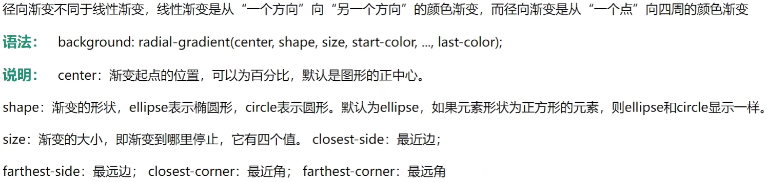
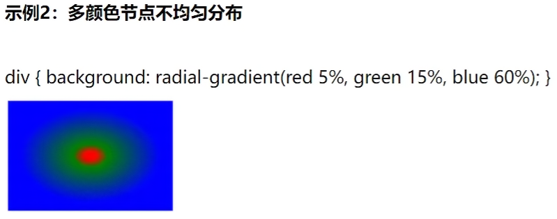
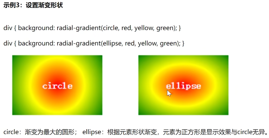
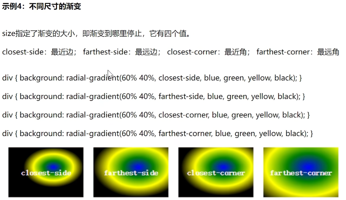
1.2 径向渐变
background: radial-gradient(...)
1
| background: radial-gradient(center, shape, size, start-color, ..., last-color);
|

1
2
3
4
5
6
7
8
9
10
11
12
13
14
15
16
17
18
19
20
21
22
23
24
25
26
27
28
29
30
31
32
33
34
| <!DOCTYPE html>
<html lang="en">
<head>
<meta charset="UTF-8">
<meta name="viewport" content="width=device-width, initial-scale=1.0">
<title>Document</title>
<style>
.box1{
width: 300px;
height: 300px;
border: 5px solid gray;
background: radial-gradient(red 50%, green 50%);
}
.box2{
width: 300px;
height: 100px;
border: 5px solid gray;
background: -webkit-radial-gradient(60% 40%, closest-side, blue, green, yellow, black);
}
</style>
</head>
<body>
<div class="box1"></div>
<div class="box2"></div>
</body>
</html>
|
扩展知识:-webkit-内核标记
WebKit 内核浏览器中实现的私有或实验性属性。
作用与原理 当 CSS 新特性尚未完全标准化时,不同浏览器厂商会先行实现,并通过加上特定前缀来避免与未来标准冲突。 例如:
-webkit- → WebKit/Blink 内核(Safari、Chrome 等)
-moz- → Gecko 内核(Firefox)
-ms- → Trident/EdgeHTML(IE/旧版 Edge)
1.3 重复渐变
background: repeating-linear-gradient(...)
background: repeating-radial-gradient(...)

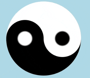
案例:画太极图
1
2
3
4
5
6
7
8
9
10
11
12
13
14
15
16
17
18
19
20
21
22
23
24
25
26
27
28
29
30
31
32
33
34
35
36
37
38
39
40
41
42
43
44
| <!DOCTYPE html>
<html lang="en">
<head>
<meta charset="UTF-8">
<meta name="viewport" content="width=device-width, initial-scale=1.0">
<title>Document</title>
<style>
body{
background: lightblue;
}
div{
width: 200px;
height: 200px;
background: linear-gradient(white 50%, black 50%);
margin: 10px auto;
display: flex;
align-items: center;
border-radius: 50%;
}
div::before{
content: "";
width: 100px;
height: 100px;
background: radial-gradient(white 25%, black 30%);
display: block;
border-radius: 50%;
}
div::after{
content: "";
width: 100px;
height: 100px;
background: radial-gradient(black 25%, white 30%);
display: block;
border-radius: 50%;
}
</style>
</head>
<body>
<div></div>
</body>
</html>
|
效果:

当我以为 css 中 用了 before 和 after 后会多了个div标签 id=”immersive-translate-browser-popup”,实际情况不是。
我看到的 <div id="immersive-translate-browser-popup"> 是 “沉浸式翻译” 插件、”浮图秀”插件为了实现翻译弹窗、悬浮按钮等功能,自动向页面注入的 DOM 节点,和代码逻辑无关。
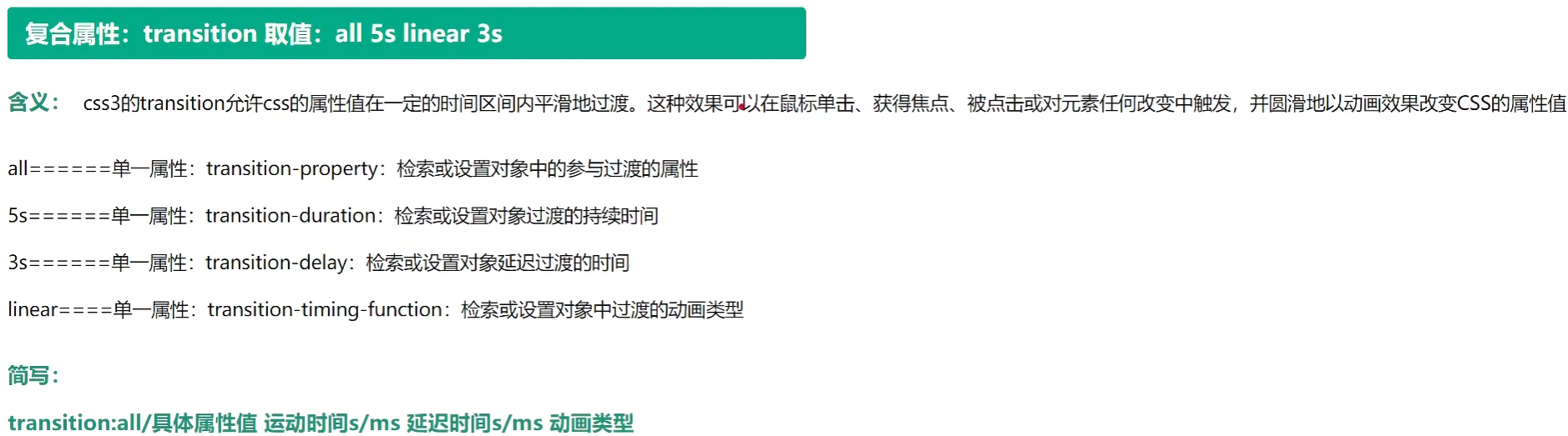
2. 过渡 transition
2.1 语法
transition 取值示例:all 5s linear 3s
1
| transition: all 5s linear 3s;
|
参数,同时也是独立属性:
- transition-property,如all,设置参与过渡的属性
- 独立属性使用时,可监测多个,如 transition-property: height background;
- transition-duration,如5s,动画持续时间 s/ms
- transition-timing-function,如linear,线性匀速
- transition-delay,如3s,延迟时间 s/ms
注意:
- 不支持 display:none/block; 这个属性。
- 放在元素标签的样式里,而不是 :hover 的样式里(hover里会丢失鼠标移开后动画效果)
示例:
1
2
3
4
5
6
7
8
9
10
11
12
13
14
| <style>
div{
width: 200px;
height: 200px;
background: red;
transition: all 5s linear 2s;
}
div:hover{
width: 400px;
height: 600px;
background: yellow;
}
</style>
|
不支持 display:none/block 属性的示例:替换为 height:0 和 overflow:hidden; 来默认隐藏。
1
2
3
4
5
6
7
8
9
10
11
12
13
14
15
16
17
18
19
20
21
22
23
24
25
26
27
28
29
30
31
32
33
34
35
36
| <!DOCTYPE html>
<html lang="en">
<head>
<meta charset="UTF-8">
<meta name="viewport" content="width=device-width, initial-scale=1.0">
<title>Document</title>
<style>
div{
width: 200px;
height: 30px;
background: yellow;
}
div ul{
transition: all 1s;
height: 0;
overflow: hidden;
}
div:hover ul{
height: 100px;
}
</style>
</head>
<body>
<div>
我的菜单
<ul>
<li>111</li>
<li>222</li>
<li>333</li>
<li>444</li>
</ul>
</div>
</body>
</html>
|
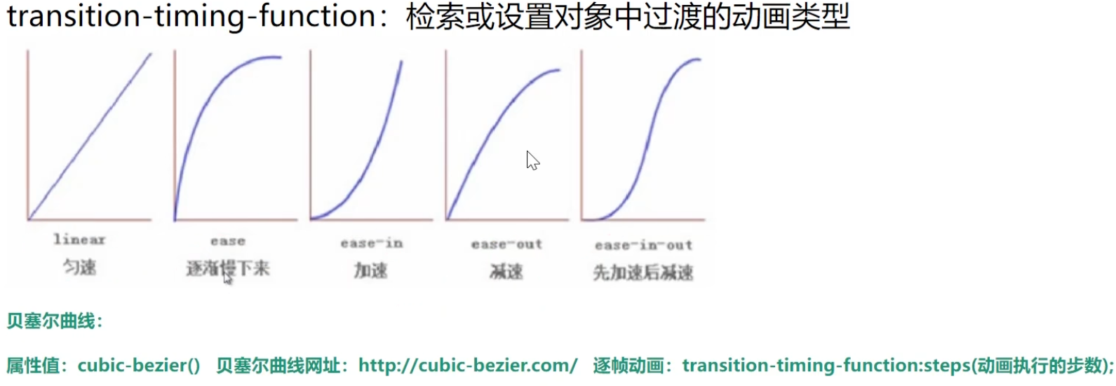
2.2 动画效果
第三个参数:transition-timing-function
- cubic-bezier(v1, v2, v3, v4) 使用贝赛尔曲线值
1
| transition: all 2s cubic-bezier(.13,1.26,.26,-0.37);
|
演示:
1
2
3
4
5
6
7
8
9
10
11
12
13
14
15
16
17
18
19
20
21
22
23
24
25
26
27
28
29
30
31
32
33
34
35
36
37
38
39
40
41
42
43
44
45
46
47
48
49
50
51
52
53
| <!DOCTYPE html>
<html lang="en">
<head>
<meta charset="UTF-8">
<meta name="viewport" content="width=device-width, initial-scale=1.0">
<title>Document</title>
<style>
ul{
list-style: none;
}
li{
width: 200px;
height: 50px;
border: 1px solid gray;
}
ul:hover li:nth-child(1) {
width: 600px;
transition: all 2s linear;
}
ul:hover li:nth-child(2) {
width: 600px;
transition: all 2s ease;
}
ul:hover li:nth-child(3) {
width: 600px;
transition: all 2s ease-in;
}
ul:hover li:nth-child(4) {
width: 600px;
transition: all 2s ease-out;
}
ul:hover li:nth-child(5) {
width: 600px;
transition: all 2s ease-in-out;
}
ul:hover li:nth-child(6) {
width: 600px;
transition: all 2s cubic-bezier(.13,1.26,.26,-0.37);
}
</style>
</head>
<body>
<ul>
<li>线性=匀速</li>
<li>放缓</li>
<li>进入时放缓</li>
<li>退出时放缓</li>
<li>进入和退出都放缓</li>
<li>贝塞尔曲线:https://cubic-bezier.com/</li>
</ul>
</body>
</html>
|
动画曲线-贝塞尔曲线:https://cubic-bezier.com/
贝塞尔曲线是一种通过控制点生成光滑曲线的数学参数曲线,广泛应用于计算机图形学和设计领域。
贝塞尔曲线广泛应用于各种绘图相关的软件中,甚至计算机中的字体设计就全靠贝塞尔曲线来控制。

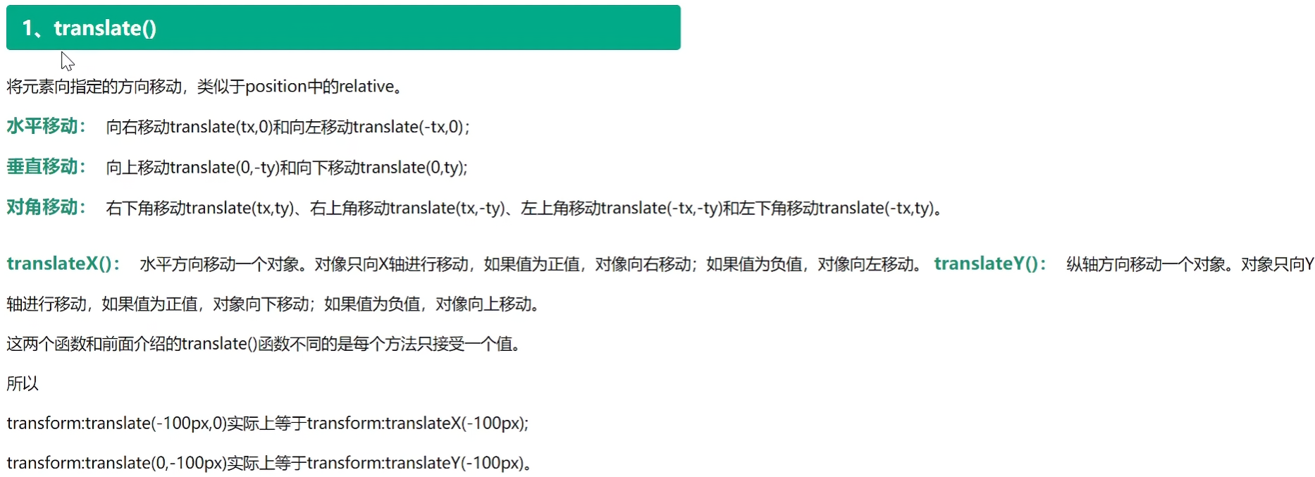
3.1 translate() 位移
transform: translate(x, y); 等同于 transform: translateX(x) translateY(y);
将元素向指定的方向移动,类似于 position 中的 ralative (相对定位)。
- translate,两个参数对应x轴,y轴
- translateX,对应x轴移动
- translateY,对应y轴移动
1
2
3
4
5
6
7
8
9
10
11
12
13
14
15
16
17
18
19
20
21
22
23
| <!DOCTYPE html>
<html lang="en">
<head>
<meta charset="UTF-8">
<meta name="viewport" content="width=device-width, initial-scale=1.0">
<title>Document</title>
<style>
div{
width: 200px;
height: 200px;
background: red;
margin: 0 auto;
}
div:hover{
transform: translate(100px, 100px);
}
</style>
</head>
<body>
<div></div>
</body>
</html>
|
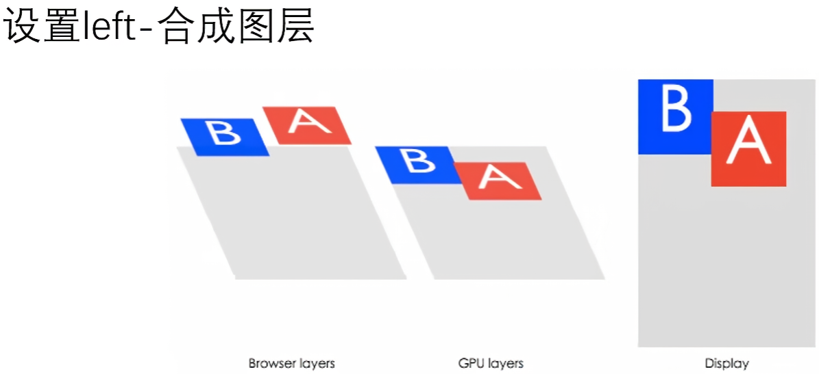
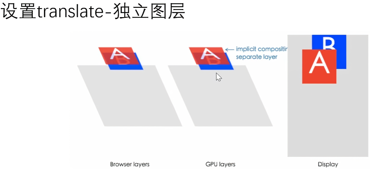
如果使用 position 定位后,去设置 left 属性偏移,会频繁造成浏览器回流重排,而 transform 和 opacity 属性不会,因为它是作为合成图层发送到GPU上,由显卡执行的渲染,这样做的优化如下:
- 可以通过亚像素精度得到一个运行在特殊优化过的单位图形任务上的平滑动画,并且运行非常快
- 动画不再绑定到CPU重排,而是通过GPU合成图像。即使运行一个非常复杂的 JavaScript 任务,动画仍然会很快运行。
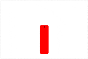
3.2 scale() 缩放
transform: scale(x, y); 等同于 transform: scaleX(x) scaleY(y);
支持负值,倒立放大效果(图片会上下翻转了)。
transform-origin: right top; 改变 scale 缩放中心点的位置。
取值:
- left
- right
- top
- bottom
- center
- left top
- left bottom
- right top
- right bottom
1
2
3
4
5
6
7
8
9
10
11
12
13
14
15
16
17
18
19
20
21
22
23
24
25
26
27
28
29
30
31
32
33
| <!DOCTYPE html>
<html lang="en">
<head>
<meta charset="UTF-8">
<meta name="viewport" content="width=device-width, initial-scale=1.0">
<title>Document</title>
<style>
div{
width: 500px;
border: 5px solid gray;
margin: 50px auto;
}
div img{
width: 100%;
transition: all 1s;
transform-origin: right top;
}
div:hover img{
transform: scale(1.5);
}
</style>
</head>
<body>
<div>
<img src="../08-css3/img/banner.png" alt="">
</div>
</body>
</html>
|
3.3 rotate() 旋转
transform: rotate(角度) 角度取值正负均可,正-顺时针,负-逆时针。
- rotate,绕中心点平面旋转
- rotateX,绕 X 轴立体旋转
- rotateY,绕 Y 轴立体旋转
- rotateZ,等价于 rotate
说明:同样也只是 transform-origin 改变旋转中心点的位置。
示例:太极图鼠标放上去旋转
1
2
3
4
5
6
7
8
9
10
11
12
13
14
15
16
17
18
19
20
21
22
23
24
25
26
27
28
29
30
31
32
33
34
35
36
37
38
39
40
41
42
43
44
45
46
47
48
49
50
51
52
| <!DOCTYPE html>
<html lang="en">
<head>
<meta charset="UTF-8">
<meta name="viewport" content="width=device-width, initial-scale=1.0">
<title>Document</title>
<style>
body{
background: lightblue;
}
div{
width: 200px;
height: 200px;
background: linear-gradient(white 50%, black 50%);
margin: 10px auto;
display: flex;
align-items: center;
border-radius: 50%;
transition: all 2s;
transform: rotate(0deg);
}
div:hover{
transform: rotate(360deg);
}
div::before{
content: "";
width: 100px;
height: 100px;
background: radial-gradient(white 25%, black 30%);
display: block;
border-radius: 50%;
}
div::after{
content: "";
width: 100px;
height: 100px;
background: radial-gradient(black 25%, white 30%);
display: block;
border-radius: 50%;
}
</style>
</head>
<body>
<div></div>
</body>
</html>
|
效果:
案例:折扇打开效果
1
2
3
4
5
6
7
8
9
10
11
12
13
14
15
16
17
18
19
20
21
22
23
24
25
26
27
28
29
30
31
32
33
34
35
36
37
38
39
40
41
42
43
44
45
46
47
48
49
50
51
52
53
54
55
56
57
58
59
60
61
62
63
64
65
66
67
68
69
70
71
72
73
74
75
76
77
78
79
80
81
82
83
84
85
86
87
88
89
90
91
92
93
94
95
96
97
98
99
100
101
102
103
104
105
106
107
108
109
110
111
112
113
114
115
116
117
118
119
120
121
122
123
124
125
126
127
128
129
130
131
| <!DOCTYPE html>
<html lang="en">
<head>
<meta charset="UTF-8">
<meta name="viewport" content="width=device-width, initial-scale=1.0">
<title>Document</title>
<style>
*{
margin: 0;
padding: 0;
}
ul{
list-style: none;
}
ul{
margin: 10px auto;
width: 600px;
height: 400px;
border: 1px dashed gray;
position: relative;
}
li{
width: 60px;
height: 200px;
position: absolute;
left: 50%;
margin-left: -30px;
bottom: 30px;
text-align: center;
border-radius: 10px;
transform-origin: bottom center;
transition: all 1s;
}
ul li:not(:nth-child(7)) {
opacity: 0;
}
ul:hover li{
opacity: 1;
}
ul li:nth-child(1), ul li:nth-child(13) {
background: purple;
}
ul li:nth-child(2), ul li:nth-child(12) {
background: pink;
}
ul li:nth-child(3), ul li:nth-child(11) {
background: deepskyblue;
}
ul li:nth-child(4), ul li:nth-child(10) {
background: green;
}
ul li:nth-child(5), ul li:nth-child(9) {
background: lightcoral;
}
ul li:nth-child(6), ul li:nth-child(8) {
background: yellow;
}
ul li:nth-child(7) {
background: red;
}
ul:hover li:nth-child(1) {
transform: rotate(90deg);
}
ul:hover li:nth-child(13) {
transform: rotate(-90deg);
}
ul:hover li:nth-child(2) {
transform: rotate(75deg);
}
ul:hover li:nth-child(12) {
transform: rotate(-75deg);
}
ul:hover li:nth-child(3) {
transform: rotate(60deg);
}
ul:hover li:nth-child(11) {
transform: rotate(-60deg);
}
ul:hover li:nth-child(4) {
transform: rotate(45deg);
}
ul:hover li:nth-child(10) {
transform: rotate(-45deg);
}
ul:hover li:nth-child(5) {
transform: rotate(30deg);
}
ul:hover li:nth-child(9) {
transform: rotate(-30deg);
}
ul:hover li:nth-child(6) {
transform: rotate(15deg);
}
ul:hover li:nth-child(8) {
transform: rotate(-15deg);
}
</style>
</head>
<body>
<ul>
<li>1</li>
<li>2</li>
<li>3</li>
<li>4</li>
<li>5</li>
<li>6</li>
<li>7</li>
<li>8</li>
<li>9</li>
<li>10</li>
<li>11</li>
<li>12</li>
<li>13</li>
</ul>
</body>
</html>
|
效果:
多属性并用问题
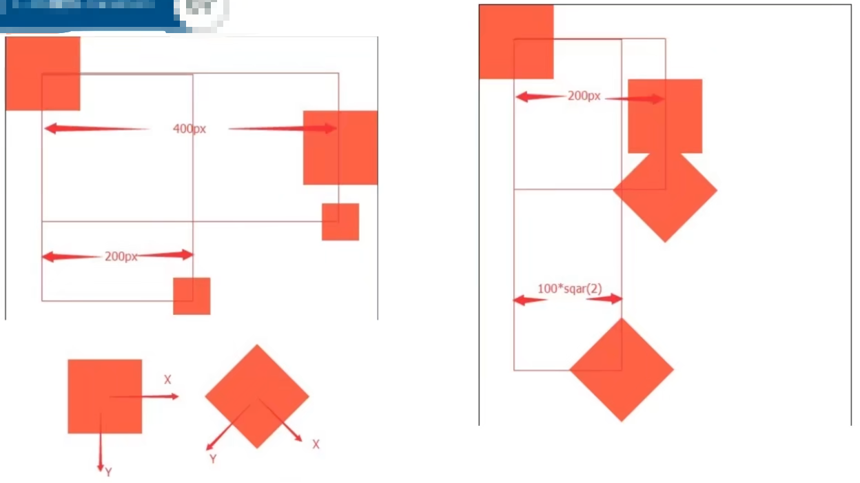
核心:位移 translate(...) 属性写在前面,否则会导致与预期结果不一致的问题。
正例:
1
2
3
4
|
transform: translateX(400px) scale(0.5);
transform: translateX(400px) rotate(45deg);
|
图示:
示例1:
1
2
3
4
5
6
7
8
9
10
11
12
13
14
15
16
17
18
19
20
21
22
23
24
25
26
27
28
29
30
31
32
33
34
35
36
37
38
39
| <!DOCTYPE html>
<html lang="en">
<head>
<meta charset="UTF-8">
<meta name="viewport" content="width=device-width, initial-scale=1.0">
<title>Document</title>
<style>
.box{
width: 600px;
height: 600px;
border: 2px solid gray;
}
.box div{
width: 200px;
height: 200px;
background: red;
border: 1px solid black;
}
.box div:nth-child(1){
transform: translateX(400px);
}
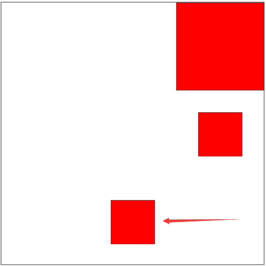
.box div:nth-child(2){
transform: translateX(400px) scale(0.5);
}
.box div:nth-child(3){
transform: scale(0.5) translateX(400px);
}
</style>
</head>
<body>
<div class="box">
<div></div>
<div></div>
<div></div>
</div>
</body>
</html>
|
效果:
示例2:
1
2
3
4
5
6
7
8
9
10
11
12
13
14
15
16
17
18
19
20
21
22
23
24
25
26
27
28
29
30
31
32
33
34
35
36
37
38
39
| <!DOCTYPE html>
<html lang="en">
<head>
<meta charset="UTF-8">
<meta name="viewport" content="width=device-width, initial-scale=1.0">
<title>Document</title>
<style>
.box{
width: 600px;
height: 600px;
border: 2px solid gray;
}
.box div{
width: 200px;
height: 200px;
background: red;
border: 1px solid black;
}
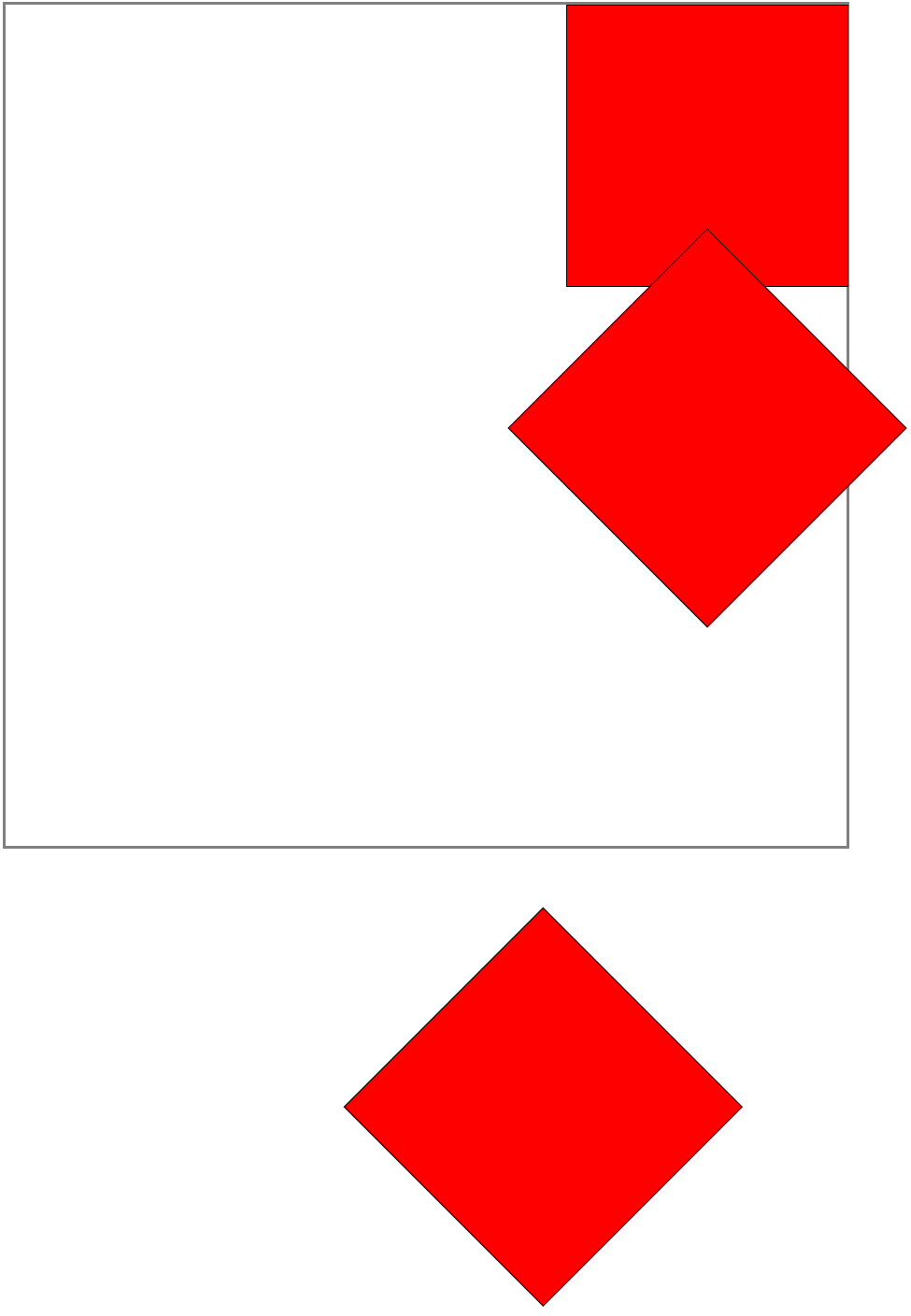
.box div:nth-child(1){
transform: translateX(400px);
}
.box div:nth-child(2){
transform: translateX(400px) rotate(45deg);
}
.box div:nth-child(3){
transform: rotate(45deg) translateX(400px);
}
</style>
</head>
<body>
<div class="box">
<div></div>
<div></div>
<div></div>
</div>
</body>
</html>
|
效果:
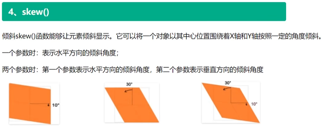
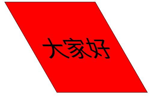
3.4 skew() 倾斜
transform: skew(角度) 让元素倾斜显示。正负值均可。
- skew,正值,拽右下角,往X轴Y轴即右下角拉动;负值则反方向
- skewX,正值,拽右下角,往X轴右边拉动,拉到倾斜角度;负值则反方向
- skewY,正值,拽右下角,往Y轴下边拉动,拉到倾斜角度;负值则反方向
1
2
3
4
5
6
7
8
9
10
11
12
13
14
15
16
17
18
19
20
21
22
23
24
25
| <!DOCTYPE html>
<html lang="en">
<head>
<meta charset="UTF-8">
<meta name="viewport" content="width=device-width, initial-scale=1.0">
<title>Document</title>
<style>
div {
width: 200px;
height: 200px;
background: red;
line-height: 200px;
text-align: center;
border: 1px solid black;
font-size: 50px;
margin: 0 auto;
transform: skewX(30deg);
}
</style>
</head>
<body>
<div>大家好</div>
</body>
</html>
|
效果:
案例:明星资料卡动效1
1
2
3
4
5
6
7
8
9
10
11
12
13
14
15
16
17
18
19
20
21
22
23
24
25
26
27
28
29
30
31
32
33
34
35
36
37
38
39
40
41
42
43
44
45
46
47
48
49
50
51
52
53
54
55
56
57
58
59
60
61
62
63
64
65
66
67
68
69
70
71
72
73
74
75
76
77
78
79
80
81
82
83
84
85
86
87
88
89
90
91
92
93
94
95
96
97
98
| <!DOCTYPE html>
<html lang="en">
<head>
<meta charset="UTF-8">
<meta name="viewport" content="width=device-width, initial-scale=1.0">
<title>Document</title>
<style>
*{
margin: 0;
padding: 0;
}
html,body{
height: 100%;
}
img{
display: block;
}
.box{
width: 350px;
border: 5px solid gray;
margin: 0 auto;
position: relative;
overflow: hidden;
}
.box img{
width: 100%;
transition: all 1s;
}
.box:hover img{
transform: translateX(30px);
opacity: 0.5;
}
.box h2{
position: absolute;
left: 50px;
top: 10px;
color: white;
transition: all 1s 0.5s;
}
.box:hover h2{
transform: translateX(100px);
}
.box p{
width: 100px;
position: absolute;
left: 50px;
color: white;
background: blue;
transition: all 1s;
}
.box .p1{
top: 100px;
transform: translateY(400px);
}
.box:hover .p1{
transform: translateY(0);
}
.box .p2{
top: 150px;
transform: translateX(400px);
}
.box:hover .p2{
transform: translateX(0);
}
.box .p3{
top: 200px;
transform: translateX(-400px);
}
.box:hover .p3{
transform: translateX(0);
}
</style>
</head>
<body>
<div class="box">
<img src="./img/1.png" alt="">
<h2>这是一个标题</h2>
<p class="p1">111</p>
<p class="p2">222</p>
<p class="p3">333</p>
</div>
</body>
</html>
|
效果:
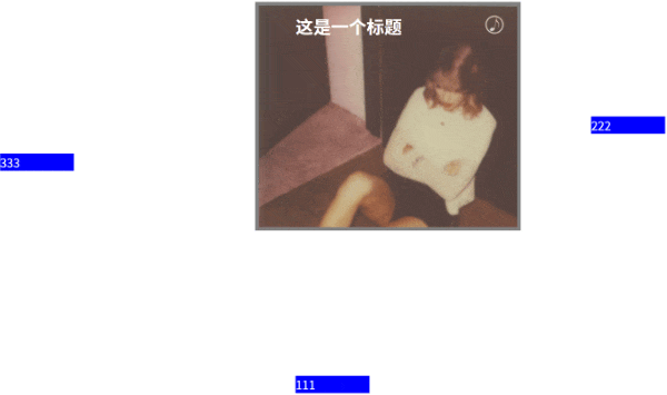
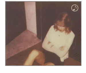
案例:明星资料卡动效2
1
2
3
4
5
6
7
8
9
10
11
12
13
14
15
16
17
18
19
20
21
22
23
24
25
26
27
28
29
30
31
32
33
34
35
36
37
38
39
40
41
42
43
44
45
46
47
48
49
50
51
52
53
54
55
56
57
58
59
60
61
62
63
64
65
66
67
68
69
70
71
72
73
74
75
76
77
78
79
80
81
82
83
84
85
86
87
88
89
90
91
92
93
94
95
96
97
98
99
100
101
102
103
104
105
106
| <!DOCTYPE html>
<html lang="en">
<head>
<meta charset="UTF-8">
<meta name="viewport" content="width=device-width, initial-scale=1.0">
<title>Document</title>
<style>
*{
margin: 0;
padding: 0;
}
html,body{
height: 100%;
}
img{
display: block;
}
.box{
width: 300px;
margin: 10px auto;
border: 2px solid gray;
position: relative;
overflow: hidden;
}
img,p,h2{
transition: all 0.5s;
}
.box .pic{
width: 100%;
transform: translateY(0);
}
.box:hover .pic{
transform: translateY(-30px);
opacity: 0.5;
}
.box h2{
position: absolute;
left: 20px;
top: 20px;
color: white;
transform: translateY(-300px);
opacity: 0;
}
.box:hover h2{
transform: translateY(0);
opacity: 1;
}
.box p{
position: absolute;
bottom: 30px;
left: 20px;
color: white;
transform: translateY(300px);
opacity: 0;
}
.box:hover p{
transform: translateY(0);
opacity: 1;
}
.box .musicBtn{
position: absolute;
top: 10px;
right: 10px;
width: 30px;
}
.box:hover .musicBtn{
transform: rotate(360deg);
}
</style>
</head>
<body>
<div class="box">
<img src="./img/1.png" alt="" class="pic">
<div>
<h2>Back To December</h2>
<p>Lorem, ipsum dolor sit amet consectetur adipisicing elit. Velit voluptatum, iure placeat quidem voluptatem modi dolores tenetur quam incidunt ad debitis corrupti tempora! Accusamus magni earum ipsam quis! Repellat, ipsum.</p>
</div>
<img src="./img/music.jpg" alt="" class="musicBtn">
</div>
</body>
</html>
|
效果: