
参考资料:
1. 关键帧动画
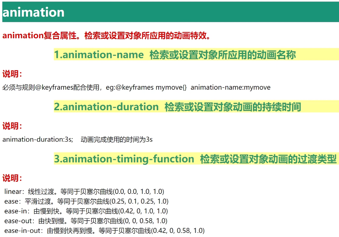
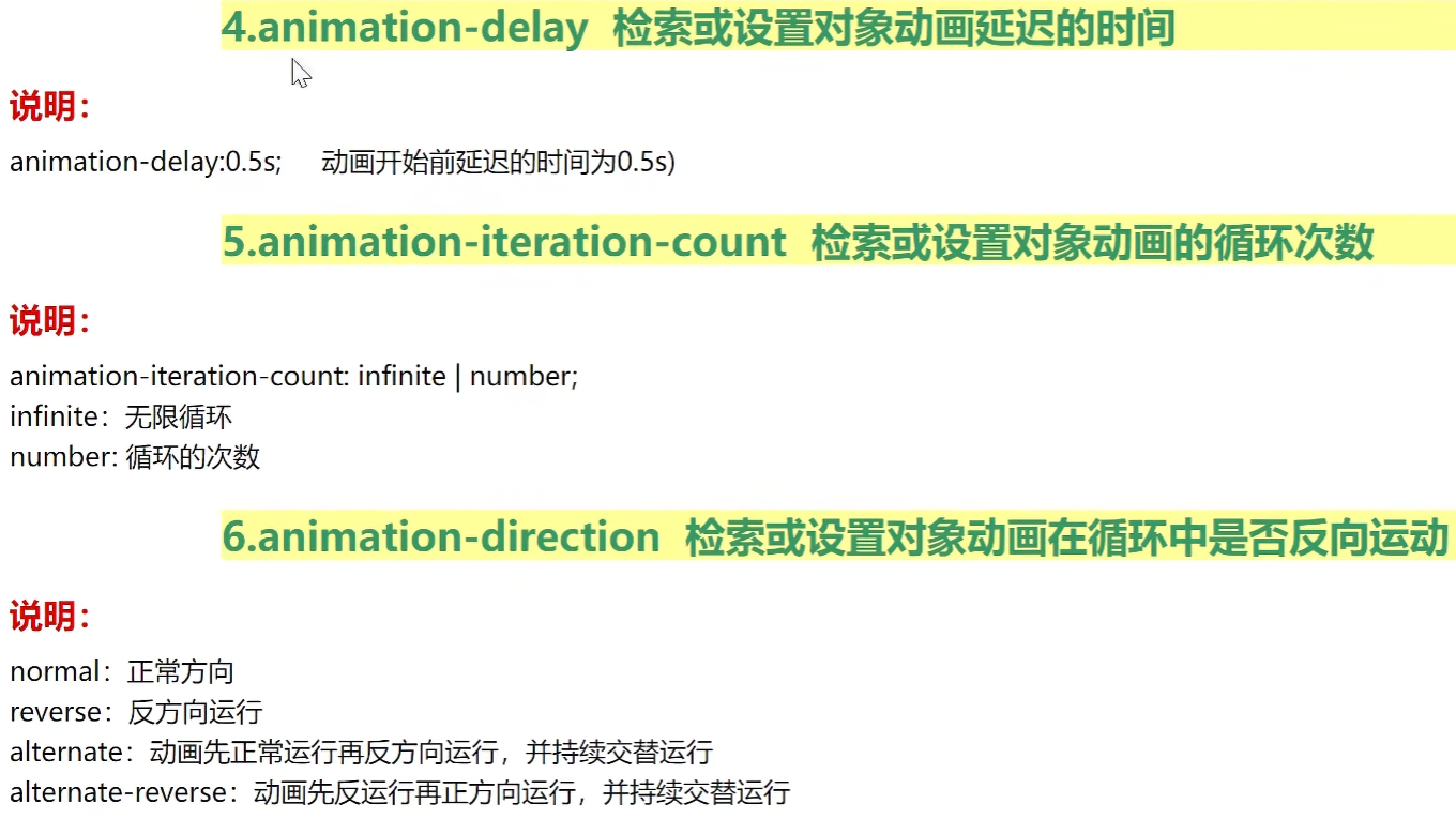
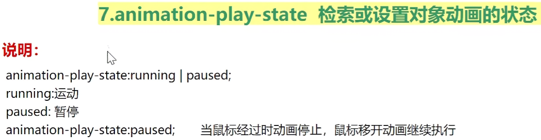
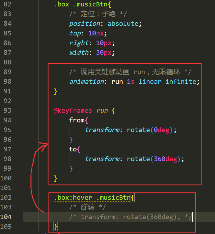
1.1 animation 复合属性
animation 用于创建动画效果。
1
2
3
4
5
6
7
8
9
10
11
12
13
14
15
16
17
18
19
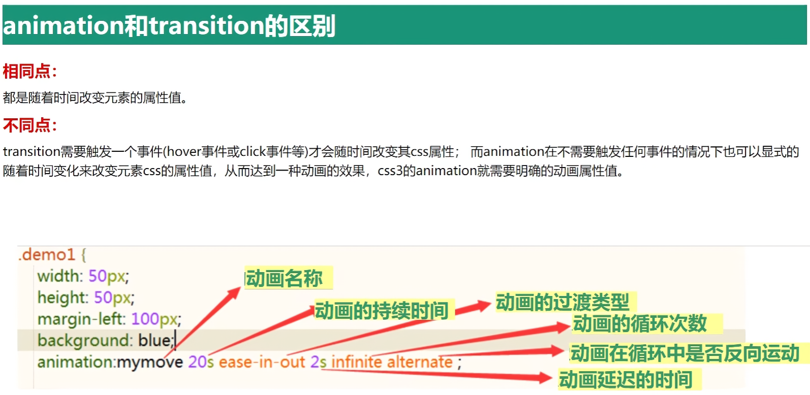
| animation: name duration timing-function delay iteration-count direction fill-mode;
animation: 名称 持续时间 过渡类型 [延迟时间] [循环次数] [循环中是否反向运动] [填充模式];
eg:
animation: myrun1 2s linear infinite;
animation: myrun1 2s linear 1s infinite;
animation: myrun1 0.5s linear forwards;
animation: run 0.5s linear forwards reverse;
@keyframes myrun1 {
from {
样式
}
to {
样式
}
}
|
特别说明:
- animation-fill-mode, 填充模式
- none,默认,不保留动画
- forwards,保留最后一帧,即最后画面
- backwards,保留第一帧,即初始画面
1.2 animation-xxx 单一属性
示例:基本用法
1
2
3
4
5
6
7
8
9
10
11
12
13
14
15
16
17
18
19
20
21
22
23
24
25
26
27
28
29
30
31
32
33
34
35
36
37
38
39
40
41
42
43
44
45
46
47
48
49
50
51
52
53
54
55
56
57
58
59
60
61
62
63
64
65
66
67
68
69
70
71
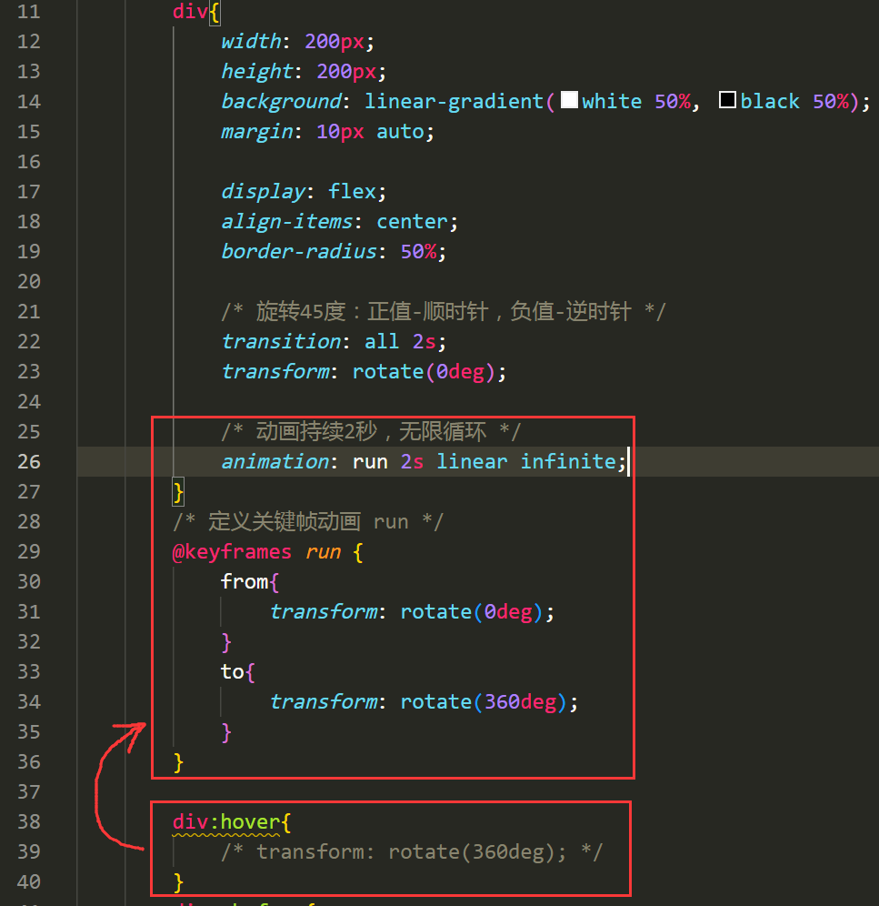
| <!DOCTYPE html>
<html lang="en">
<head>
<meta charset="UTF-8">
<meta name="viewport" content="width=device-width, initial-scale=1.0">
<title>Document</title>
<style>
div{
width: 200px;
height: 200px;
background: red;
animation: myrun1 2s linear 1s infinite;
}
@keyframes myrun1 {
from {
width: 200px;
height: 200px;
background: red;
}
to {
width: 400px;
height: 600px;
background: green;
}
}
@keyframes myrun2 {
0% {
width: 200px;
height: 200px;
background: red;
}
20% {
width: 200px;
height: 400px;
background: yellow;
}
50% {
width: 400px;
height: 400px;
background: blue;
}
72% {
width: 400px;
height: 600px;
background: gray;
}
to {
width: 400px;
height: 600px;
background: green;
}
}
</style>
</head>
<body>
<div></div>
</body>
</html>
|
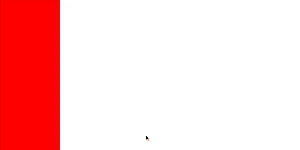
效果:

效果:

案例:抽屉效果
1
2
3
4
5
6
7
8
9
10
11
12
13
14
15
16
17
18
19
20
21
22
23
24
25
26
27
28
29
30
31
32
33
34
35
36
37
38
39
40
41
42
43
44
45
46
47
| <!DOCTYPE html>
<html lang="en">
<head>
<meta charset="UTF-8">
<meta name="viewport" content="width=device-width, initial-scale=1.0">
<title>Document</title>
<style>
*{
margin: 0;
padding: 0;
}
html,body{
height: 100%;
}
div{
height: 100%;
width: 200px;
background: red;
position: fixed;
left: 0;
top: 0;
transform: translateX(-100%);
animation: run 0.5s linear forwards;
}
@keyframes run {
from{
transform: translateX(-100%);
}
to{
transform: translateX(0);
}
}
</style>
</head>
<body>
<div></div>
</body>
</html>
|
效果:
案例:轮播图效果
1
2
3
4
5
6
7
8
9
10
11
12
13
14
15
16
17
18
19
20
21
22
23
24
25
26
27
28
29
30
31
32
33
34
35
36
37
38
39
40
41
42
43
44
45
46
47
48
49
50
51
52
53
54
55
56
57
58
59
60
61
62
63
64
65
66
67
68
69
70
71
72
73
74
75
76
77
78
79
80
81
82
83
84
| <!DOCTYPE html>
<html lang="en">
<head>
<meta charset="UTF-8">
<meta name="viewport" content="width=device-width, initial-scale=1.0">
<title>Document</title>
<style>
*{
margin: 0;
padding: 0;
}
.swiper-container{
width: 768px;
height: 240px;
margin: 10px auto;
overflow: hidden;
}
.swiper-container img{
width: 768px;
height: 240px;
}
.swiper-slide{
float: left;
}
.swiper-wrapper{
width: 9999px;
animation: swiperrun 10s infinite;
}
@keyframes swiperrun {
0%{
transform: translateX(0);
}
20%{
transform: translateX(0);
}
40%{
transform: translateX(-768px);
}
60%{
transform: translateX(-768px);
}
80%{
transform: translateX(-1536px);
}
100%{
transform: translateX(-1536px);
}
}
.swiper-wrapper:hover{
animation-play-state: paused;
}
</style>
</head>
<body>
<div class="swiper-container">
<div class="swiper-wrapper">
<div class="swiper-slide">
<img src="./img/1.jpg" alt="">
</div>
<div class="swiper-slide">
<img src="./img/2.jpg" alt="">
</div>
<div class="swiper-slide">
<img src="./img/3.jpg" alt="">
</div>
</div>
</div>
</body>
</html>
|
效果:

1.3 逐帧动画
steps(x, start|end) 逐帧动画参数,属于 animation-timing-function 参数的取值。
1
2
3
4
5
6
7
8
9
10
11
|
animation: run 5s steps(1, start);
animation: run 5s step-start;
animation: run 5s step-end;
|

代码:
1
2
3
4
5
6
7
8
9
10
11
12
13
14
15
16
17
18
19
20
21
22
23
24
25
26
27
28
29
30
31
32
33
34
35
36
37
38
39
40
41
42
43
44
45
46
47
48
| <!DOCTYPE html>
<html lang="en">
<head>
<meta charset="UTF-8">
<meta name="viewport" content="width=device-width, initial-scale=1.0">
<title>Document</title>
<style>
div{
width: 190px;
height: 250px;
background-image: url(./img/a.png);
background-position: -180px 0;
animation: run 2s step-end infinite;
}
@keyframes run {
0%{
background-position: 0px 0;
}
14.3%{
background-position: -180px 0;
}
28.6%{
background-position: -360px 0;
}
42.9%{
background-position: -540px 0;
}
57.2%{
background-position: -720px 0;
}
71.5%{
background-position: -900px 0;
}
85.8%{
background-position: -1080px 0;
}
100%{
background-position: -1260px 0;
}
}
</style>
</head>
<body>
<div></div>
</body>
</html>
|
效果:

2. animate 动画库
1
| https://cdnjs.cloudflare.com/ajax/libs/animate.css/3.5.1/animate.min.css
|
浏览器兼容:IE10+, FireFox, Chrome, Opera, Safari

示例:
1
2
3
4
5
6
7
8
9
10
11
12
13
14
15
16
17
18
19
20
21
22
23
24
25
26
27
28
29
| <!DOCTYPE html>
<html lang="en">
<head>
<meta charset="UTF-8">
<meta name="viewport" content="width=device-width, initial-scale=1.0">
<title>Document</title>
<link rel="stylesheet" href="https://cdnjs.cloudflare.com/ajax/libs/animate.css/3.5.1/animate.min.css">
<style>
div{
width: 200px;
height: 200px;
background: red;
margin: 0 auto;
}
.mytest {
animation-iteration-count: 3;
animation-duration: 2s;
}
</style>
</head>
<body>
<div class="animated bounce mytest"></div>
<br>
<div class="animated wobble mytest"></div>
</body>
</html>
|
效果:

3. 3D
2d场景:屏幕水平和垂直的交叉线X轴和Y轴。
3D场景:在垂直于2d屏幕的方向,多出一个Z轴。
Z轴:靠近屏幕的方向是正向,远离屏幕的方向是反向。

3.1 3D位移
translateZ() 或 translate3d()

示例:
1
2
3
4
5
6
7
8
9
10
11
12
13
14
15
16
17
18
19
20
21
22
23
24
25
26
27
28
29
30
31
32
33
34
35
36
37
38
39
40
41
42
43
44
45
46
47
| <!DOCTYPE html>
<html lang="en">
<head>
<meta charset="UTF-8">
<meta name="viewport" content="width=device-width, initial-scale=1.0">
<title>Document</title>
<style>
.box{
width: 500px;
height: 500px;
border: 5px solid black;
margin: 0 auto;
position: relative;
transform-style: preserve-3d;
perspective: 900px;
}
.center{
position: absolute;
width: 200px;
height: 200px;
background: red;
left: 50%;
top: 50%;
margin-top: -100px;
margin-left: -100px;
transition: all 2s;
}
.box:hover .center{
transform: translate3d(0, 0, 700px);
}
</style>
</head>
<body>
<div class="box">
<div class="center"></div>
</div>
</body>
</html>
|
效果:

3.2 3D旋转
rotateZ() 或 rotate3d()
示例:
1
2
3
4
5
6
7
8
9
10
11
12
13
14
15
16
17
18
19
20
21
22
23
24
25
26
27
28
29
30
31
32
33
34
| <!DOCTYPE html>
<html lang="en">
<head>
<meta charset="UTF-8">
<meta name="viewport" content="width=device-width, initial-scale=1.0">
<title>Document</title>
<style>
.box{
width: 500px;
height: 500px;
border: 5px solid gray;
margin: 10px auto;
display: flex;
transform-style: preserve-3d;
}
.center{
margin: auto;
width: 200px;
height: 200px;
background: red;
transform: rotate3d(1, 1, 1, 30deg);
}
</style>
</head>
<body>
<div class="box">
<div class="center"></div>
</div>
</body>
</html>
|
效果:

3.3 3D缩放
scaleZ() 或 scale3d() 核心参数是放大的比例,如1-1倍,2-2倍…

示例:
1
2
3
4
5
6
7
8
9
10
11
12
13
14
15
16
17
18
19
20
21
22
23
24
25
26
27
28
29
30
31
32
33
34
35
| <!DOCTYPE html>
<html lang="en">
<head>
<meta charset="UTF-8">
<meta name="viewport" content="width=device-width, initial-scale=1.0">
<title>Document</title>
<style>
.box{
width: 500px;
height: 500px;
border: 5px solid gray;
margin: 10px auto;
display: flex;
transform-style: preserve-3d;
perspective: 800px;
}
.center{
margin: auto;
width: 200px;
height: 200px;
background: red;
transform: scaleZ(6) rotateX(45deg);
}
</style>
</head>
<body>
<div class="box">
<div class="center"></div>
</div>
</body>
</html>
|

案例:立方体
1
2
3
4
5
6
7
8
9
10
11
12
13
14
15
16
17
18
19
20
21
22
23
24
25
26
27
28
29
30
31
32
33
34
35
36
37
38
39
40
41
42
43
44
45
46
47
48
49
50
51
52
53
54
55
56
57
58
59
60
61
62
63
64
65
66
67
68
69
70
71
72
73
74
75
76
77
78
79
80
81
82
83
84
85
86
| <!DOCTYPE html>
<html lang="en">
<head>
<meta charset="UTF-8">
<meta name="viewport" content="width=device-width, initial-scale=1.0">
<title>Document</title>
<style>
*{
margin: 0;
padding: 0;
}
.box{
width: 500px;
height: 500px;
margin: 10px auto;
border: 5px solid gray;
transform-style: preserve-3d;
position: relative;
transform: rotateY(30deg) rotateX(30deg);
animation: run 5s linear infinite;
}
@keyframes run {
0%{
transform: rotateY(30deg) rotateX(30deg);
}
50%{
transform: rotateY(360deg) rotateX(360deg);
}
100%{
transform: rotateY(30deg) rotateX(30deg);
}
}
.box div{
width: 200px;
height: 200px;
position: absolute;
left: 50%;
top: 50%;
margin-left: -100px;
margin-top: -100px;
text-align: center;
font-size: 100px;
color: white;
opacity: 0.8;
}
.box div:nth-child(1){
background: red;
transform: translateZ(100px);
}
.box div:nth-child(2){
background: orange;
transform: translateX(-100px) rotateY(-90deg);
}
.box div:nth-child(3){
background: purple;
transform: translateY(-100px) rotateX(90deg);
}
.box div:nth-child(4){
background: green;
transform: translateY(100px) rotateX(-90deg);
}
.box div:nth-child(5){
background: cyan;
transform: translateX(100px) rotateY(90deg);
}
.box div:nth-child(6){
background: blue;
transform: translateZ(-100px);
}
</style>
</head>
<body>
<div class="box">
<div>1</div>
<div>2</div>
<div>3</div>
<div>4</div>
<div>5</div>
<div>6</div>
</div>
</body>
</html>
|
效果: