参考资料:
1.直接设置宽度
直接设置元素宽度,可以说是最简单也最直接的实现方式了。只要保证元素相加的之后正好为100%,即可实现占满整个页面。假设有的元素是按照像素设置宽度,有的是按照比例设置宽度,那么如何使其相加为100%呢?这就要用到 calc() ,即CSS中动态计算长度值的函数。
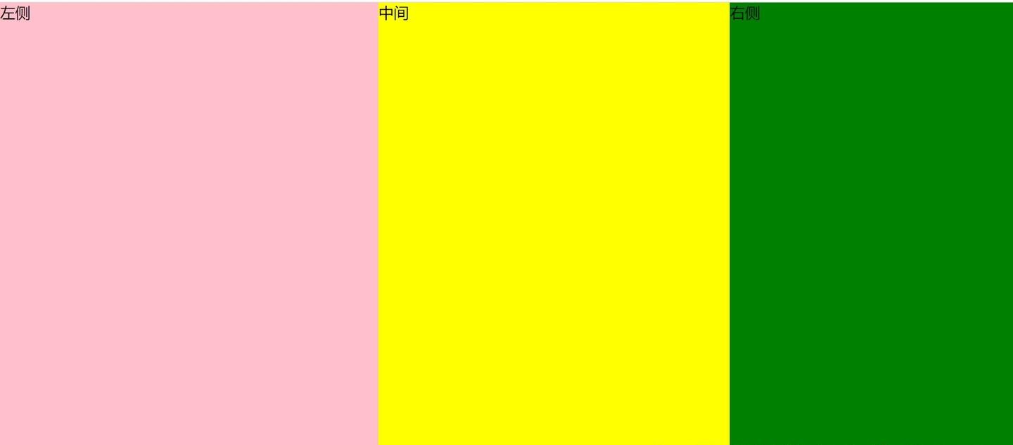
calc和float实现左右三栏布局
即使我们设置了元素宽度,且相加为100%。但是由于块级元素依然默认占据一行,因此我们要加入浮动float: left,使其在一行内排列。
1
2
3
4
5
6
7
8
9
10
11
12
13
14
15
16
17
18
19
20
21
22
23
24
25
26
27
28
29
| <div class="whole-page">
<div class="left">左侧</div>
<div class="middle">中间</div>
<div class="right">右侧</div>
</div>
<style>
.whole-page {
height: 100vh;
width: 100vw;
}
.left {
width: 400px;
background-color: pink;
height: 100%;
float: left;
}
.right {
width: 300px;
background-color: green;
height: 100%;
float: left;
}
.middle {
width:calc(100% - 700px);
background-color: yellow;
height: 100%;
float: left;
}
</style>
|

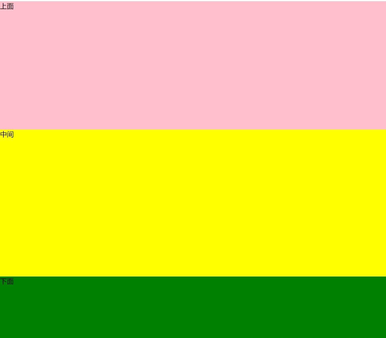
calc实现上下三栏布局
由于在垂直方向,块级元素并不会垂直方向占据一行,因此不需要有浮动或者其他设置,实现更简单。
1
2
3
4
5
6
7
8
9
10
11
12
13
14
15
16
17
18
19
20
21
22
23
| <div class="whole-page">
<div class="top">上面</div>
<div class="middle">中间</div>
<div class="bottom">下面</div>
</div>
<style>
.whole-page {
height: 100vh;
width: 100vw;
}
.top {
height: 300px;
background-color: pink;
}
.bottom {
height: 200px;
background-color: green;
}
.middle {
height: calc(100% - 500px);
background-color: yellow;
}
</style>
|
可以看到,就仅仅计算下高度即可。
calc和float实现两栏或N栏布局
如果不希望要左侧栏或者右侧栏,或者希望按照比例进行宽度大小调整,或者想要四栏甚至更多栏组合,使用calc和float也可以轻易实现。这里使用横向分栏来举例,纵向分栏实际上更简单,去掉float即可。
1
2
3
4
5
6
7
8
9
10
11
12
13
14
15
16
17
18
19
20
21
22
23
24
25
26
27
28
29
30
31
32
33
34
35
36
37
38
39
40
41
42
43
44
45
46
47
48
49
50
51
52
53
54
55
56
57
58
59
60
61
62
63
64
65
66
67
68
69
70
71
72
73
74
75
76
77
78
79
80
81
82
83
84
85
86
| <div class="part-page container">
<div class="left1">左侧</div>
<div class="right1">右侧</div>
</div>
<div class="part-page container">
<div class="left2">左侧</div>
<div class="right2">右侧</div>
</div>
<div class="part-page container">
<div class="left3">左侧</div>
<div class="right3">右侧</div>
</div>
<div class="part-page container">
<div class="column1">第一栏 width: 30%</div>
<div class="column2">第二栏 撑开剩余空间 </div>
<div class="column3">第三栏 width: 200px</div>
<div class="column4">第四栏 width: 100px</div>
</div>
<style>
.part-page {
height: 80px;
margin-bottom: 10px;
}
.container {
.left1 {
width: 30%;
height: 100%;
background-color: pink;
float: left;
}
.right1 {
width: 70%;
height: 100%;
background-color: green;
float: left;
}
.left2 {
width: calc(100% - 60%);
height: 100%;
float: left;
background-color: pink;
}
.right2 {
width: 60%;
height: 100%;
float: left;
background-color: green;
}
.left3 {
width: 300px;
height: 100%;
float: left;
background-color: pink;
}
.right3 {
width: calc(100% - 300px);
height: 100%;
float: left;
background-color: green;
}
.column1 {
width: 30%;
height: 100%;
float: left;
background-color: pink;
}
.column2 {
width: calc(100% - 30% - 200px - 100px);
height: 100%;
float: left;
background-color: green;
}
.column3 {
height: 100%;
float: left;
width: 200px;
background-color: yellow;
}
.column4 {
height: 100%;
float: left;
width: 100px;
background-color: grey;
}
}
</style>
|
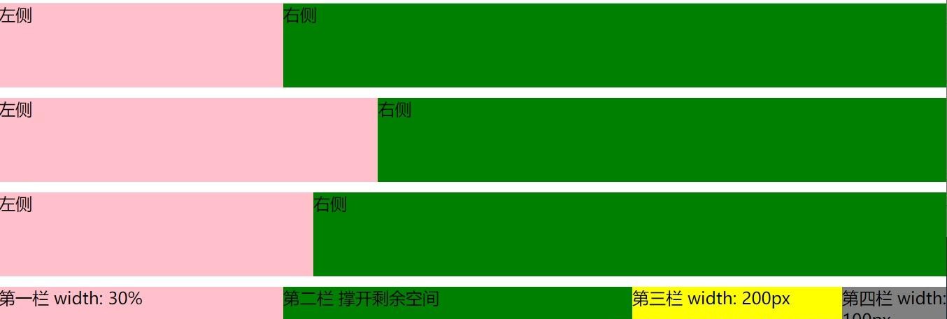
这些不同的方案描述: 1. 左右两栏设置不同的宽度比例。 2. 宽度比例由calc计算得出。 3. 左侧设置固定宽度,右侧占满剩余宽度。 4. 四栏实例,为上面方案的组合。
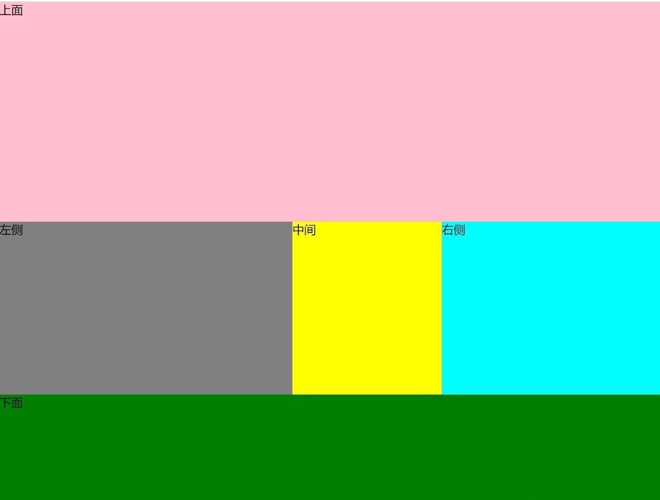
calc和float实现上下左右三栏嵌套布局
上面我们实现了左右三栏布局和上下三栏布局。在更复杂的页面中,我们需要同时使用左右三栏和上下三栏,此时我们的实现也能很方便的进行组合。这里以上下嵌套左右三栏为例。
1
2
3
4
5
6
7
8
9
10
11
12
13
14
15
16
17
18
19
20
21
22
23
24
25
26
27
28
29
30
31
32
33
34
35
36
37
38
39
40
41
42
43
44
45
46
47
48
49
50
| <div class="whole-page container">
<div class="top">上面</div>
<div class="middle">
<div class="left">左侧</div>
<div class="middle-deep">中间</div>
<div class="right">右侧</div>
</div>
<div class="bottom">下面</div>
</div>
<style>
.whole-page {
height: 100vh;
width: 100vw;
}
.container {
--top-value: 300px;
--bottom-value: 200px;
--left-value: 400px;
--right-value: 300px;
.top {
height: var(--top-value);
background-color: pink;
}
.bottom {
height: var(--bottom-value);
background-color: green;
}
.middle {
height: calc(100% - var(--top-value) - var(--bottom-value));
.left {
width: 400px;
background-color: grey;
height: 100%;
float: left;
}
.right {
width: 300px;
background-color: aqua;
height: 100%;
float: left;
}
.middle-deep {
width: calc(100% - var(--left-value) - var(--right-value));
background-color: yellow;
height: 100%;
float: left;
}
}
}
</style>
|
为了方便查看,我使用了四个css变量来标明上下左右四边的宽度。

2.使用flex实现
使用flex布局,可以简单的实现三栏布局,其中的关键在于flex-grow: 1,即定义元素的放大比例。如果其它的元素flex-grow为0,需要撑开的元素flex-grow设为1,即可以实现自适应。
flex左右三栏布局
1
2
3
4
5
6
7
8
9
10
11
12
13
14
15
16
17
18
19
20
21
22
23
24
25
26
| <div class="whole-page container">
<div class="left">左侧</div>
<div class="middle">中间</div>
<div class="right">右侧</div>
</div>
<style>
.whole-page {
height: 100vh;
width: 100vw;
}
.container {
display: flex;
.left {
width: 400px;
background-color: pink;
}
.right {
width: 300px;
background-color: green;
}
.middle {
flex:1;
background-color: yellow;
}
}
</style>
|

flex上下三栏布局
上下三栏布局与左右三栏布局基本一模一样,区别就仅仅是多加了一个flex-direction: column
1
2
3
4
5
6
7
8
9
10
11
12
13
14
15
16
17
18
19
20
21
22
23
24
25
26
27
| <div class="whole-page container">
<div class="top">上面</div>
<div class="middle">中间</div>
<div class="bottom">下面</div>
</div>
<style>
.whole-page {
height: 100vh;
width: 100vw;
}
.container {
display: flex;
flex-direction: column;
.top {
height: 300px;
background-color: pink;
}
.bottom {
height: 200px;
background-color: green;
}
.middle {
flex:1;
background-color: yellow;
}
}
</style>
|

flex两栏或N栏布局
如果不希望要左侧栏或者右侧栏,或者按照实际内容撑开,或者想要四栏甚至更多栏,那么上面的布局稍微改变下即可实现。下面的代码中给出了多种不同的实现方案:
1
2
3
4
5
6
7
8
9
10
11
12
13
14
15
16
17
18
19
20
21
22
23
24
25
26
27
28
29
30
31
32
33
34
35
36
37
38
39
40
41
42
43
44
45
46
47
48
49
50
51
52
53
54
55
56
57
58
59
60
61
62
63
64
65
66
67
68
69
70
71
72
73
74
75
76
77
78
79
80
81
82
83
84
85
86
87
88
89
90
91
92
93
94
95
96
97
98
99
100
| <div class="part-page container">
<div class="left1">左侧</div>
<div class="right1">右侧</div>
</div>
<div class="part-page container">
<div class="left2">左侧</div>
<div class="right2">右侧</div>
</div>
<div class="part-page container">
<div class="left3">左侧</div>
<div class="right3">右侧</div>
</div>
<div class="part-page container">
<div class="left4">左侧</div>
<div class="right4">右侧</div>
</div>
<div class="part-page container">
<div class="left5">左侧 按实际内容撑开</div>
<div class="right5">右侧</div>
</div>
<div class="part-page container">
<div class="left6">左侧</div>
<div class="right6">右侧 按实际内容撑开</div>
</div>
<div class="part-page container">
<div class="column1">第一栏 按实际内容撑开</div>
<div class="column2">第二栏 width: 30% </div>
<div class="column3">第三栏 flex-grow: 1</div>
<div class="column4">第四栏 width: 200px</div>
</div>
<style>
.part-page {
height: 80px;
margin-bottom: 10px;
}
.container {
display: flex;
.left1 {
width: 30%;
background-color: pink;
}
.right1 {
width: 70%;
background-color: green;
}
.left2 {
flex-grow: 1;
background-color: pink;
}
.right2 {
width: 60%;
background-color: green;
}
.left3 {
flex-grow: 1;
background-color: pink;
}
.right3 {
flex-grow: 1;
background-color: green;
}
.left4 {
flex-grow: 1;
background-color: pink;
}
.right4 {
flex-basis: 40%;
background-color: green;
}
.left5 {
background-color: pink;
}
.right5 {
flex-grow: 1;
background-color: green;
}
.left6 {
flex-grow: 1;
background-color: pink;
}
.right6 {
background-color: green;
}
.column1 {
background-color: pink;
}
.column2 {
width: 30%;
background-color: green;
}
.column3 {
flex-grow: 1;
background-color: yellow;
}
.column4 {
width: 200px;
background-color: aqua;
}
}
</style>
|
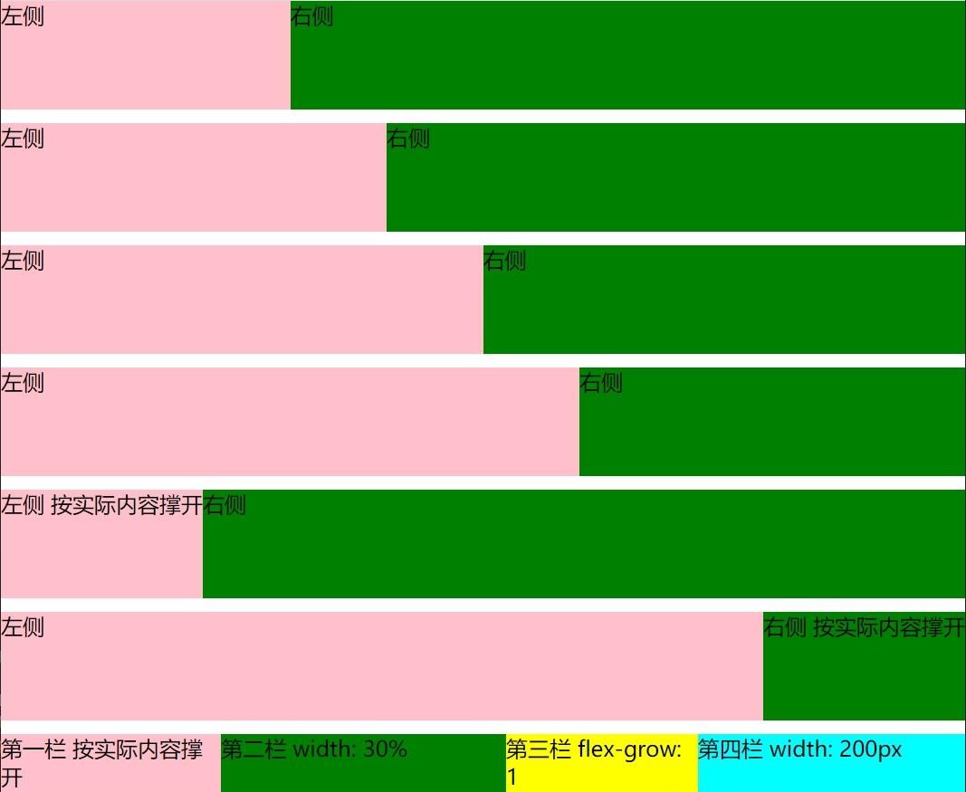
这些不同的方案描述:
- 直接设置宽度比例,相加为100%即可。
- 一个设置宽度,另外一个设置flex-grow: 1
- 两个都设置flex-grow: 1,即实现左右宽度相等。
- 设置flex-basis,与直接设置width效果基本一致。
- 左侧不设置宽度,右侧设置flex-grow: 1。即左侧为实际内容宽度,右侧占满剩余宽度。
- 右侧为实际内容宽度,作侧占满剩余宽度。
- 四栏实例,为上面方案的组合。
flex上下左右三栏嵌套布局
同样的,使用flex也可以对上面的布局进行混合和嵌套。这里依然以上下嵌套左右三栏为例。
1
2
3
4
5
6
7
8
9
10
11
12
13
14
15
16
17
18
19
20
21
22
23
24
25
26
27
28
29
30
31
32
33
34
35
36
37
38
39
40
41
42
43
| <div class="whole-page container">
<div class="top">上面</div>
<div class="middle">
<div class="left">左侧</div>
<div class="middle-deep">中间</div>
<div class="right">右侧</div>
</div>
<div class="bottom">下面</div>
</div>
<style>
.whole-page {
height: 100vh;
width: 100vw;
}
.container {
display: flex;
flex-direction: column;
.top {
height: 300px;
background-color: pink;
}
.bottom {
height: 200px;
background-color: green;
}
.middle {
flex-grow: 1;
display: flex;
.left {
width: 400px;
background-color: grey;
}
.right {
width: 300px;
background-color: aqua;
}
.middle-deep {
flex-grow: 1;
background-color: yellow;
}
}
}
</style>
|
3.使用grid实现
grid是一种强大的网格布局方法,将页面元素划分为一个一个的网格。在实际的布局中,比flex更为强大。三栏布局对grid来说非常轻松,而且还能实现更多复杂的布局方案。
grid左右三栏布局
直接设置grid-template-columns分割即可。需要占据剩余空间的元素元素设置auto或者1fr。
1
2
3
4
5
6
7
8
9
10
11
12
13
14
15
16
17
18
19
20
21
22
23
24
| <div class="whole-page container">
<div class="left">左侧</div>
<div class="middle">中间</div>
<div class="right">右侧</div>
</div>
<style>
.whole-page {
height: 100vh;
width: 100vw;
}
.container {
display: grid;
grid-template-columns: 400px auto 300px;
.left {
background-color: pink;
}
.right {
background-color: green;
}
.middle {
background-color: yellow;
}
}
</style>
|
grid上下三栏布局
上下三栏布局与左右三栏布局基本一模一样,区别就仅仅是grid-template-columns换成了grid-template-rows。
1
2
3
4
5
6
7
8
9
10
11
12
13
14
15
16
17
18
19
20
21
22
23
24
| <div class="whole-page container">
<div class="top">上面</div>
<div class="middle">中间</div>
<div class="bottom">下面</div>
</div>
<style>
.whole-page {
height: 100vh;
width: 100vw;
}
.container {
display: grid;
grid-template-rows: 300px auto 200px;
.top {
background-color: pink;
}
.bottom {
background-color: green;
}
.middle {
background-color: yellow;
}
}
</style>
|

grid两栏或N栏布局
grid布局的强大,使其可以有更多两栏甚至N栏布局的方式,这里列举一些。
1
2
3
4
5
6
7
8
9
10
11
12
13
14
15
16
17
18
19
20
21
22
23
24
25
26
27
28
29
30
31
32
33
34
35
36
37
38
39
40
41
42
43
44
45
46
47
48
49
50
51
52
53
54
55
56
57
58
59
60
61
62
63
64
65
66
67
68
69
70
71
72
73
74
75
76
77
78
79
80
81
82
| <div class="part-page container1">
<div class="left">左侧</div>
<div class="right">右侧</div>
</div>
<div class="part-page container2">
<div class="left">左侧</div>
<div class="right">右侧</div>
</div>
<div class="part-page container3">
<div class="left">左侧</div>
<div class="right">右侧</div>
</div>
<div class="part-page container4">
<div class="left">左侧</div>
<div class="right">右侧</div>
</div>
<div class="part-page container5">
<div class="left">左侧</div>
<div class="right">右侧</div>
</div>
<div class="part-page container6">
<div class="left">左侧 按实际内容撑开</div>
<div class="right">右侧</div>
</div>
<div class="part-page container7">
<div class="column1">第一栏 200px</div>
<div class="column2">第二栏 30%</div>
<div class="column3">第三栏 1fr</div>
<div class="column4">第四栏 auto按实际内容撑开</div>
</div>
<style>
.part-page {
height: 80px;
margin-bottom: 10px;
}
.left {
background-color: pink;
}
.right {
background-color: green;
}
.container1 {
display: grid;
grid-template-columns: 30% 70%;
}
.container2 {
display: grid;
grid-template-columns: auto 60%;
}
.container3 {
display: grid;
grid-template-columns: auto auto;
}
.container4 {
display: grid;
grid-template-columns: 200px auto;
}
.container5 {
display: grid;
grid-template-columns: 300px 1fr;
}
.container6 {
display: grid;
grid-template-columns: auto 1fr;
}
.container7 {
display: grid;
grid-template-columns: 200px 30% 1fr auto;
.column1 {
background-color: pink;
}
.column2 {
background-color: green;
}
.column3 {
background-color: yellow;
}
.column4 {
background-color: aqua;
}
}
</style>
|
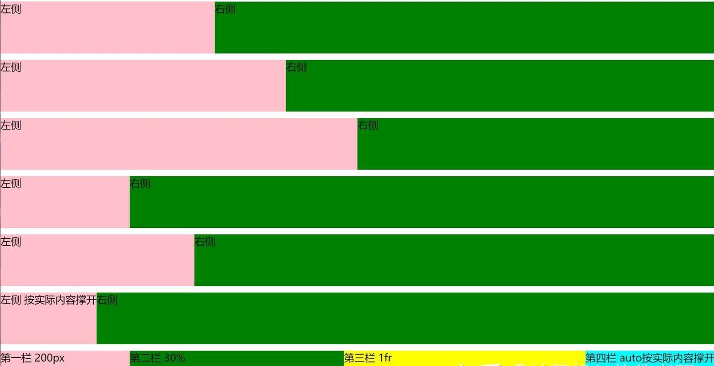
这些不同的方案描述:
- 设置两栏比例。
- 左侧设置比例,右侧撑开剩余空间。
- 两个都是auto,均分空间。
- 左侧固定宽度,右侧撑开剩余空间。
- 左侧固定宽度,右侧使用1fr撑开剩余空间。
- 左侧按照实际内容撑开,右侧使用1fr撑开剩余空间。
- 四栏实例,为上面方案的组合。
当auto和1fr单独使用时,作用都是撑开剩余空间。但是当同时使用时,1fr的优先级更高,作用依然是撑开剩余空间。但是auto的作用则变成了按照实际包含内容作为宽度(可以看第六个例子)。
grid上下左右三栏嵌套布局
在上面,我们使用了flex对上下三栏和左右三栏布局进行了嵌套。同样的,grid布局也可以做到。
1
2
3
4
5
6
7
8
9
10
11
12
13
14
15
16
17
18
19
20
21
22
23
24
25
26
27
28
29
30
31
32
33
34
35
36
37
38
| <div class="whole-page container">
<div class="top">上面</div>
<div class="middle">
<div class="left">左侧</div>
<div class="middle-deep">中间</div>
<div class="right">右侧</div>
</div>
<div class="bottom">下面</div>
</div>
<style>
.whole-page {
height: 100vh;
width: 100vw;
}
.container {
display: grid;
grid-template-rows: 300px auto 200px;
.top {
background-color: pink;
}
.bottom {
background-color: green;
}
.middle {
display: grid;
grid-template-columns: 400px auto 300px;
.left {
background-color: grey;
}
.right {
background-color: aqua;
}
.middle-deep {
background-color: yellow;
}
}
}
</style>
|

grid上下左右三栏网格布局
grid本身就支持这种网格布局方式,上面对grid进行嵌套有点画蛇添足了。这里我们直接利用网格实现。
1
2
3
4
5
6
7
8
9
10
11
12
13
14
15
16
17
18
19
20
21
22
23
24
25
26
27
28
29
30
31
32
33
34
35
36
37
| <div class="whole-page container">
<div class="top">上面</div>
<div class="left">左侧</div>
<div class="middle-deep">中间</div>
<div class="right">右侧</div>
<div class="bottom">下面</div>
</div>
<style>
.whole-page {
height: 100vh;
width: 100vw;
}
.container {
display: grid;
grid-template-rows: 300px auto 200px;
grid-template-columns: 400px auto 300px;
.top {
grid-column-start: 1;
grid-column-end: 4;
background-color: pink;
}
.bottom {
grid-column-start: 1;
grid-column-end: 4;
background-color: green;
}
.left {
background-color: grey;
}
.right {
background-color: aqua;
}
.middle-deep {
background-color: yellow;
}
}
</style>
|

可以看到,利用网格合并,可以直接实现一样的效果。
4.圣杯布局
上面的几种布局,在页面DOM结构上,都是先左侧再中间后右侧。虽然这和页面的展示顺序是一致的,但也造成了在页面渲染中,先左侧渲染,再中间渲染。在部分场景下,这种渲染顺序是不行的。
试想一种场景:一个页面的中间是主要内容,左侧和右侧是不重要的内容,甚至是广告。用户在浏览页面时,左侧的广告会先加载然后才是中间的主要内容。这样对于用户的浏览体验太差了。因此,我们要找到一种布局方式,在DOM结构上是中间在前左侧在后,保证页面是中间先渲染;但是在页面展示中却是左侧居左中间居中布局方式。
这种布局方式就是经典的——圣杯布局。圣杯布局来源于2006年的这篇文章:In Search of the Holy Grail
圣杯布局解析
首先是HTML结构,可以看到确实中间在前,左侧在后。为了方便后续引用,我们设置了两个CSS变量,分别代表左侧和右侧的宽度,方便后面引用。三个区域都撑满高度。
1
2
3
4
5
6
7
8
9
10
11
12
13
14
15
16
17
18
19
20
21
22
23
24
25
26
27
28
| <div class="whole-page container">
<div class="middle">中间</div>
<div class="left">左侧</div>
<div class="right">右侧</div>
</div>
<style>
.whole-page {
height: 100vh;
}
.container {
--left-value: 400px;
--right-value: 300px;
.left {
height: 100%;
background-color: pink;
width: var(--left-value);
}
.right {
height: 100%;
background-color: green;
width: var(--right-value);
}
.middle {
height: 100%;
background-color: yellow;
}
}
</style>
|
然后设置容器的padding,左边为左侧的宽度,右边为右侧的宽度。
1
2
3
| .container {
padding: 0 var(--right-value) 0 var(--left-value);
}
|
此时三个元素各自占一行,都挤在中间区域。此时我们设置下三个区域的浮动,使其脱离文档流,在同一行显示。
1
2
3
4
5
6
7
8
9
| .left {
float: left;
}
.right {
float: left;
}
.middle {
float: left;
}
|
此时我们发现三个区域跑到一行展示了,但是依然按照中间左侧右侧的顺序挤在容器中间位置。这时候我们让左侧区域相对定位,靠左一个宽度值,使其位置正好在容器的左侧。
1
2
3
4
| .left {
position: relative;
left: calc(-1 * var(--left-value));
}
|
但是这样依然很奇怪,运行一下可以看到左侧并不完全靠左,而是空出了一个当前中间区域宽度的位置,而且左侧宽度正好把中间区域的宽度覆盖了。因为在相对定位之前,左侧区域的位置就并不是靠着容器的左侧,因此设置往左一个相对的左侧宽度也不能使其到达正确的位置。
此时我们可以设置中间区域的宽度为占满父元素宽度,这样中间和左侧区域的横向位置就正确了。
1
2
3
| .middle {
width: 100%;
}
|
这时我们会发现:虽然左侧区域的横向位置正确了,但左侧区域被挤到了第二行。这时因为中间区域占满了全部宽度,左侧区域没有位置了。这时候我们需要让这几个区域都在同一行。
我们使用负magrin来实现。在设置了浮动且移动到父元素边框以外时,就会向上浮动。
1
2
3
| .left {
margin-left: -100%;
}
|
我们让左侧区域的margin-left为100%,实际上也就是容器的宽度,那么左侧区域会上浮到第一行,而且完全在容器的左侧。
同样的,我们对右侧区域也使用负magrin。值为右侧自己的宽度,同样右侧区域也能上浮到第一行,且完全在容器的右侧。
1
2
3
| .right {
margin-right: calc(-1 * var(--right-value));
}
|
到这里,我们已经做到了左右三栏布局的效果,且中间区域先渲染。

圣杯布局源码
1
2
3
4
5
6
7
8
9
10
11
12
13
14
15
16
17
18
19
20
21
22
23
24
25
26
27
28
29
30
31
32
33
34
35
36
37
| <div class="whole-page container">
<div class="middle">中间</div>
<div class="left">左侧</div>
<div class="right">右侧</div>
</div>
<style>
.whole-page {
height: 100vh;
}
.container {
--left-value: 400px;
--right-value: 300px;
padding: 0 var(--right-value) 0 var(--left-value);
.left {
float: left;
position: relative;
left: calc(-1 * var(--left-value));
width: var(--left-value);
background-color: pink;
height: 100%;
margin-left: -100%;
}
.right {
float: left;
width: var(--right-value);
background-color: green;
height: 100%;
margin-right: calc(-1 * var(--right-value));
}
.middle {
float: left;
background-color: yellow;
height: 100%;
width: 100%;
}
}
</style>
|
圣杯布局对于中间区域的位置虽然可以自适应,但实际上是有最小宽度要求的,即不能小于左侧区域的宽度。如果小于,则左侧和右侧区域会都跑到第二行了。
上下三栏嵌套圣杯布局
圣杯布局的外面同样可以嵌套其他的布局方式,比如上下左右三栏嵌套布局。上下三栏一般没有加载顺序要求,从上往下加载即可,因此我们使用最简单的计算calc实现。使用其他布局方式也同样可以。
1
2
3
4
5
6
7
8
9
10
11
12
13
14
15
16
17
18
19
20
21
22
23
24
25
26
27
28
29
30
31
32
33
34
35
36
37
38
39
40
41
42
43
44
45
46
47
48
49
50
51
52
53
54
| <div class="whole-page container">
<div class="top">上面</div>
<div class="middle">
<div class="middle-deep">中间</div>
<div class="left">左侧</div>
<div class="right">右侧</div>
</div>
<div class="bottom">下面</div>
</div>
<style>
.whole-page {
height: 100vh;
}
.container {
--top-value: 300px;
--bottom-value: 200px;
--left-value: 400px;
--right-value: 300px;
.top {
height: var(--top-value);
background-color: pink;
}
.bottom {
height: var(--bottom-value);
background-color: green;
}
.middle {
height: calc(100% - var(--top-value) - var(--bottom-value));
padding: 0 var(--right-value) 0 var(--left-value);
.left {
float: left;
position: relative;
left: calc(-1 * var(--left-value));
width: var(--left-value);
background-color: grey;
height: 100%;
margin-left: -100%;
}
.right {
float: left;
width: var(--right-value);
background-color: aqua;
height: 100%;
margin-right: calc(-1 * var(--right-value));
}
.middle-deep {
float: left;
background-color: yellow;
height: 100%;
width: 100%;
}
}
}
</style>
|

5.双飞翼布局
双飞翼布局来源于淘宝,是圣杯布局的一种改进。解决了圣杯布局要求中间区域最小宽度的问题。
双飞翼布局解析
首先是HTML结构,与圣杯基本一致,区别就在于中间区域多套了一层。
1
2
3
4
5
6
7
8
9
10
11
12
13
14
15
16
17
18
19
20
21
22
23
24
25
26
27
28
29
30
31
32
| <template>
<div class="whole-page container">
<div class="middle">
<div class="inner">中间</div>
</div>
<div class="left">左侧</div>
<div class="right">右侧</div>
</div>
</template>
<style>
.whole-page {
height: 100vh;
}
.container {
--left-value: 400px;
--right-value: 300px;
.left {
background-color: pink;
height: 100%;
width: var(--left-value);
}
.right {
background-color: green;
height: 100%;
width: var(--right-value);
}
.middle {
background-color: yellow;
height: 100%;
}
}
</style>
|
然后我们设置中间区域的宽度为撑满父容器宽度,中间区域的内部元素的左右padding设置为左侧和右侧的宽度。
1
2
3
4
5
6
7
8
| .middle {
width: 100%;
.inner {
padding-left: var(--left-value);
padding-right: var(--right-value);
height: 100%;
}
}
|
到这里我们已经看出,双飞翼布局是以中间区域作为整个布局空间的,左侧和右侧区域在后面都会盖到中间区域的padding上。这里使用margin也可以。
三个区域都设置浮动,且左测和右侧区域都设置负值margin。这里的用法与圣杯布局一样,让三个区域都在同一行展示,且放置在正确的位置上。
1
2
3
4
5
6
7
8
9
10
11
| .left {
float: left;
margin-left: -100%;
}
.right {
float: left;
margin-left: calc(-1 * var(--right-value));
}
.middle {
float: left;
}
|
到这里我们的布局就已经完成了。这时候我们改变浏览器的宽度,中间区域也能自适应缩放,且对于中间区域的宽度没有大小要求。

双飞翼布局源码
1
2
3
4
5
6
7
8
9
10
11
12
13
14
15
16
17
18
19
20
21
22
23
24
25
26
27
28
29
30
31
32
33
34
35
36
37
38
39
40
41
| <div class="whole-page container">
<div class="middle">
<div class="inner">中间</div>
</div>
<div class="left">左侧</div>
<div class="right">右侧</div>
</div>
<style>
.whole-page {
height: 100vh;
}
.container {
--left-value: 400px;
--right-value: 300px;
.left {
background-color: pink;
height: 100%;
width: var(--left-value);
float: left;
margin-left: -100%;
}
.right {
background-color: green;
height: 100%;
width: var(--right-value);
float: left;
margin-left: calc(-1 * var(--right-value));
}
.middle {
background-color: yellow;
height: 100%;
width: 100%;
float: left;
.inner {
padding-left: var(--left-value);
padding-right: var(--right-value);
height: 100%;
}
}
}
</style>
|
上下三栏嵌套双飞翼布局
同样的,双飞翼布局也可以嵌套使用,这里我们依然使用简单的计算calc实现上下三栏布局,中间嵌套双飞翼布局。
1
2
3
4
5
6
7
8
9
10
11
12
13
14
15
16
17
18
19
20
21
22
23
24
25
26
27
28
29
30
31
32
33
34
35
36
37
38
39
40
41
42
43
44
45
46
47
48
49
50
51
52
53
54
55
56
57
58
| <div class="whole-page container">
<div class="top">上面</div>
<div class="middle">
<div class="middle-deep">
<div class="inner">中间</div>
</div>
<div class="left">左侧</div>
<div class="right">右侧</div>
</div>
<div class="bottom">下面</div>
</div>
<style>
.whole-page {
height: 100vh;
}
.container {
--top-value: 300px;
--bottom-value: 200px;
--left-value: 400px;
--right-value: 300px;
.top {
height: var(--top-value);
background-color: pink;
}
.bottom {
height: var(--bottom-value);
background-color: green;
}
.middle {
height: calc(100% - var(--top-value) - var(--bottom-value));
.left {
background-color: grey;
height: 100%;
width: var(--left-value);
float: left;
margin-left: -100%;
}
.right {
background-color: aqua;
height: 100%;
width: var(--right-value);
float: left;
margin-left: calc(-1 * var(--right-value));
}
.middle-deep {
background-color: yellow;
float: left;
height: 100%;
width: 100%;
.inner {
margin-left: var(--left-value);
margin-right: var(--right-value);
height: 100%;
}
}
}
}
</style>
|

总结
通过上面的实现,可以看到实现三栏布局其实有很多种方法,简单的有直接计算calc,flex等,复杂一点的有圣杯和双飞翼。那么我们在遇到三栏布局时,是不是应该直接使用复杂的圣杯和双飞翼,而不使用简单的布局方法呢?
并不是越复杂的实现就越好。圣杯和双飞翼是为了解决希望中间先渲染的问题,所以将中间区域的DOM结构在前,又为了保证布局效果和可嵌套使用而实现的。
如果我们的页面没有广告,不需要考虑左侧和中间区域的加载问题,直接使用简单的flex等布局即可,没必要改变DOM结构。
参考