1
2
3
4
5
6
7
8
9
10
11
12
13
14
15
16
17
18
19
20
21
22
23
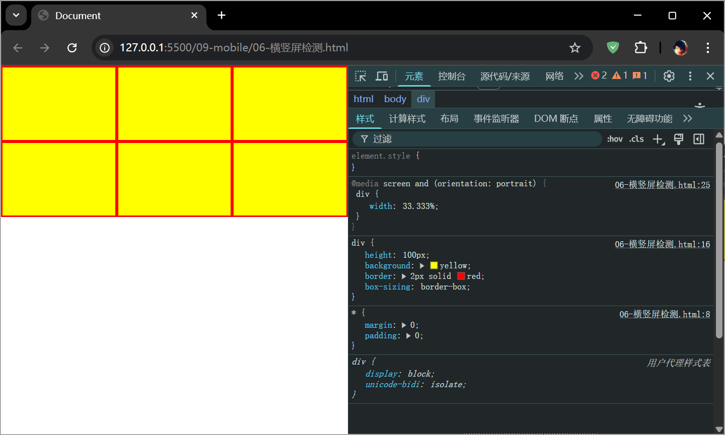
24
25
26
27
28
29
30
31
32
33
34
35
36
37
38
39
40
41
42
43
44
45
46
47
48
49
50
51
52
53
54
55
56
57
58
59
60
61
62
63
64
65
66
67
68
69
70
71
72
73
74
75
76
77
78
79
80
81
82
83
84
85
86
87
88
89
90
91
92
93
94
95
96
97
98
99
100
101
102
103
104
105
106
| <!DOCTYPE html>
<html lang="en">
<head>
<meta charset="UTF-8">
<meta name="viewport" content="width=device-width, initial-scale=1.0">
<title>Document</title>
<style>
*{
margin: 0;
padding: 0;
}
html,body{
height: 100%;
}
img{
display: block;
}
.box{
width: 300px;
margin: 10px auto;
border: 2px solid gray;
position: relative;
overflow: hidden;
}
img,p,h2{
transition: all 0.5s;
}
.box .pic{
width: 100%;
transform: translateY(0);
}
.box:hover .pic{
transform: translateY(-30px);
opacity: 0.5;
}
.box h2{
position: absolute;
left: 20px;
top: 20px;
color: white;
transform: translateY(-300px);
opacity: 0;
}
.box:hover h2{
transform: translateY(0);
opacity: 1;
}
.box p{
position: absolute;
bottom: 30px;
left: 20px;
color: white;
transform: translateY(300px);
opacity: 0;
}
.box:hover p{
transform: translateY(0);
opacity: 1;
}
.box .musicBtn{
position: absolute;
top: 10px;
right: 10px;
width: 30px;
}
.box:hover .musicBtn{
transform: rotate(360deg);
}
</style>
</head>
<body>
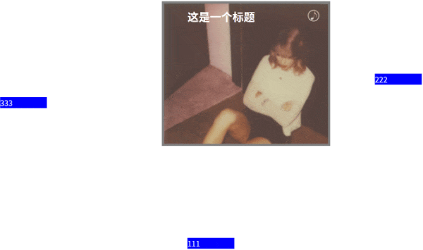
<div class="box">
<img src="./img/1.png" alt="" class="pic">
<div>
<h2>Back To December</h2>
<p>Lorem, ipsum dolor sit amet consectetur adipisicing elit. Velit voluptatum, iure placeat quidem voluptatem modi dolores tenetur quam incidunt ad debitis corrupti tempora! Accusamus magni earum ipsam quis! Repellat, ipsum.</p>
</div>
<img src="./img/music.jpg" alt="" class="musicBtn">
</div>
</body>
</html>
|