1. Bootstrap 概述 Bootstrap是一个前端框架,由Twitter开发,非常受欢迎。
定义了很多的css样式和js插件,直接可以使用这些样式和插件得到丰富的 页面效果
支持响应式布局,写一套页面就可以在不同分辨率的设备上有比较好的效果。
2. Bootstrap 环境配置
下载 Bootstrap:https://v3.bootcss.com/
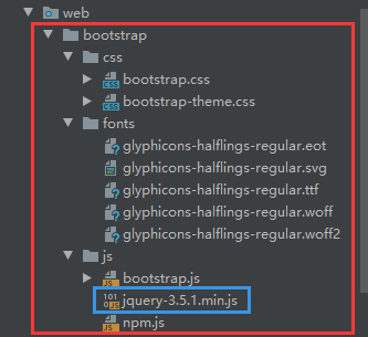
创建 bootstrap 目录,拷贝 css/ fonts/ js/ 三个目录:
jquery-3.5.1.min.js
将资源导入到页面:bootstrap.min.cssjquery-3.5.1.min.jsbootstrap.min.js
1 2 3 <link href ="bootstrap/css/bootstrap.min.css" rel ="stylesheet" > <script src ="bootstrap/js/jquery-3.5.1.min.js" > </script > <script src ="bootstrap/js/bootstrap.min.js" > </script >
3. Bootstrap 基本使用
CV大法,按需微调。
4. Bootstrap 可视化布局
ibootstrap.cn:http://www.ibootstrap.cn/
15 款最好的 Bootstrap 在线编辑工具:https://www.runoob.com/bootstrap/bootstrap-ui-editor.html
5. Bootstrap 响应式布局 概念
Bootstrap 提供了一套响应式、移动设备优先的流式栅格系统,随着屏幕或视口(viewport)尺寸的增加,系统会自动分为最多12列。
组成
栅格系统用于通过一系列的行(row)与列(column)的组合来创建页面布局,你的内容就可以放入这些创建好的布局中。
栅格系统容器包含行;行包含列,列包含内容
栅格系统容器
container 即<div class="container"> </div>为网页两边留白的布局容器container-fluid 即<div class="container-fluid"> </div>为网页两边顶边不留白的布局容器
1
2
3
4
5
6
7
8
.container 类用于固定宽度并支持响应式布局的容器。<div class ="container" > </div > <div class ="container-fluid" > </div >
行
列
col(col-lg-?、col-md-?、col-sm-?、col-xs-?)
需求:
整个容器占满屏幕的宽度,
在lg分辨率(大桌面)下,要求每一个元素占1个位置,
在md分辨率(桌面)下,每一个元素占2个位置;
在sm分辨率(平板)下,每一个元素占3个位置;
在xs分辨率(手机)下,每一个元素占3个位置。
代码实现:
1 2 3 4 5 6 7 8 9 10 11 12 13 14 15 16 17 18 19 20 21 22 23 24 25 26 27 28 29 30 31 32 33 34 35 36 37 38 39 40 41 42 43 44 45 46 47 48 49 50 51 52 <head > <title > Bootstrap的栅格系统</title > <link href ="bootstrap/css/bootstrap.min.css" rel ="stylesheet" > <script src ="js/jquery-3.2.1.min.js" > </script > <script src ="bootstrap/js/bootstrap.min.js" > </script > <style > .one { background-color : pink; } .two { background-color : dodgerblue; } .three { background-color : green; } .four { background-color : orange; } </style > </head > <body > <div class ="container-fluid" > <div class ="row" > <div class ="one col-lg-1 col-md-2 col-sm-3 col-xs-6" > 1</div > <div class ="two col-lg-1 col-md-2 col-sm-3 col-xs-6" > 2</div > <div class ="three col-lg-1 col-md-2 col-sm-3 col-xs-6" > 3</div > <div class ="four col-lg-1 col-md-2 col-sm-3 col-xs-6" > 4</div > <div class ="one col-lg-1 col-md-2 col-sm-3 col-xs-6" > 5</div > <div class ="two col-lg-1 col-md-2 col-sm-3 col-xs-6" > 6</div > <div class ="three col-lg-1 col-md-2 col-sm-3 col-xs-6" > 7</div > <div class ="four col-lg-1 col-md-2 col-sm-3 col-xs-6" > 8</div > <div class ="one col-lg-1 col-md-2 col-sm-3 col-xs-6" > 9</div > <div class ="two col-lg-1 col-md-2 col-sm-3 col-xs-6" > 10</div > <div class ="three col-lg-1 col-md-2 col-sm-3 col-xs-6" > 11</div > <div class ="four col-lg-1 col-md-2 col-sm-3 col-xs-6" > 12</div > </div > </div >
6. Bootstrap 全局css样式 按钮
1 2 3 4 5 6 7 8 9 10 11 12 13 14 15 16 17 18 19 20 <button type ="button" class ="btn btn-default" > (默认样式)Default</button > <button type ="button" class ="btn btn-primary" > (首选项)Primary</button > <button type ="button" class ="btn btn-success" > (成功)Success</button > <button type ="button" class ="btn btn-info" > (一般信息)Info</button > <button type ="button" class ="btn btn-warning" > (警告)Warning</button > <button type ="button" class ="btn btn-danger" > (危险)Danger</button > <button type ="button" class ="btn btn-link" > (链接)Link</button >
图片
1 2 3 <img src ="img/girl.jpg" class ="img-rounded" > <img src ="img/girl.jpg" class ="img-circle" > <img src ="img/girl.jpg" class ="img-thumbnail" >
表格
1 2 3 4 5 6 7 8 9 10 11 12 13 14 15 16 17 18 19 20 21 22 23 24 25 26 27 <table class ="table" > <tr class ="danger" > <td > ID</td > <td > 账户</td > <td > 密码</td > <td > 操作</td > </tr > <tr > <td > 1</td > <td > 张三</td > <td > root</td > <td > <a href ="javascript:void(0);" class ="btn btn-success" > 删除</a > </td > </tr > <tr > <td > 2</td > <td > 李四</td > <td > root</td > <td > <a href ="javascript:void(0);" class ="btn btn-default" > 删除</a > </td > </tr > </table >
表单
1 2 3 4 5 6 7 8 9 10 11 12 13 14 15 16 17 18 19 20 21 22 23 24 25 26 27 28 <form class ="form-horizontal" > <div class ="form-group" > <label for ="inputEmail3" class ="col-sm-2 control-label" > 账户</label > <div class ="col-sm-10" > <input type ="email" class ="i1 form-control" id ="inputEmail3" placeholder ="Email" > </div > </div > <div class ="form-group" > <label for ="inputPassword3" class =" col-sm-2 control-label" > 密码</label > <div class ="col-sm-10" > <input type ="password" class ="i1 form-control" id ="inputPassword3" placeholder ="Password" > </div > </div > <div class ="form-group" > <div class ="col-sm-offset-2 col-sm-10" > <div class ="checkbox" > <label > <input type ="checkbox" > 记住我</label > </div > </div > </div > <div class ="form-group" > <div class ="col-sm-offset-2 col-sm-10" > <button type ="submit" class ="btn btn-default" > 登录</button > </div > </div > </form >
7. Bootstrap 组件 7.1 排版
标题: HTML 中的所有标题标签,h1 到 h6 均可使用。另外,还提供了 .h1 到 .h6 类,为的是给内联(inline)属性的文本赋予标题的样式。
1 2 3 <h1 > 我是h1</h1 > 我是跟随者<span class ="h1" > 我是h1</span > 我是跟随者
对齐:通过文本对齐类,可以简单方便的将文字重新对齐。
1 2 3 4 5 <p class ="text-left" > Left aligned text.</p > <p class ="text-center" > Center aligned text.</p > <p class ="text-right" > Right aligned text.</p > <p class ="text-justify" > Justified text.</p > <p class ="text-nowrap" > No wrap text.</p >
改变大小写:text-lowercase 或 text-uppercase 或 text-capitalize
1 <p class ="text-uppercase" > Uppercased text.</p >
7.2 表格
table 表格
table-striped 表格隔行变色
table-hover 悬浮变色
1 2 3 4 <div class ="table-responsive" > <table class ="table" > </table >
行状态:通过这些状态类可以为行或单元格设置颜色。
class类名
描述
.active
鼠标悬停在行或单元格上时所设置的颜色
.success
标识成功或积极的动作
.info
标识普通的提示信息或动作
.warning
标识警告或需要用户注意
.danger
标识危险或潜在的带来负面影响的动作
7.3 表单【★】
素都将被默认设置宽度属性为 width: 100%;将 label 元素和前面提到的控件包裹在 .form-group 中可以获得最好的排列。
单独的表单控件会被自动赋予一些全局样式。所有设置了 .form-control 类的 input、textarea 和 select标签
把标签和控件放在一个带有 class .form-group 的 div 中。这是获取最佳间距所必需的。
向所有的文本元素 input、textarea 和 select 标签 添加 class =”form-control” 。
form-group 会将label和input上下排列 。
form-control 会自动将input填充满屏幕 并添加点击高亮效果。
1 2 3 4 5 6 7 8 9 10 11 12 13 14 15 16 17 18 19 <form > <div class ="form-group" > <label for ="exampleInputEmail1" > Email address</label > <input type ="email" class ="form-control" id ="exampleInputEmail1" placeholder ="Email" > </div > <div class ="form-group" > <label for ="exampleInputPassword1" > Password</label > <input type ="password" class ="form-control" id ="exampleInputPassword1" placeholder ="Password" > </div > <div class ="form-group" > <label for ="exampleInputFile" > File input</label > <input type ="file" id ="exampleInputFile" > <p class ="help-block" > Example block-level help text here.</p > </div > <div class ="checkbox" > <label > <input type ="checkbox" > Check me out</label > </div > <button type ="submit" class ="btn btn-default" > Submit</button > </form >
内联表单:为 form元素添加 .form-inline 类可使其内容左对齐并且表现为 inline-block 级别的控件。只适用于视口(viewport)至少在 768px 宽度时(视口宽度再小的话就会使表单折叠)。
1 2 3 4 5 6 7 8 9 10 11 <form class ="form-inline" > <div class ="form-group" > <label for ="exampleInputName2" > Name</label > <input type ="text" class ="form-control" id ="exampleInputName2" placeholder ="Jane Doe" > </div > <div class ="form-group" > <label for ="exampleInputEmail2" > Email</label > <input type ="email" class ="form-control" id ="exampleInputEmail2" placeholder ="jane.doe@example.com" > </div > <button type ="submit" class ="btn btn-default" > Send invitation</button > </form >
水平表单:通过为表单添加 .form-horizontal 类,并联合使用 Bootstrap 预置的栅格类,可以将 label 标签和控件组水平并排布局。这样做将改变 .form-group 的行为,使其表现为栅格系统中的行(row),因此就无需再额外添加 .row 了。
1 2 3 4 5 6 7 8 9 10 11 12 13 14 15 16 17 18 19 20 21 22 23 24 25 26 27 28 <form class ="form-horizontal" > <div class ="form-group" > <label for ="inputEmail3" class ="col-sm-2 control-label" > Email</label > <div class ="col-sm-10" > <input type ="email" class ="form-control" id ="inputEmail3" placeholder ="Email" > </div > </div > <div class ="form-group" > <label for ="inputPassword3" class ="col-sm-2 control-label" > Password</label > <div class ="col-sm-10" > <input type ="password" class ="form-control" id ="inputPassword3" placeholder ="Password" > </div > </div > <div class ="form-group" > <div class ="col-sm-offset-2 col-sm-10" > <div class ="checkbox" > <label > <input type ="checkbox" > Remember me</label > </div > </div > </div > <div class ="form-group" > <div class ="col-sm-offset-2 col-sm-10" > <button type ="submit" class ="btn btn-default" > Sign in</button > </div > </div > </form >
案例: 显示带引导的
1 2 3 4 5 6 7 8 9 10 11 <form class ="form-inline" > <div class ="form-group" > <label class ="sr-only" for ="exampleInputAmount" > Amount (in dollars)</label > <div class ="input-group" > <div class ="input-group-addon" > $</div > <input type ="text" class ="form-control" id ="exampleInputAmount" placeholder ="Amount" > <div class ="input-group-addon" > .00</div > </div > </div > <button type ="submit" class ="btn btn-primary" > Transfer cash</button > </form >
通过将 .checkbox-inline 或 .radio-inline 类应用到一系列的多选框(checkbox)或单选框(radio)控件上,可以使这些控件排列在一行。
1 2 3 4 5 6 7 8 9 10 11 12 13 14 15 16 17 18 <label class ="checkbox-inline" > <input type ="checkbox" id ="inlineCheckbox1" value ="option1" > 1</label > <label class ="checkbox-inline" > <input type ="checkbox" id ="inlineCheckbox2" value ="option2" > 2</label > <label class ="checkbox-inline" > <input type ="checkbox" id ="inlineCheckbox3" value ="option3" > 3</label > <label class ="radio-inline" > <input type ="radio" name ="inlineRadioOptions" id ="inlineRadio1" value ="option1" > 1</label > <label class ="radio-inline" > <input type ="radio" name ="inlineRadioOptions" id ="inlineRadio2" value ="option2" > 2</label > <label class ="radio-inline" > <input type ="radio" name ="inlineRadioOptions" id ="inlineRadio3" value ="option3" > 3</label >
下拉列表
1 2 3 4 5 6 7 8 9 10 11 12 13 14 15 <select class ="form-control" > <option > 1</option > <option > 2</option > <option > 3</option > <option > 4</option > <option > 5</option > </select > <select multiple class ="form-control" > <option > 1</option > <option > 2</option > <option > 3</option > <option > 4</option > <option > 5</option > </select >
带分割线的下拉框
1 2 3 4 5 6 7 8 9 10 11 12 13 14 <div class ="btn-group" > <button id ="show" type ="button" class ="btn btn-danger" > Action</button > <button type ="button" class ="btn btn-danger dropdown-toggle" data-toggle ="dropdown" aria-haspopup ="true" aria-expanded ="false" > <span class ="caret" > </span > <span class ="sr-only" > Toggle Dropdown</span > </button > <ul id ="ul" class ="dropdown-menu" > <li > <a href ="#" > Action</a > </li > <li > <a href ="#" > Another action</a > </li > <li > <a href ="#" > Something else here</a > </li > <li role ="separator" class ="divider" > </li > <li > <a href ="#" > Separated link</a > </li > </ul > </div >
1 2 3 4 5 6 7 8 9 10 11 12 13 14 15 16 <div class ="dropdown" > <button class ="btn btn-success dropdown-toggle" type ="button" id ="dropdownMenu1" data-toggle ="dropdown" aria-haspopup ="true" aria-expanded ="true" > <span class ="glyphicon glyphicon-arrow-down" > </span > </button > <ul class ="dropdown-menu" aria-labelledby ="dropdownMenu1" > <li > <a href ="#" > Action</a > </li > <li > <a href ="#" > Another action</a > </li > <li > <a href ="#" > Something else here</a > </li > <li role ="separator" class ="divider" > </li > <li > <a href ="#" > Separated link</a > </li > </ul > </div >
静态控件
1 2 3 4 5 6 7 8 9 10 11 12 13 14 <form class ="form-horizontal" > <div class ="form-group" > <label class ="col-sm-2 control-label" > Email</label > <div class ="col-sm-10" > <p class ="form-control-static" > email@example.com</p > </div > </div > <div class ="form-group" > <label for ="inputPassword" class ="col-sm-2 control-label" > Password</label > <div class ="col-sm-10" > <input type ="password" class ="form-control" id ="inputPassword" placeholder ="Password" > </div > </div > </form >
1 2 3 4 5 6 7 8 9 10 11 12 13 14 15 16 17 18 19 20 21 22 23 24 25 26 27 28 29 30 31 32 33 34 35 36 37 38 39 40 41 42 43 44 45 46 47 <div class ="form-group has-success" > <label class ="control-label" for ="inputSuccess1" > Input with success</label > <input type ="text" class ="form-control" id ="inputSuccess1" aria-describedby ="helpBlock2" > <span id ="helpBlock2" class ="help-block" > A block of help text that breaks onto a new line and may extend beyond one line.</span > </div > <div class ="form-group has-warning" > <label class ="control-label" for ="inputWarning1" > Input with warning</label > <input type ="text" class ="form-control" id ="inputWarning1" > </div > <div class ="form-group has-error" > <label class ="control-label" for ="inputError1" > Input with error</label > <input type ="text" class ="form-control" id ="inputError1" > </div > <div class ="has-success" > <div class ="checkbox" > <label > <input type ="checkbox" id ="checkboxSuccess" value ="option1" > </label > </div > </div > <div class ="has-warning" > <div class ="checkbox" > <label > <input type ="checkbox" id ="checkboxWarning" value ="option1" > </label > </div > </div > <div class ="has-error" > <div class ="checkbox" > <label > <input type ="checkbox" id ="checkboxError" value ="option1" > </label > </div > </div > <input class ="form-control" > 元素上。<div class ="form-group has-success has-feedback" > <label class ="control-label" for ="inputSuccess2" > Input with success</label > <input type ="text" class ="form-control" id ="inputSuccess2" aria-describedby ="inputSuccess2Status" > <span class ="glyphicon glyphicon-ok form-control-feedback" aria-hidden ="true" > </span > <span id ="inputSuccess2Status" class ="sr-only" > (success)</span > </div >
7.4 按钮
class = btn 将任何东西变成按钮 需要配合 btn-default a标签也可以
1 2 3 4 5 6 7 8 9 10 11 12 13 14 15 16 17 18 19 20 21 22 23 24 25 26 27 28 29 30 31 32 33 34 1.按钮颜色<button type ="button" class ="btn btn-default" > (默认样式)Default</button > <button type ="button" class ="btn btn-primary" > (首选项)Primary</button > <button type ="button" class ="btn btn-success" > (成功)Success</button > <button type ="button" class ="btn btn-info" > (一般信息)Info</button > <button type ="button" class ="btn btn-warning" > (警告)Warning</button > <button type ="button" class ="btn btn-danger" > (危险)Danger</button > <button type ="button" class ="btn btn-link" > (链接)Link</button > <div class ="btn-group" data-toggle ="buttons" > <label class ="btn btn-primary" > <input type ="radio" name ="options" id ="option1" > 选项 1</label > <label class ="btn btn-primary" > <input type ="radio" name ="options" id ="option2" > 选项 2</label > <label class ="btn btn-primary" > <input type ="radio" name ="options" id ="option3" > 选项 3</label > </div >
需要让按钮具有不同尺寸吗?使用 .btn-lg、.btn-sm 或 .btn-xs 就可以获得不同尺寸的按钮
1 2 3 4 5 6 7 8 9 10 11 12 13 14 15 16 <p > <button type ="button" class ="btn btn-primary btn-lg" > (大按钮)Large button</button > <button type ="button" class ="btn btn-default btn-lg" > (大按钮)Large button</button > </p > <p > <button type ="button" class ="btn btn-primary" > (默认尺寸)Default button</button > <button type ="button" class ="btn btn-default" > (默认尺寸)Default button</button > </p > <p > <button type ="button" class ="btn btn-primary btn-sm" > (小按钮)Small button</button > <button type ="button" class ="btn btn-default btn-sm" > (小按钮)Small button</button > </p > <p > <button type ="button" class ="btn btn-primary btn-xs" > (超小尺寸)Extra small button</button > <button type ="button" class ="btn btn-default btn-xs" > (超小尺寸)Extra small button</button > </p >
按钮组:把一系列的.btn按钮放入.btn-group。
btn-group 内部嵌套 btn
1 2 3 4 5 <div class ="btn-group" role ="group" aria-label ="..." > <button type ="button" class ="btn btn-default" > Left</button > <button type ="button" class ="btn btn-default" > Middle</button > <button type ="button" class ="btn btn-default" > Right</button > </div >
按钮工具栏:把一组 div class=”btn-group” 组合进一个 div class=”btn-toolbar” 中就可以做成更复杂的组件
1 2 3 4 5 <div class ="btn-toolbar" role ="toolbar" aria-label ="..." > <div class ="btn-group" role ="group" aria-label ="..." > ...</div > <div class ="btn-group" role ="group" aria-label ="..." > ...</div > <div class ="btn-group" role ="group" aria-label ="..." > ...</div > </div >
尺寸 :只要给 .btn-group 加上 .btn-group-* 类,就省去为按钮组中的每个按钮都赋予尺寸类了,如果包含了多个按钮组时也适用。
1 2 3 4 <div class ="btn-group btn-group-lg" role ="group" aria-label ="..." > ...</div > <div class ="btn-group" role ="group" aria-label ="..." > ...</div > <div class ="btn-group btn-group-sm" role ="group" aria-label ="..." > ...</div > <div class ="btn-group btn-group-xs" role ="group" aria-label ="..." > ...</div >
7.5 图片形状
响应式图片随着窗体大小改变大小, img src=”img/6.png” class=”img-responsive” alt=”Responsive image”
通过为 img 元素添加以下相应的类,可以让图片呈现不同的形状。
1 2 3 <img src ="..." alt ="..." class ="img-rounded" > <img src ="..." alt ="..." class ="img-circle" > <img src ="..." alt ="..." class ="img-thumbnail" >
7.6 导航栏
data-toggle=”tab”
1
2
倒航条自带响应效果 缩小显示成手机效果 <li role ="presentation" class ="active" > <a href ="#" data-toggle ="tab" > Home</a > </li >
标签式导航栏
1 2 3 4 5 6 7 8 9 10 11 12 13 14 15 16 17 18 <li role ="presentation" class ="active" > <a href ="#" data-toggle ="tab" > Home</a > </li > <ul class ="nav nav-tabs" > <li role ="presentation" class ="active" > <a href ="#" data-toggle ="tab" > Home</a > </li > <li role ="presentation" > <a href ="#" data-toggle ="tab" > Profile</a > </li > <li role ="presentation" > <a href ="#" data-toggle ="tab" > Messages</a > </li > </ul > <div id ="myTabContent" class ="tab-content" > <div class ="tab-pane fade in active" id ="h5" > <p > Html5最近比较火</p > </div > <div class ="tab-pane fade" id ="java" > <p > java是高级语言,是最好的语言</p > </div > <div class ="tab-pane fade" id ="android" > <p > android是最受大众欢迎的智能机品牌</p > </div > </div >
胶囊导航
1 2 3 4 5 6 7 8 9 10 11 12 13 14 15 16 <ul class ="nav nav-pills " > <li class ="active" > <a href ="#h5" data-toggle ="tab" > HTML5</a > </li > <li > <a href ="#java" data-toggle ="tab" > JAVAEE</a > </li > <li > <a href ="#android" data-toggle ="tab" > ANDROID</a > </li > </ul > <div id ="myTabContent" class ="tab-content" > <div class ="tab-pane fade in active" id ="h5" > <p > Html5最近比较火</p > </div > <div class ="tab-pane fade" id ="java" > <p > java是高级语言,是最好的语言</p > </div > <div class ="tab-pane fade" id ="android" > <p > android是最受大众欢迎的智能机品牌</p > </div > </div >
路径导航 面包屑导航
1 2 3 4 5 <ol class ="breadcrumb" > <li > <a href ="#" > Home</a > </li > <li > <a href ="#" > 2013</a > </li > <li class ="active" > 十一月</li > </ol >
7.7 分页 1 2 3 4 5 6 7 8 9 10 11 12 13 14 15 16 17 18 19 <nav aria-label ="Page navigation" > <ul class ="pagination" > <li > <a href ="#" aria-label ="Previous" > <span aria-hidden ="true" > « </span > </a > </li > <li > <a href ="#" > 1</a > </li > <li > <a href ="#" > 2</a > </li > <li > <a href ="#" > 3</a > </li > <li > <a href ="#" > 4</a > </li > <li > <a href ="#" > 5</a > </li > <li > <a href ="#" aria-label ="Next" > <span aria-hidden ="true" > » </span > </a > </li > </ul > </nav >
7.8 缩略图 1 2 3 4 5 6 7 8 9 10 11 <div class ="container" style ="margin-top: 30px;" > <div class ="row" > <div class ="col-md-4" > <a href ="#" class ="thumbnail" > <img src ="images/6.png" > </a > <div class ="caption" > <h4 > HTML入门</h4 > <h6 > html是最好的静态网页语言</h6 > </div > </div > </div > </div >
7.9 模态框
动态模态框,弹出高亮提示框,模糊并调按其他区域。——聚焦
1 2 3 4 5 6 7 8 9 10 11 12 13 14 15 16 17 18 19 20 21 22 23 24 25 26 27 28 29 30 31 32 33 34 35 36 37 38 <div class ="modal fade" tabindex ="-1" role ="dialog" > <div class ="modal-dialog" role ="document" > <div class ="modal-content" > <div class ="modal-header" > <button type ="button" class ="close" data-dismiss ="modal" aria-label ="Close" > <span aria-hidden ="true" > × </span > </button > <h4 class ="modal-title" > Modal title</h4 > </div > <div class ="modal-body" > <p > One fine body… </p > </div > <div class ="modal-footer" > <button type ="button" class ="btn btn-default" data-dismiss ="modal" > Close</button > <button type ="button" class ="btn btn-primary" > Save changes</button > </div > </div > </div > </div > <button type ="button" class ="btn btn-primary btn-lg" data-toggle ="modal" data-target ="#myModal" > </button > <div class ="modal fade" id ="myModal" tabindex ="-1" role ="dialog" aria-labelledby ="myModalLabel" > <div class ="modal-dialog" role ="document" > <div class ="modal-content" > <div class ="modal-header" > <button type ="button" class ="close" data-dismiss ="modal" aria-label ="Close" > <span aria-hidden ="true" > × </span > </button > <h4 class ="modal-title" id ="myModalLabel" > Modal title</h4 > </div > <div class ="modal-body" > </div > <div class ="modal-footer" > <button type ="button" class ="btn btn-default" data-dismiss ="modal" > Close</button > <button type ="button" class ="btn btn-primary" > Save changes</button > </div > </div > </div > </div >
7.10 轮播图 1 2 3 4 5 6 7 8 9 10 11 12 13 14 15 16 17 18 19 20 21 22 23 24 25 26 27 28 29 30 31 32 33 34 35 <div id ="carousel-example-generic" class ="carousel slide" data-ride ="carousel" > <ol class ="carousel-indicators" > <li data-target ="#carousel-example-generic" data-slide-to ="0" class ="active" > </li > <li data-target ="#carousel-example-generic" data-slide-to ="1" > </li > <li data-target ="#carousel-example-generic" data-slide-to ="2" > </li > </ol > <div class ="carousel-inner" role ="listbox" > <div class ="item active" > <img src ="..." alt ="..." > <div class ="carousel-caption" > </div > </div > <div class ="item" > <img src ="..." alt ="..." > <div class ="carousel-caption" > </div > </div > </div > <a class ="left carousel-control" href ="#carousel-example-generic" role ="button" data-slide ="prev" > <span class ="glyphicon glyphicon-chevron-left" aria-hidden ="true" > </span > <span class ="sr-only" > Previous</span > </a > <a class ="right carousel-control" href ="#carousel-example-generic" role ="button" data-slide ="next" > <span class ="glyphicon glyphicon-chevron-right" aria-hidden ="true" > </span > <span class ="sr-only" > Next</span > </a > </div >
8. Bootstrap 插件 轮播图
1 2 3 4 5 6 7 8 9 10 11 12 13 14 15 16 17 18 19 20 21 22 23 24 25 26 27 28 29 30 31 32 33 34 35 36 37 38 <div id ="carousel-example-generic" class ="carousel slide" data-ride ="carousel" > <ol class ="carousel-indicators" > <li data-target ="#carousel-example-generic" data-slide-to ="0" class ="active" > </li > <li data-target ="#carousel-example-generic" data-slide-to ="1" > </li > <li data-target ="#carousel-example-generic" data-slide-to ="2" > </li > </ol > <div class ="carousel-inner" role ="listbox" > <div class ="item active" > <img src ="img/b1.jpg" alt ="..." > <div class ="carousel-caption" > </div > </div > <div class ="item" > <img src ="img/b2.jpg" alt ="..." > <div class ="carousel-caption" > </div > </div > <div class ="item" > <img src ="img/b3.jpg" alt ="..." > <div class ="carousel-caption" > </div > </div > </div > <a class ="left carousel-control" href ="#carousel-example-generic" role ="button" data-slide ="prev" > <span class ="glyphicon glyphicon-chevron-left" aria-hidden ="true" > </span > <span class ="sr-only" > Previous</span > </a > <a class ="right carousel-control" href ="#carousel-example-generic" role ="button" data-slide ="next" > <span class ="glyphicon glyphicon-chevron-right" aria-hidden ="true" > </span > <span class ="sr-only" > Next</span > </a > </div >