参考资料:
本文全部基于 vue3。
vue3插件:
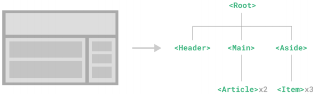
一、vue3进阶 1.1 单文件组件 组件定义 组件允许我们将 UI 划分为独立的、可重用的部分,并且可以对每个部分进行单独的思考。在实际应用中,组件常 常被组织成层层嵌套的树状结构:
1
2
3
4
5
6
7
8
9
10
11
12
13
14
15
16
17
18
19
20
app.component("tabbar”,{
组件带来的好处 (1)结构清晰 (2)复用性增加 (3)封装性
当前写法的吐槽: (1)dom高亮和代码提示没有 (2)css只能行内
单文件组件(SFC) Vue的单文件组件(即*.vue文件,英文Single-File Component,简称SFC)是一种特殊的文件格式,使我们能够 将一个Vue组件的模板、逻辑与样式封装在单个文件中。下面是一个单文件组件的示例:
1
2
3
4
5
6
7
8
9
10
11
12
13
14
15
16
17
18
<script>
Vue的单文件组件是网页开发中HTML、CSS和JavaScript三种语言经典组合的自然延伸。
使用熟悉的HTML、CSS和JavaScript语法编写模块化的组件
让本来就强相关的关注点自然内聚]
预编译模板,避免运行时的编译开销
[组件作用域的CSS]
[在使用组合式API时语法更简单]
通过交叉分析模板和逻辑代码能进行更多编译时优化
更好的IDE支持],提供自动补全和对模板中表达式的类型检查
开箱即用的模块热更新(HMR)支持
创建项目: Vue-CLI Vue CLI 是一个基于 Vue.js 进行快速开发的完整系统(已进入维护模式,官方推荐 Vite),提供:
一个丰富的官方插件集合,集成了前端生态中最好的工具。
一套完全图形化的创建和管理Vue.js项目的用户界面。
Vue CLI 致力于将Vue生态中的工具基础标准化。它确保了各种构建工具能够基于智能的默认配置即可平稳衔接, 这样你可以专注在撰写应用上,而不必花好几天去纠结配置的问题。与此同时,它也为每个工具提供了调整配置的 灵活性,无需eject。
安装:
1
2
3
npm install -g @vue/cli
确认版本:
1
2
3
4
5
6
7
8
9
> nvm list
创建一个项目:
1
2
3
4
5
6
7
8
> vue create my-projectfor your project: Babeldo you prefer placing config for Babel, ESLint, etc.? In dedicated config filesfor future projects? No
创建项目: Vite-官方推荐(★) 官方文档:https://cn.vitejs.dev/
Vite (法语意为”快速的”,发音/vit/,发音同”veet”)是一种新型前端构建工具,能够显著提升前端开发体验。它主要由两部分组成:
一个开发服务器 ,它基于原生ES模块提供了丰富的内建功能,如速度快到惊人的模块热更新(HMR)。
一套构建指令 ,它使用Rollup打包你的代码,并且它是预配置的,可输出用于生产环境的高度优化过的静态资源。
Vite意在提供开箱即用的配置,同时它的插件API和JavaScript API带来了高度的可扩展性,并有完整的类型支持。 官方图文说明
创建项目
Vite需要Node.js版本14.18+, 16+。然而,有些模板需要依赖更高的Node版本才能正常运行,当你的包管理器发出警告时,请注意升级你的Node版本。
node 与 vite 版本对应关系:参考说明
Vite 7 对应node版本:node 20.19+ 或者 22.12+
Vite 6 对应node版本:node 18+ 或者 20+
Vite 5 对应node版本:node 18+ 或者 20+
Vite 4 对应node版本:node 14、18+ 或者 16+
Vite 3 对应node版本:node 14、18+ 或者 16+
Vite 2 对应node版本:node 大于或等于 12.2.0
执行命令 npm view create-vite versions 查看当前vite所有版本,然后找到对应大版本下的小版本就好了。
查询当前通过脚手架可以指定的安装的版本:输入npm view create-vue versions
使用NPM:
1
2
3
4
5
6
7
8
9
10
11
12
13
14
15
npm create vite@latestin E:\work\webProjects\vue\3.0\myappvite...cd myappvite
使用Yarn:
使用PNPM:
启动流程 1.2 组件基础 1.2.1 父传子-接收传值props 1 2 3 4 5 6 7 8 9 10 11 12 13 14 15 16 17 18 19 20 21 22 23 <!-- 写法1:传值属性单独写 -->
子组件接收:(如果对接收的值不满意,可以通过 computed 计算属性进行二次计算、赋值给自己定义的属性值放dom上使用)
1 2 3 4 5 6 7 8 9 10 11 12 13 <template>
注意:
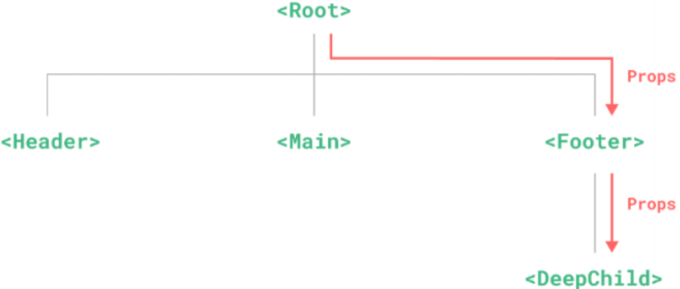
所有的props都遵循着单向绑定原则,props因父组件的更新而变化,自然地将新的状态向下流往子组件,而不会逆向传递。这避免了子组件意外修改父组件的状态的情况,不然应用的数据流将很容易变得混乱而难以理解。
另外,每次父组件更新后,所有的子组件中的props都会被更新到最新值,这意味着你不应该在子组件中去更改一个prop。若你这么做了,Vue会在控制台上向你抛出警告:
1 2 3 4 5 6 export default {props : ['foo' ],created :{this .foo = 'bar'
props属性验证&默认属性 1 2 3 4 5 6 7 8 9 10 11 12 13 14 15 16 17 18 19 20 21 22 23 24 25 26 27 28 29 30 31 32 33 34 35 export default {props : {propA : {type : null ,propB : {type : [String , Number ],required : true ,propC : {type : String ,required : true ,propD : {type : Number ,default : 100 ,propE : {type : Object ,default (rawProps ) {return { message : "hello" }propF : {validator (value ) { return ["success" , "warning" , "danger" ].includes (value)
当验证失败时,Vue会在控制台发出警告,但默认情况下不会阻止数据的传递和显示。
不过,可以通过自定义逻辑来处理不满足条件的参数,使其不显示或者以默认值替代。
1 2 3 4 5 6 7 8 9 10 11 12 13 14 15 16 17 18 19 20 21 22 23 24 25 26 27 <template>
校验选项中的type可以是下列这些原生构造函数:
String
Number
Boolean
Array
Object
Date
Function
Symbol
1.2.2 禁止属性透传 inheritAttrs: false,封装的组件在被其他组件使用时,不想被其他组件(即父组件)给污染了属性或样式,因此会设置禁止属性透传。
1 2 3 export default {inheritAttrs :false ,
1.2.3 子传父-自定义事件 $emit 在组件的模板表达式中,可以直接使用$emit方法触发自定义事件(例如:在v-on的处理函数中):
1 2 <!-- MyComponent,直接在标签上写可以不用 this. -->
emit()方法在组件实例上也同样以 this.emit()方法在组件实例上也同样以this. emit()方法在组件实例上也同样以this.emit()的形式可用:
1 2 3 4 5 6 7 8 export default {methods : {submit (this .$emit('someEvent' )
父组件可以通过v-on (缩写为@)来监听事件:
1 2 3 4 5 6 7 8 9 10 11 12 <MyComponent @some-event="callback" />
同样,组件的事件监听器也支持 .once 修饰符 、也支持同时监听多个事件 :
1 <MyComponent @some-event.once="callback" @some-event2="callback2" />
1.2.4 $refs-父组件的强权
ref 如果绑定在dom节点上,拿到的就是原生dom节点
ref 如果绑定在组件上,拿到的就是组件对象,可以实现通信功能
1 2 3 4 5 6 7 8 9 10 11 12 13 14 15 16 17 <Field label="用户名" ref="myusername"></Field>
1.2.5 $parent & root-子组件无法无天 在子组件中通过 $parent 访问父组件,通过 $root 访问根组件
1 2 3 4 5 6 methods :{handleClick (console .log (this .$parent .title ) console .log (this .$root .title )
1.2.6 provide() & inject-跨级通信 非响应式: 子孙组件可以inject注入到值,但无法去修改。
1 2 3 4 5 6 7 8 9 10 11 12 13 14 15 16 17 18 data (return {message :"hello jerry" provide (return {message : this .message export default {inject :["message" ]
1.2.7 模拟订阅发布模式 跨级组件通信方案,模拟订阅发布模式的简易实现。
store.js
1 2 3 4 5 6 7 8 9 10 export default {datalist : [],subscribe (callback ) {this .datalist .push (callback)publish (param ) {this .datalist .forEach (callback =>callback (param))
调用订阅的组件:
1 2 3 4 5 6 7 8 import store from "./store" export default {mounted (subscribe ((value ) => {console .log ("订阅被触发了" , value)
调用发布的组件:
1 2 3 4 5 6 7 8 import store from "./store" export default {methods : {handleClick (publish (this .xxx )
1.2.8 component 动态组件 在切换时创建新的组件实例通常是有意义的,但在这个例子中,我们的确想要组件能在被“切走”的时候保留它们的状态。要解决这个问题,我们可以用<KeepAlive> 或 <keep-alive>内置组件将这些动态组件包装起来。
include 属性,指定包含的组件,必须写成组件的名字(script setup 时会自动有组件名字,否则需要自己指定组件名字)exclude 属性,指定不包含的组件
1 2 3 4 5 6 7 8 9 10 11 12 13 14 15 16 17 18 19 <!--非活跃的组件将会被缓存!-->
1 2 3 4 5 6 7 8 9 10 11 12 13 14 15 16 17 18 19 import store from "./store" export default {data (return {whichComponent : "Home" mounted (let obj = {"Home" ,"List" ,"Center" ,subscribe (value =>this .whichComponent = obj[value]
v-model 在组件中通信(原理) v-model 的展开形式如下:
1 <componet :modelValue="inputText" @update:modelValue="newValue => inputText = newValue">
因此在
父传子 时,父使用 v-model,子组件的 props 中需要使用 modelValue 来接收值。
子传父 时,子组件通过 @input 事件 $emit 去触发 update:modelValue 事件,并带上输入的参数。
1 2 3 <!-- 子组件 Field.vue -->
1 2 <!-- 父组件 xxx.vue -->
1.2.9 异步加载组件(★) 在大型项目中,我们可能需要拆分应用为更小的块,并仅在需要时(如点击时)再从服务器加载相关组件。
defineAsyncComponent(() => import(path)) Vue提供了该方法来实现此功能(注意:*需要删除手动导入组件的方式 import … from …*)。
1 2 3 4 5 6 7 8 9 10 11 12 13 <script>
加载与错误提示
1 2 3 4 5 6 7 8 9 10 11 12 13 const AsyncComp = defineAsyncComponent ({loader : () => import ('./Foo.vue' ),loadingcomponent : Loadingcomponent ,delay : 200 ,errorComponent : ErrorComponent ,timeout : 3000
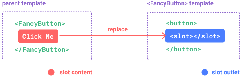
1.3 组件插槽 1.3.1 slot 插槽基本应用 <slot>元素是一个插槽出口(slot outlet),标示了父元素提供的插槽内容(slot content)将在哪 里被渲染。
注意:
插槽内容可以访问到父组件的数据作用域。(比如在父组件中放按钮直接控制父组件的属性来改变其他子组件的显示隐藏)
插槽内容无法访问子组件的数据。
Vue模板中的表达式只能访问其定义时所处的作用域,这和JavaScript的词法作用域规则是一致的。
换言之:父组件模板中的表达式只能访问父组件的作用域;子组件模板中的表达式只能访问子组件的作用域。
1.3.2 #name 具名插槽 v-slot:name 简写 #name ,插槽名字。
1 2 3 4 5 6 7 8 9 10 11 12 //子组件:
1 2 3 4 5 6 7 8 9 10 11 12 //父组件:
1.3.3 作用域插槽 在某些场景下插槽的内容可能想要同时使用父组件域内和子组件域内的数据。要做到这一点,我们需要一种方法来让子组件在渲染时将一部分数据提供给插槽。
1 2 3 4 5 6 7 8 9 10 11 12 <Nowplaying v-slot="myprops">
解构写法 + 具名插槽简写:
1 2 3 4 5 <!-- myprops可以结构写为 {mylist},遍历时直接使用 mylist 就不需要 myprops. 了 -->
1 2 3 4 5 6 7 8 <!-- Nowplaying.vue子组件开放了 datalist 给父组件可以进行传入数据(如果没有使用mylist插槽内默认显示自己的内容) -->
1.4 生命周期 每个Vue组件实例在创建时都需要经历一系列的初始化步骤,比如设置好数据侦听,编译模板,挂载实例到 DOM,以及在数据改变时更新DOM。在此过程中,它也会运行被称为生命周期钩子的函数,让开发者有机会在特定阶段运行自己的代码。
beforeCreate() 会在实例初始化完成、props解析之后、data()和computed等选项处理之前立即调用。
created() 当这个钩子被调用时,以下内容已经设置完成:响应式数据、计算属性、方法和侦听器。然而,此时挂载阶段还未开始,因此$el属性仍不可用。
beforeMount() 当这个钩子被调用时,组件已经完成了其响应式状态的设置,但还没有创建DOM节点。它即将 首次执行DOM渲染过程。
mounted() 所有同步子组件都已经被挂载。这个钩子通常用于执行需要访问组件所渲染的DOM树 相关的作用。—— 最常用
场景:订阅发布、ajax、setInterval、访问dom
beforeUpdate() 这个钩子可以用来在Vue更新DOM之前访问DOM状态。在这个钩子中更改状态也是安全的。
updated() 这个钩子会在组件的任意DOM更新后被调用,这些更新可能是由不同的状态变更导致的。如果你需要在某个特定的状态更改后访问更新后的DOM,请使用 nextTick() 作为替代。
beforeUnmount() 当这个钩子被调用时,组件实例依然还保有全部的功能。
unmounted() 在一个组件实例被卸载之后调用。
场景:解绑事件如窗口大小变动监听window.onresize=null
vue2 & vue3 生命周期对比
vue2
vue3
beforeCreate setup(()=>{ })
created setup(()=>{ })
beforeMount
onBeforeMount(()=>{})
mounted
onMounted(()=>{})
beforeUpdate
onBeforeUpdate(()=>{})
updated
onUpdated(()=>{})
beforeDestroy onBeforeUnmount(()=>{ })
destroyed onUnmounted(()=>{ })
总结: Vue2和Vue3钩子变化不大,beforeCreate 、created 两个钩子被 setup() 钩子来替代。
结合单文件组件使用的组合式 API,推荐通过 <script setup> ... </script> 以获得更加简洁及符合人体工程学的语法。
示例(echarts与生命周期):
1 2 3 4 5 6 7 8 9 10 11 12 13 14 15 16 17 18 19 20 21 22 23 24 25 26 27 28 29 30 31 32 33 34 35 36 37 38 39 40 41 42 43 44 45 46 47 48 49 50 51 52 53 54 <template>
1.5 组件的封装-swiper 1.5.1 纯静态轮播 .html
【注意】一定要在dom数据都上树(渲染到dom节点上)后再 new Swiper()
1 2 3 4 5 6 7 8 9 10 11 12 13 14 15 16 17 18 19 20 21 22 23 24 25 26 27 28 29 30 31 32 33 34 35 36 37 38 39 40 41 42 43 44 45 46 47 48 49 50 51 52 53 54 55 56 57 58 59 60 <!DOCTYPE html > <html lang ="en" > <head > <meta charset ="UTF-8" > <meta name ="viewport" content ="width=device-width, initial-scale=1.0" > <title > Document</title > <link rel ="stylesheet" href ="https://unpkg.com/swiper@8/swiper-bundle.min.css" > <script src ="https://unpkg.com/swiper@8/swiper-bundle.min.js" > </script > <style > .swiper { width : 600px ; height : 300px ; } </style > </head > <body > <h1 > </h1 > <div class ="swiper" > <div class ="swiper-wrapper" > <div class ="swiper-slide" > Slide 1</div > <div class ="swiper-slide" > Slide 2</div > <div class ="swiper-slide" > Slide 3</div > </div > <div class ="swiper-pagination" > </div > <div class ="swiper-button-prev" > </div > <div class ="swiper-button-next" > </div > </div > <script > var mySwiper = new Swiper ('.swiper' , { loop : true , pagination : { el : '.swiper-pagination' , }, navigation : { nextEl : '.swiper-button-next' , prevEl : '.swiper-button-prev' , }, }) </script > </body > </html >
1.5.2 模块化轮播 .vue-推荐(★) 基于 swiper12 引入,安装 swiper 指定版本,如12版本:npm i swiper@12
1 2 3 4 5 6 7 8 9 10 11 12 13 14 15 16 17 18 19 20 21 22 23 24 25 26 27 28 29 30 31 32 33 34 35 36 37 38 39 40 41 42 43 44 45 46 47 48 49 50 51 52 53 54 55 56 57 58 59 60 61 62 63 64 65 <template>
1.5.3 自定义轮播组件封装 1 2 3 4 5 6 7 8 9 10 11 12 13 14 15 16 17 18 19 20 21 22 23 24 25 26 27 28 29 30 31 32 33 34 35 36 37 38 39 40 41 42 43 44 <template>
MySwiper.vue
1 2 3 4 5 6 7 8 9 10 11 12 13 14 15 16 17 18 19 20 21 22 23 24 25 26 27 28 29 30 31 32 <template>
MySwiperItem.vue
1 2 3 4 5 <template>
二、自定义指令 2.1 指令写法 除了 Vue内置的一系列指令(比如v-model或v-show)之外,Vue还允许你注册自定义的指令(Custom Directives)。
自定义指令主要是为了重用涉及普通元素的底层DOM访问的逻辑。
全局
1 2 3 4 5 const app = createApp (App )directive ('focus' , {
局部
1 2 3 4 5 6 7 8 const focus = { mounted : (el ) => el.focus ()export default { directives : {
2.2 指令钩子-生命周期 1 2 3 4 5 6 7 8 9 const myDirective = {created (el, binding, vnode, prevVnode ) {}, beforeMount (el, binding, vnode, prevVnode ) {}, mounted (el, binding, vnode, prevVnode ) {}, beforeUpdate (el, binding, vnode, prevVnode ) {}, updated (el, binding, vnode, prevVnode ) {}, beforeUnmount (el, binding, vnode, prevVnode ) {}, unmounted (el, binding, vnode, prevVnode ) {}
简写形式
对于自定义指令来说,一个很常见的情况是仅仅需要在mounted和updated上实现相同的行为,除此之外并不 需要其他钩子。这种情况下我们可以直接用一个函数来定为指令,如下所示:
1 <div v-jerrycolor ="yellow" > </div >
1 2 3 4 5 6 7 8 9 10 11 12 13 directive ('jerrycolor' , (el, binding ) => {style .color = binding.value export default {directives : {jerrycolor (el, binding ) {style .color = binding.value
三、过渡动画 Vue 提供了两个内置组件,可以帮助你制作基于状态变化的过渡和动画:
3.1 过渡效果
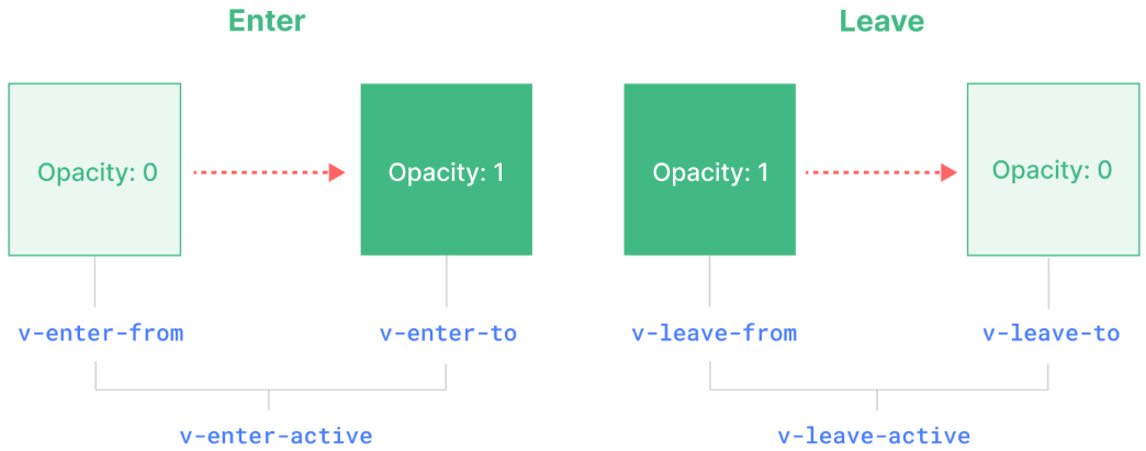
v-enter-from:进入动画的起始状态。在元素插入之前添加,在元素插入完成后的下一帧移除。v-enter-active:进入动画的生效状态。应用于整个进入动画阶段。在元素被插入之前添加,在过渡或动画完成之后移除。这个 class 可以被用来定义进入动画的持续时间、延迟与速度曲线类型。v-enter-to:进入动画的结束状态。在元素插入完成后的下一帧被添加 (也就是 v-enter-from 被移除的同时),在过渡或动画完成之后移除。v-leave-from:离开动画的起始状态。在离开过渡效果被触发时立即添加,在一帧后被移除。v-leave-active:离开动画的生效状态。应用于整个离开动画阶段。在离开过渡效果被触发时立即添加,在过渡或动画完成之后移除。这个 class 可以被用来定义离开动画的持续时间、延迟与速度曲线类型。v-leave-to:离开动画的结束状态。在一个离开动画被触发后的下一帧被添加 (也就是 v-leave-from 被移除的同时),在过渡或动画完成之后移除。
最简单的示例:
1 2 3 4 5 6 7 8 9 10 11 12 13 14 15 16 17 18 19 20 21 22 23 24 25 26 27 <template>
可以给Transition传一个name属性来声明一个过渡效果名:
1 2 3 <Transition name="fade">
class样式则可以使用过渡效果名称 name:
1 2 3 4 5 6 7 8 9 .fade-enter-active ,.fade-leave-active {transition : opacity 0.5s ease;.fade-enter-from ,.fade-leave-to {opacity : 0 ;
3.1.1 animate CSS动画库 官网:https://animate.style/
示例:
animate__animated 前缀必须添加 ,否则不生效。animate__backInDown 或 animate__backOutDown 是从官网复制过来的效果。
1 2 3 4 5 6 7 8 9 10 11 12 13 14 15 16 17 18 19 <template>
示例:多个并存或切换
如果内部有多个元素,最好使用标签进行包裹。
v-if 和 v-else 切换
1 2 3 4 <Transition>
3.1.2 JS钩子函数 1 2 3 4 5 6 7 8 9 10 11 12 <Transition
1 2 3 4 5 6 7 8 9 10 11 12 13 14 15 16 17 18 19 20 21 22 23 24 25 26 27 28 29 function onBeforeEnter (el ) {}function onEnter (el, done ) {done ()function onAfterEnter (el ) {}function onEnterCancelled (el ) {}function onBeforeLeave (el ) {}function onLeave (el, done ) {done ()function onAfterLeave (el ) {}function onLeaveCancelled (el ) {}
过渡模式
1 2 3 <Transition mode="out-in">
组件间过渡
1 2 3 <Transition name="fade" mode="out-in">
3.2 列表过渡 TransitionGroup是一个内置组件,用于对 v-for 列表中的元素或组件的插入、移除和顺序改变添加动画效果。
区别:
默认情况下,它不会渲染一个容器元素。但你可以通过传入tag prop来指定一个元素作为容器元素来渲染。
过渡模式在这里不可用,因为我们不再是在互斥的元素之间进行切换。
列表中的每个元素都必须有一个独一无二的 key 字段,否则动画会不生效。
CSS过渡class会被应用在列表内的元素上,而不是容器元素上。
1 2 3 4 5 <TransitionGroup name="list" tag="ul">
移动动画
当某一项被插入或移除时,它周围的元素会立即发生“跳跃”而不是平稳地移动。我们可以通过添加一些额外的CSS 规则来解决这个问题:
1 2 3 4 5 6 7 8 .list-move {transition : all 0.5s ease;.list-leave-active {position : absolute;
3.3 可复用过渡 得益于Vue的组件系统,过渡效果是可以被封装复用的。要创建一个可被复用的过渡,我们需要为Transition组 件创建一个包装组件,并向内传入插槽内容:
1 2 3 4 5 6 7 8 9 10 11 12 13 14 15 16 17 18 19 <!-- MyTransition.vue -->
现在MyTransition 可以在导入后像内置组件那样使用了 :
1 2 3 <MyTransition>