参考:
1. styled-components
它是通过JavaScript改变CSS编写方式的解决方案之一,从根本上解决常规CSS编写的一些弊端。
通过JavaScript来为CSS赋能,我们能达到常规CSS所不好处理的逻辑复杂、函数方法、复用、避免干扰。样式书写将直接依附在JSX上面,HTML、CSS、JS三者再次内聚,all in js 的思想。
1.1 安装
安装:npm i styled-components - 当前大版本是 v6
VSCode 插件
安装:vscode-styled-components 可以支持 styled-components 在 js 或 ts 文件中写 css 也能高亮且提示。
1.2 基本使用
- 所有的样式语法都使用
styled.xxx`` 语法。
1
2
3
4
5
6
7
8
9
10
11
12
13
14
15
16
17
18
19
20
21
22
23
24
25
26
27
28
29
30
31
32
33
34
35
36
37
38
39
40
| import React, { Component } from 'react'
import { styled } from 'styled-components'
export default class App extends Component {
render() {
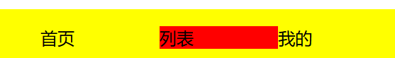
const StyledFooter = styled.footer`
background: yellow;
position: fixed;
left: 0;
bottom: 0;
width: 100%;
height: 50px;
line-height: 50px
text-align: center;
ul {
display: flex;
list-style: none;
li{
flex: 1;
&:hover {
background: red;
}
}
}
`
return (
<StyledFooter>
<footer>
<ul>
<li>首页</li>
<li>列表</li>
<li>我的</li>
</ul>
</footer>
</StyledFooter>
)
}
}
|
1.3 透传 props
1
2
3
4
5
6
7
8
9
10
11
12
13
14
15
16
17
18
19
20
21
22
23
24
| import React, { Component } from 'react'
import { styled } from 'styled-components'
export default class App extends Component {
render() {
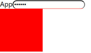
const StyledInput = styled.input`
outline: none;
border-radius: 10px;
border-bottom: 1px solid red;
`
const StyledDiv = styled.div`
background: ${props => props.bg || 'yellow'};
width: 100px;
height: 100px;
`
return (
<div>
App
<StyledInput type="password" placeholder="请输入" />
<StyledDiv bg="red"></StyledDiv>
</div>
)
}
}
|
1.4 样式化组件
1
2
3
4
5
6
7
8
9
10
11
12
13
14
15
16
17
18
19
20
| import { Component } from 'react'
import styled from 'styled-components'
export default class App extends Component {
render() {
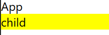
const StyledChild = styled(Child)`
background: yellow;
`
return (
<div>App
{/* 默认会传给子组件 className 属性 */}
<StyledChild></StyledChild>
</div>
)
}
}
function Child(props) {
return <div className={props.className}>child</div>
}
|
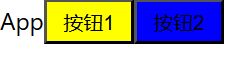
1.5 样式继承
1
2
3
4
5
6
7
8
9
10
11
12
13
14
15
16
17
18
19
20
21
22
| import React, { Component } from 'react'
import styled from 'styled-components'
export default class App extends Component {
render() {
const StyledButton = styled.button`
width: 60px;
height: 30px;
background: yellow;
`
const StyledButton2 = styled(StyledButton)`
background: blue;
`
return (
<div>App
<StyledButton>按钮1</StyledButton>
<StyledButton2>按钮2</StyledButton2>
</div>
)
}
}
|
1.6 动画
1
2
3
4
5
6
7
8
9
10
11
12
13
14
15
16
17
18
19
20
21
22
23
24
25
26
| import { Component } from 'react'
import styled, { keyframes } from 'styled-components'
export default class App extends Component {
render() {
const myaniamtion = keyframes`
from {
transform: rotate(0deg);
}
to {
transform: rotate(360deg);
}
`
const StyleDiv = styled.div`
width: 100px;
height: 100px;
background: yellow;
animation: ${myaniamtion} 1s infinite
`
return (
<div>
<StyleDiv></StyleDiv>
</div>
)
}
}
|