
参考:
1. 环境准备
1.1 安装 HBuild X
HBuild X 开发工具:https://hx.dcloud.net.cn/
注意事项:
- 安装时选择快捷键方案
IntelliJ IDEA 方案即可。
HBuilderX 代码格式化配置参考:https://zhuanlan.zhihu.com/p/374891673
1.2 创建项目
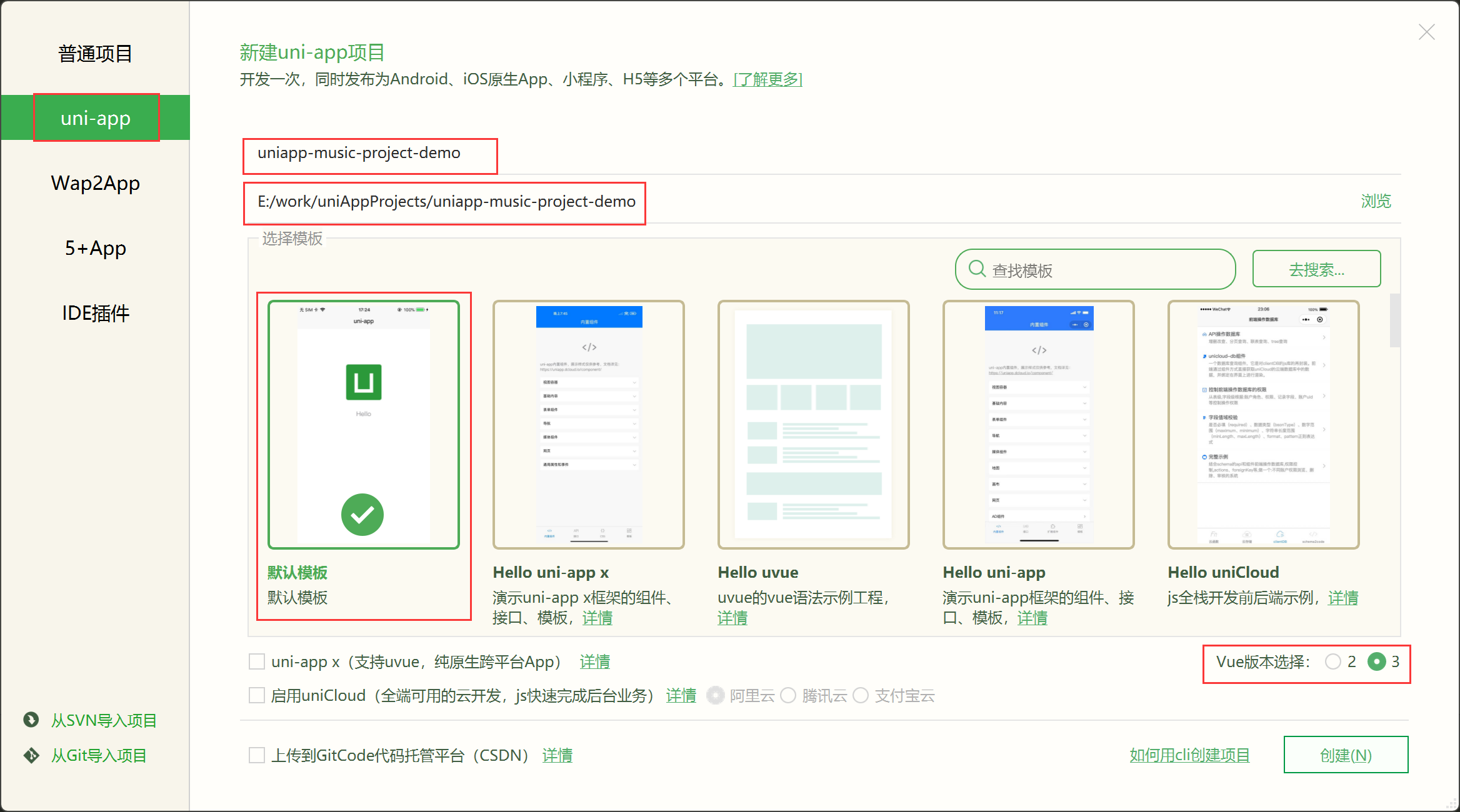
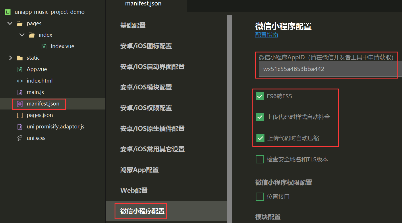
1.3 验证运行
① 运行到 chrome 浏览器:【运行】-【运行到浏览器】-【Chrome】
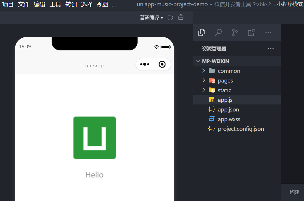
第一次运行项目,确保默认模版代码运行成功。
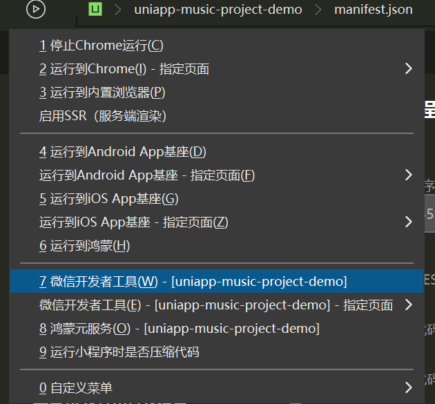
② 运行到 微信开发者工具:
1.4 iconfont
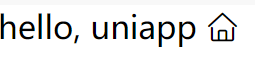
阿里矢量图标库,准备字体图标,收集好图标,打包下载到本地,放在项目的 static/ 目录下。样式文件放在 common/目录下(手动创建)
1
2
3
4
5
| common/
iconfont.css
static/
iconfont/
其他文件.xxx
|
common/iconfont.css
1
2
3
4
5
6
7
8
| @font-face {
font-family: "iconfont";
src: url('~@/static/iconfont/iconfont.woff2?t=1770204954739') format('woff2'),
url('~@/static/iconfont/iconfont.woff?t=1770204954739') format('woff'),
url('~@/static/iconfont/iconfont.ttf?t=1770204954739') format('truetype');
}
...
|
验证:pages/index/index.vue
1
2
3
4
5
6
7
8
9
10
11
12
13
| <template>
<view class="content">
hello, uniapp <text class="iconfont icon-shouye"></text>
</view>
</template>
<script>
import '@/common/iconfont.css'
export default {}
</script>
<style>
</style>
|
2. 页面与组件
先搭结构 -> 再写样式 -> 渲染数据 -> 交互行为。
2.1 目录结构
https://uniapp.dcloud.net.cn/tutorial/project.html
1
2
3
4
5
6
7
8
9
10
11
12
13
14
15
16
17
18
19
20
21
22
23
24
25
26
27
28
29
30
| ┌─uniCloud 云空间目录,支付宝小程序云为uniCloud-alipay,阿里云为uniCloud-aliyun,腾讯云为uniCloud-tcb(uniCloud)
│─components 符合vue组件规范的uni-app【'组件'】目录
│ └─comp-a.vue 可复用的a组件
├─pages 业务【'页面'】文件存放的目录
│ ├─index
│ │ └─index.vue index页面
│ └─list
│ └─list.vue list页面
├─static 存放应用引用的本地【'静态资源'】(如图片、视频等)的目录,注意:静态资源都应存放于此目录
├─uni_modules 存放uni_module
├─platforms 存放各平台专用页面的目录
├─nativeplugins App原生语言插件
├─nativeResources App端原生资源目录
│ ├─android Android原生资源目录
| └─ios iOS原生资源目录
├─hybrid App端存放本地html文件的目录
├─wxcomponents 存放微信小程序、QQ小程序组件的目录
├─mycomponents 存放支付宝小程序组件的目录
├─swancomponents 存放百度小程序组件的目录
├─ttcomponents 存放抖音小程序、飞书小程序组件的目录
├─kscomponents 存放快手小程序组件的目录
├─jdcomponents 存放京东小程序组件的目录
├─unpackage 非工程代码,一般存放运行或发行的【'编译结果'】
├─main.js 【'Vue初始化入口'】文件
├─App.vue 【'应用配置'】,用来配置App全局样式以及监听 应用生命周期
├─pages.json 【'配置页面路由、导航条、选项卡'】等页面类信息
├─manifest.json 配置应用名称、appid、logo、版本等【'打包信息'】
├─AndroidManifest.xml Android原生应用清单文件
├─Info.plist iOS原生应用配置文件
└─uni.scss 内置的常用样式变量
|
2.2 自定义头部组件
自定义导航 title:https://uniapp.dcloud.net.cn/collocation/pages.html#style
配置 pages.json
1
2
3
4
5
6
7
8
9
10
11
12
| {
"pages": [
{
"path": "pages/index/index",
"style": {
"navigationStyle": "custom"
}
}
],
...
}
|
根目录新建 components/ 目录,在该目录下新建组件 xxx,同时勾选 ☑创建组件 。
2.3 页面创建
https://uniapp.dcloud.net.cn/component/view.html
创建页面使用 vue3 + 组合式api 方式:使用 scss 的页面(组合式) + 导航栏标题 navigationBarTitleText
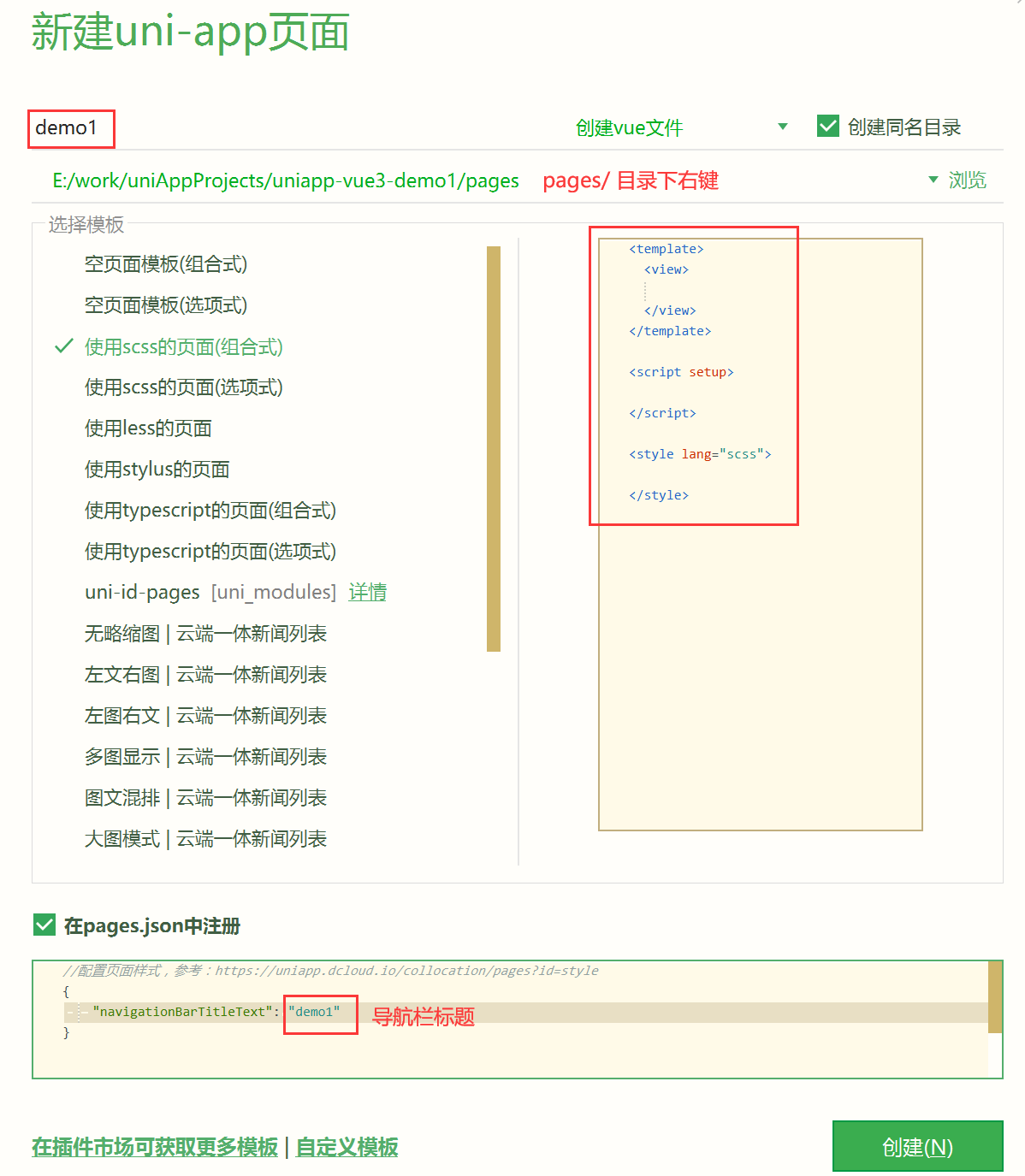
对应 page.json 也会创建出来路由:
1
2
3
4
5
6
7
8
9
10
11
12
13
14
15
16
17
18
19
20
21
22
23
| {
"pages": [
{
"path": "pages/index/index",
"style": {
"navigationBarTitleText": "uni-app"
}
},
{
"path": "pages/demo1/demo1",
"style": {
"navigationBarTitleText": "demo1"
}
}
],
"globalStyle": {
"navigationBarTextStyle": "black",
"navigationBarTitleText": "uni-app",
"navigationBarBackgroundColor": "#F8F8F8",
"backgroundColor": "#F8F8F8"
},
"uniIdRouter": {}
}
|
2.4 view | text 容器
view 类似于传统html中的div,用于包裹各种元素内容。
text 类似于传统html中的span,用于包裹文本内容。
1
2
3
4
5
6
7
8
| <template>
<view class="box" hover-class="boxHover" hover-stay-time="0">
<view class="inner" hover-class="innerHover" hover-stop-propagation>内部</view>
</view>
<text selectable space>text文本标签</text>
</template>
|
scroll-view 使用竖向滚动时,需要给 <scroll-view> 一个固定高度,通过 css 设置 height;使用横向滚动时,需要给<scroll-view>添加white-space: nowrap;样式。
1
2
3
4
5
6
7
8
9
10
11
12
13
|
<scroll-view scroll-y class="scrollview-y">
<view>scrollview子元素</view>
...
</scroll-view>
<style lang="scss">
.scrollview-y {
width: 80%;
height: 200px;
border: 1px solid red;
}
</style>
|
1
2
3
4
5
6
7
8
9
10
11
12
13
14
15
16
17
18
19
20
|
<scroll-view scroll-x class="scrollview-x">
<view>scrollview子元素</view>
...
</scroll-view>
<style lang="scss">
.scrollview-x {
width: 80%;
height: 200px;
border: 1px solid red;
white-space: nowrap;
view {
width: 80px;
height: 80px;
border: 1px solid blue;
display: inline-block;
}
}
</style>
|
2.6 swiper 轮播
swiper 滑块视图容器。一般用于左右滑动或上下滑动,比如banner轮播图。
注意滑动切换和滚动的区别,滑动切换是一屏一屏的切换。swiper下的每个swiper-item是一个滑动切换区域,不能停留在2个滑动区域之间。
1
2
3
4
5
6
7
8
9
10
11
12
13
14
15
16
17
18
19
20
21
22
23
24
25
26
27
28
29
30
31
| <template>
<view class="">
<swiper :indicator-dots="true" :circular="true" :autoplay="true" :interval="3000" :duration="1000">
<swiper-item>111</swiper-item>
<swiper-item>222</swiper-item>
<swiper-item>333</swiper-item>
<swiper-item>444</swiper-item>
</swiper>
</view>
</template>
<script setup></script>
<style lang="scss">
swiper {
width: 99vw;
height: 200px;
border: 1px solid red;
swiper-item {
width: 100%;
height: 100%;
background: pink;
}
swiper-item:nth-child(2n) {
background: orange;
}
}
</style>
|
2.7 image 图片
image 媒体组件中用于图片渲染显示。常用 mode 属性:
- aspectFit 保持纵横比缩放图片,使图片的长边能完全显示出来。也就是说,可以完整地将图片显示出来。
- aspectFill 保持纵横比缩放图片,只保证图片的短边能完全显示出来。也就是说,图片通常只在水平或垂直方向是完整的,另一个方向将会发生截取。
- widthFix 宽度不变,高度自动变化,保持原图宽高比不变
- heightFix 高度不变,宽度自动变化,保持原图宽高比不变
1
2
3
4
5
6
7
8
9
10
11
12
13
14
15
16
17
18
19
20
21
22
| <template>
<view>
<image src="/static/logo.png" mode="" class="pic1"></image>
<image src="/static/logo.png" mode="aspectFill" class="pic2"></image>
</view>
</template>
<script setup></script>
<style lang="scss">
.pic1 {
width: 150px;
height: 150px;
}
.pic2 {
width: 100px;
height: 100px;
}
</style>
|
2.8 navigator 跳转
navigator 页面跳转。该组件类似HTML中的<a>组件,但只能跳转本地页面。目标页面必须在 pages.json 中注册。
重点是 open-type 属性:(声明式路由跳转 ,编程式路由跳转 对应 nui.xxx)
| 值 |
说明 |
平台差异说明 |
| navigate |
对应 uni.navigateTo 的功能,保留当前页面,跳转到应用内的某个页面 |
|
| redirect |
对应 uni.redirectTo 的功能,关闭当前页面,跳转到应用内的某个页面 |
|
| switchTab |
对应 uni.switchTab 的功能,跳转到 tabBar 页面,并关闭其他所有非 tabBar 页面 |
|
| reLaunch |
对应 uni.reLaunch 的功能,关闭所有页面,打开到应用内的某个页面 |
抖音小程序与飞书小程序不支持 |
| navigateBack |
对应 uni.navigateBack 的功能,关闭当前页面,返回上一页面或多级页面 |
|
| exit |
退出小程序,target=”miniProgram”时生效 |
微信2.1.0+、百度2.5.2+、QQ1.4.7+、小红书小程序 |
1
2
3
4
5
6
7
| <template>
<view>
<navigator url="/pages/demo1/demo1">跳转到demo1</navigator>
<navigator url="/pages/demo1/demo1" open-type="reLaunch">跳转到demo1-open-type</navigator>
</view>
</template>
|
2.9 表单组件
button input
1
2
3
4
5
6
7
8
9
10
11
12
13
| <template>
<view>
<button>默认按钮</button>
<button size="mini">mini</button>
<button size="mini" type="primary">primary</button>
<button size="mini" type="warn">warn</button>
<button size="mini" type="primary" plain>plain镂空</button>
<button size="mini" type="primary" plain disabled>禁用</button>
<button size="mini" type="primary" plain loading>loading</button>
<hr />
<input type="text" placeholder="默认text输入框" maxlength="10" />
</view>
</template>
|
2.10 事件映射表
1
2
3
4
5
6
7
8
9
10
11
12
13
14
15
16
17
18
19
20
21
22
23
|
{
click: 'tap',
touchstart: 'touchstart',
touchmove: 'touchmove',
touchcancel: 'touchcancel',
touchend: 'touchend',
tap: 'tap',
longtap: 'longtap',
input: 'input',
change: 'change',
submit: 'submit',
blur: 'blur',
focus: 'focus',
reset: 'reset',
confirm: 'confirm',
columnchange: 'columnchange',
linechange: 'linechange',
error: 'error',
scrolltoupper: 'scrolltoupper',
scrolltolower: 'scrolltolower',
scroll: 'scroll'
}
|
2.11 页面生命周期
页面生命周期:uni-app 页面除支持 Vue 组件生命周期外还支持下方页面生命周期函数。
基于 vue3 的组合式 api 使用页面生命周期:https://uniapp.dcloud.net.cn/tutorial/vue3-composition-api.html
uniapp中生命周期函数的执行顺序:
不包含组件的页面:onLoad > onShow > onReady
包含组件的页面:onLoad > onShow > beforeCreate > created > beforeMount > mounted > onReady
- onLoad - 页面开始加载,一般用于获取 url 上的参数
- onReady - 监听页面初次渲染完成,此时组件已挂载完成,DOM 树($el)已可用,可做相关的初始化 或 DOM操作
- onShow - 监听页面显示,页面每次出现在屏幕上都触发,包括从下级页面点返回露出当前页面,如进入页面视频/游戏播放(从 onHide 进来的页面)
- onHide - 监听页面隐藏,如离开页面视频/游戏播放暂停
- onUnload - 监听页面卸载
- onPageScroll - 监听页面滚动,参数为Object
- …
onLoad 示例:
1
2
3
4
5
6
7
8
| <script setup>
import { ref } from 'vue'
import { onLoad } from '@dcloudio/uni-app'
const title = ref('Hello')
onLoad(() => {
console.log('onReady')
})
</script>
|
接收 url 上的参数:
1
2
3
4
5
6
7
| <script setup>
import { onLoad } from '@dcloudio/uni-app'
onLoad((e) => {
console.log("onLoad 执行:", e.name, e.age);
})
</script>
|
onPageScoroll 示例:(回到顶部功能)
1
2
3
4
5
6
7
8
9
10
11
12
13
14
15
16
17
18
19
20
21
22
23
24
25
26
27
28
29
30
31
32
33
34
35
36
37
38
39
40
| <template>
<view>
<view v-for="(item,index) in 50" :key="index">
{{item}} - {{index}}
</view>
<view class="backTop" v-if="showBackTop" @click="goBack">
Top↑
</view>
</view>
</template>
<script setup>
import {
onPageScroll
} from '@dcloudio/uni-app'
import {
ref
} from 'vue';
let showBackTop = ref(false)
onPageScroll((e) => {
console.log("滚动:", e.scrollTop);
showBackTop.value = e.scrollTop > 200
})
const goBack = () => {
document.documentElement.scrollTop = 0
}
</script>
<style lang="scss" scoped>
.backTop {
width: 50px;
height: 50px;
background-color: yellow;
position: fixed;
right: 10px;
bottom: 10px;
}
</style>
|
2.12 css 尺寸单位 rpx(750基准)
css 尺寸单位
- px 即屏幕像素
rpx 即响应式 px,一种根据屏幕宽度自适应的动态单位。以 750px 宽的屏幕为基准,750rpx 恰好为屏幕宽度。屏幕变宽,rpx 实际显示效果会等比放大,但在 App(vue2 不含 nvue) 端和 H5(vue2) 端屏幕宽度达到 960px 时,默认将按照 375px 的屏幕宽度进行计算,具体配置参考:rpx 计算配置 。
UI 常用在线工具:蓝湖、MasterGo、即时设计
取尺寸单位的方式:在 UI 工具中(或PS)中对设计稿进行等比缩放,宽度固定为 750px,此时就可以显示多大,就可以设置多大的 rpx。
目录放置要求:
css、less/scss 等资源不要放在 static 目录下,建议这些公用的资源放在自建的 common 目录下。- 非
static 目录下的文件(vue组件、js、css 等)只有被引用时,才会被打包编译。且默认 static 目录必定会被打包编译。
导入方式:使用@import语句可以导入外联样式表,@import后跟需要导入的外联样式表的相对路径,用;表示语句结束。
1
2
3
4
5
6
| <style>
@import "../../common/uni.css";
.uni-text {
color: $uni-color-primary; //可以直接使用 uni.scss 中的变量,或 uni.scss 文件中自定义新增变量
}
</style>
|
也可以自己定义目录:
1
2
3
4
5
| common/
css/
js/
scss/
xxx.scss
|
在 uni.scss 中引入自定义的 scss 文件,成为公共样式变量:
1
2
3
4
|
$uni-color-primary: #007aff;
...
@import "@/common/scss/xxx.css"; //一定注意要以分号 ; 结束
|
3. 全局配置
3.1 路由 globalStyle
globalStyle 用于设置应用的状态栏、导航条、标题、窗口背景色等。
| 属性 |
类型 |
默认值 |
描述 |
navigationBarBackgroundColor |
HexColor |
#F8F8F8 |
导航栏背景颜色(同状态栏背景色) |
navigationBarTextStyle |
String |
black |
导航栏标题颜色及状态栏前景颜色,仅支持 black/white |
navigationBarTitleText |
String |
|
导航栏标题文字内容 |
navigationStyle |
String |
default |
导航栏样式,仅支持 default/custom。custom 即取消默认的原生导航栏,需看使用注意 |
backgroundColor |
HexColor |
#ffffff |
下拉显示出来的窗口的背景色 |
backgroundTextStyle |
String |
dark |
下拉 loading 的样式,仅支持 dark / light |
enablePullDownRefresh |
Boolean |
false |
是否开启下拉刷新,详见页面生命周期。 |
onReachBottomDistance |
Number |
50 |
页面上拉触底事件触发时距页面底部距离,单位只支持 px,详见页面生命周期 |
| … |
|
|
|
1
2
3
4
5
6
7
8
9
| "globalStyle": {
"navigationBarTextStyle": "white",
"navigationBarTitleText": "全局导航标题",
"navigationBarBackgroundColor": "#14c145",
"backgroundColor": "#F8F8F8",
"backgroundTextStyle": "dark",
"enablePullDownRefresh": true,
"onReachBottomDistance": 50
},
|
3.2 配置 pages.json(完整)
pages 配置项列表 以下是包含了额所有配置项的 pages.json :
- globalStyle 中的属性都适用于 pages 中的 style,且 pages 中 style 优先级更高。
1
2
3
4
5
6
7
8
9
10
11
12
13
14
15
16
17
18
19
20
21
22
23
24
25
26
27
28
29
30
31
32
33
34
35
36
37
38
39
40
41
42
43
44
45
46
47
48
49
50
51
52
53
54
55
56
57
58
59
60
61
62
63
64
65
66
67
68
69
70
71
72
73
74
75
76
77
78
79
80
81
82
83
84
85
86
87
88
89
90
91
92
93
94
95
96
97
98
99
100
101
102
103
104
105
106
107
108
109
110
111
112
113
114
115
116
| {
"pages": [
{
"path": "pages/index/index",
"style": {
"navigationBarTitleText": "组件"
}
},
{
"path": "pages/API/index",
"style": {
"navigationBarTitleText": "接口"
}
},
{
"path": "pages/component/view/index",
"style": {
"navigationBarTitleText": "view"
}
}
],
"condition": {
"current": 0,
"list": [
{
"name": "test",
"path": "pages/component/view/index"
}
]
},
"globalStyle": {
"navigationBarTextStyle": "black",
"navigationBarTitleText": "演示",
"navigationBarBackgroundColor": "#F8F8F8",
"backgroundColor": "#F8F8F8",
"usingComponents": {
"collapse-tree-item": "/components/collapse-tree-item"
},
"renderingMode": "seperated",
"pageOrientation": "portrait",
"rpxCalcMaxDeviceWidth": 960,
"rpxCalcBaseDeviceWidth": 375,
"rpxCalcIncludeWidth": 750
},
"tabBar": {
"color": "#7A7E83",
"selectedColor": "#3cc51f",
"borderStyle": "black",
"backgroundColor": "#ffffff",
"height": "50px",
"fontSize": "10px",
"iconWidth": "24px",
"spacing": "3px",
"iconfontSrc": "static/iconfont.ttf",
"list": [
{
"pagePath": "pages/component/index",
"iconPath": "static/image/icon_component.png",
"selectedIconPath": "static/image/icon_component_HL.png",
"text": "组件",
"iconfont": {
"text": "\ue642",
"selectedText": "\ue776",
"fontSize": "17px",
"color": "#000000",
"selectedColor": "#0000ff"
}
},
{
"pagePath": "pages/API/index",
"iconPath": "static/image/icon_API.png",
"selectedIconPath": "static/image/icon_API_HL.png",
"text": "接口"
}
],
"midButton": {
"width": "80px",
"height": "50px",
"text": "文字",
"iconPath": "static/image/midButton_iconPath.png",
"iconWidth": "24px",
"backgroundImage": "static/image/midButton_backgroundImage.png"
}
},
"easycom": {
"autoscan": true,
"custom": {
"^uni-(.*)": "@/components/uni-$1.vue"
}
},
"topWindow": {
"path": "responsive/top-window.vue",
"style": {
"height": "44px"
}
},
"leftWindow": {
"path": "responsive/left-window.vue",
"style": {
"width": "300px"
}
},
"rightWindow": {
"path": "responsive/right-window.vue",
"style": {
"width": "300px"
},
"matchMedia": {
"minWidth": 768
}
}
}
|
3.3 底部选项卡
tabBar 如果应用是一个多 tab 应用,可以通过 tabBar 配置项指定一级导航栏,以及 tab 切换时显示的对应页。
- 配置最少 2 个、最多 5 个 tab,tab 按数组的顺序排序
- iconPath 图片路径,icon 大小限制为 40kb,建议尺寸为 81px * 81px
1
2
3
4
5
6
7
8
9
10
11
12
13
14
15
16
17
18
19
20
21
22
23
24
25
26
27
28
29
30
31
32
33
| "tabBar": {
"color": "#696969",
"selectedColor": "#14c145",
"borderStyle": "white",
"backgroundColor": "white",
"list": [
{
"pagePath": "pages/index/index",
"iconPath": "/static/images/home.png",
"selectedIconPath": "/static/images/home_light.png",
"text": "首页"
},
{
"pagePath": "pages/classify/classify",
"iconPath": "/static/images/category.png",
"selectedIconPath": "/static/images/category_light.png",
"text": "分类"
},
{
"pagePath": "pages/order/order",
"iconPath": "/static/images/shopcar.png",
"selectedIconPath": "/static/images/shopcar_light.png",
"text": "订单"
},
{
"pagePath": "pages/user/user",
"iconPath": "/static/images/center.png",
"selectedIconPath": "/static/images/center_light.png",
"text": "我的"
}
]
},
|

3.4 配置 manifest.json
manifest.json 是应用的配置文件,用于指定应用的名称、图标、权限等。HBuilderX 创建的工程此文件在根目录,CLI 创建的工程此文件在 src 目录。
- 【微信小程序配置】- 填写 AppId,勾选上传代码自动压缩
- 【Web配置】- 配置页面标题,和其他选项按需,打包上线时做具体配置
3.5 .vite.config 配置插件自动导包
unplugin-auto-import 是一款 npm 插件库,需要安装,安装后可以免去每次导入(如 ref、computed等)的步骤了。
安装:npm i unplugin-auto-import - 实测不安装,仅配置 vite.config.js 也可以自动导包。
项目根目录下新建 vite 配置文件:vite.config.js
vite.config.js
1
2
3
4
5
6
7
8
9
10
11
12
13
14
15
16
17
| import { defineConfig } from "vite";
import uni from "@dcloudio/vite-plugin-uni";
import AutoImport from "unplugin-auto-import/vite";
export default defineConfig({
plugins: [
uni(),
AutoImport({
imports: [
"vue",
"uni-app",
],
}),
],
});
|
还支持其他配置,参考官方文档即可:
- 自定义静态资源目录
- 注入全局依赖
- 配置环境变量
- 发布时删除 console
- 发布时动态修改 manifest.json
3.6 showToast 提示
showToast 显示消息提示框。
1
2
3
4
5
6
7
| uni.showToast({
title: "操作成功",
icon: "error",
duration: 2000,
mask: true,
});
|
3.7 showLoading 加载中
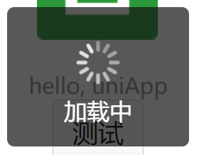
showLoading 显示 loading 提示框, 需主动调用 uni.hideLoading 才能关闭提示框。
1
2
3
4
5
6
7
| uni.showLoading({
title: "加载中",
});
setTimeout(function () {
uni.hideLoading();
}, 2000);
|
3.8 showModal 模态框
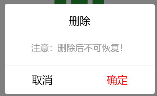
showModal 显示模态弹窗,可以只有一个确定按钮,也可以同时有确定和取消按钮。类似于一个API整合了 html 中:alert、confirm。
1
2
3
4
5
6
7
8
9
10
11
12
13
14
15
16
| uni.showModal({
title: "删除",
content: "注意:删除后不可恢复!",
confirmColor: "red",
success: function (res) {
if (res.confirm) {
console.log("用户点击确定");
} else if (res.cancel) {
console.log("用户点击取消");
}
},
});
|
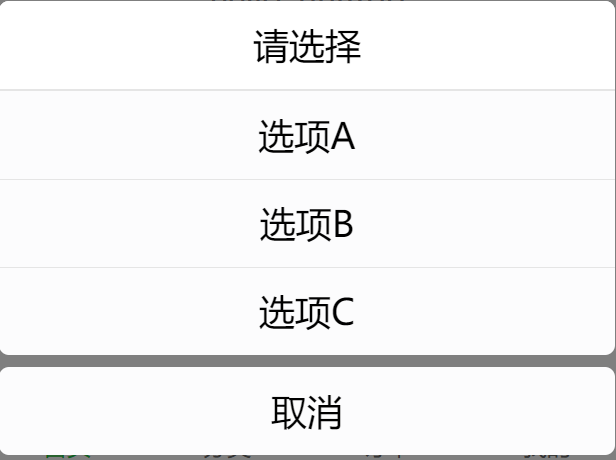
3.9 showActionSheet 弹出菜单
showActionSheet 从底部向上弹出操作菜单。
1
2
3
4
5
6
7
8
9
10
11
12
13
14
15
| let list = ["选项A", "选项B", "选项C"];
uni.showActionSheet({
title: "请选择",
itemList: list,
success: function (res) {
console.log(
"选中了第" + (res.tapIndex + 1) + "个按钮: ",
list[res.tapIndex]
);
},
fail: function (res) {
console.log("取消", res.errMsg);
},
});
|
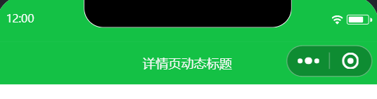
3.10 动态设置导航条
setNavigationBarTitle 动态设置当前页面的标题。
1
2
3
4
5
6
7
8
| uni.hideHomeButton();
uni.showNavigationBarLoading();
setTimeout(() => {
uni.setNavigationBarTitle({
title: "详情页动态标题",
});
uni.hideNavigationBarLoading();
}, 2000);
|

3.11 setTabBar 和 下拉刷新
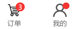
setTabBar 用于动态设置底部菜单。 - 用的极少。
setTabBarBadge - 为 tabBar 某一项的右上角添加文本。
showTabBarRedDot - 显示 tabBar 某一项的右上角的红点。
App.vue(需要在应用加载时就设置)
1
2
3
4
5
6
7
8
9
10
11
12
13
| <script setup>
onLaunch: () => {
console.log("App Launch");
uni.setTabBarBadge({
index: 2,
text: "3",
});
uni.showTabBarRedDot({
index: 3,
text: "3",
});
};
</script>
|
1
2
3
4
5
6
7
8
| <script setup>
onShow(() => {
console.log("User hide");
uni.hideTabBarRedDot({
index: 3,
});
});
</script>
|
下拉刷新:
1
2
3
4
| uni.startPullDownRefresh();
setTimeout(() => {
uni.stopPullDownRefresh();
}, 2000);
|
3.12 路由跳转
页面和路由跳转
uni.navigateTo - 保留当前页面,跳转到应用内的某个页面,使用uni.navigateBack可以返回到原页面。uni.navigateBack - 关闭当前页面,返回上一页面或多级页面。可通过 getCurrentPages() 获取当前的页面栈,决定需要返回几层。
uni.navigateBack({ delta: 2 }); 返回 2层,delta 固定参数名
uni.redirectTo - 关闭当前页面,跳转到应用内的某个页面。uni.reLaunch - 关闭所有页面,打开到应用内的某个页面。uni.switchTab - 跳转到 tabBar 页面,并关闭其他所有非 tabBar 页面。
1
2
3
4
|
uni.navigateTo({
url: 'test?id=1&name=uniapp'
});
|
1
2
3
4
5
6
7
|
export default {
onLoad: function (option) {
console.log(option.id);
console.log(option.name);
}
}
|
3.13 数据缓存 StorageSync
数据缓存 默认存储在 localStorage 中。
uni.setStorageSync(key, data) - 将 data 存储在本地缓存中指定的 key 中,会覆盖掉原来该 key 对应的内容,这是一个同步接口。const data = uni.getStorageSync(key) - 从本地缓存中同步获取指定 key 对应的内容。uni.removeStorageSync(key) - 从本地缓存中同步移除指定 key。
4. 数据请求
4.1 uni.request
uni.request 发起网络请求。
data 参数数据说明:
- 对于
GET 方法,会将数据转换为 query string。例如 { name: 'name', age: 18 } 转换后的结果是 name=name&age=18。
- 对于
POST 方法且 header['content-type'] 为 application/json 的数据,会进行 JSON 序列化。
- 对于
POST 方法且 header['content-type'] 为 application/x-www-form-urlencoded 的数据,会将数据转换为 query string。
1
2
3
4
5
6
7
|
uni.request({
url: "https://jsonplaceholder.typicode.com/posts?_limit=10",
success: (res) => {
console.log(res.data);
},
});
|
1
2
3
4
5
6
7
8
|
uni.request({
url: "https://jsonplaceholder.typicode.com/posts?_limit=10",
}).then((res) => {
console.log(res.data);
}).catch(err => {
console.error(err)
})
|
1
2
3
4
5
6
7
8
9
10
11
|
const handleRequest = async () => {
try {
let res = await uni.request({
url: "https://jsonplaceholder.typicode.com/posts?_limit=10",
});
console.log(res.data);
} catch (err) {
console.error(err);
}
};
|
完整示例
1
2
3
4
5
6
7
8
9
10
11
12
13
14
15
16
17
18
19
20
21
22
23
24
25
26
27
28
29
30
31
32
33
34
35
36
|
function network() {
uni.showNavigationBarLoading();
uni.request({
url: "https://api.thecatapi.com/v1/images/search?limit=10",
data: {
size: 10,
},
}).then((res) => {
console.log(res);
if (res.statusCode === 200) {
pets.value = res.data;
console.log(pets.value);
} else {
uni.showToast({
title: res.errMsg,
icon: "none",
duration: 2000,
});
}
}).catch((err) => {
consolog.err(err);
uni.showToast({
title: "服务器繁忙",
icon: "none",
duration: 2000,
});
}).finally(() => {
console.log("成功或失败都会执行");
uni.hideNavigationBarLoading();
});
}
|